
January 6, 2011
The “Great Recession” of 2007 to 2009 has taken a great toll on housing markets in most cities and metropolitan areas in all parts of the country. Though the pace and extent of the overall economic recovery of these markets is still far from certain, many places will likely resume growth and fully recover within the next decade or so. This is almost certainly not to be the case for all metropolitan areas. In fact, a number of large metropolitan statistical areas (MSAs) experienced severe recessions during the latter half of the 20th century and prior to the Great Recession and never fully recovered or took many years to do so. Even among those metro areas with relatively bright long-run prospects for growth, certain submarkets within them may remain well below recent house price peaks for many years to come.
What is a declining city? Simply put, a declining city is one in which the people have left, but the houses, apartment buildings, offices and storefronts remain. At the extreme, think of a ghost town from the Old West, a town that lost its reason for being. Are there cities or large metro areas in the United States at risk of disappearing back into the desert (or the swamp) today? Probably not, but there are certainly neighborhoods and submarkets within metro areas that have passed a tipping point, and have little prospect of returning to anything close to their previous peaks. Lastly, another type of declining city may also be emerging — places that grew substantially during the housing boom and are now experiencing unprecedented declines in house prices and increases in foreclosures.
The primary goal of this paper is to offer insights on the potential future evolution of real estate markets in cities that are in the midst of a severe and persistent economic decline. Through a review of a massive and interdisciplinary body of prior research, analysis of new empirical evidence on the experiences of many large U.S. metro areas over the past 40 years and a focus on the experiences of seven large metro areas since 2000, including during the Great Recession, I seek answers to three questions:
The answers to these questions are based upon review of the literature and new empirical analysis. Several different sources of data are utilized in order to highlight some of the challenges and opportunities for future or additional empirical work in this field of inquiry. Of particular interest for the last two questions is the incidence of extreme outcomes that threaten the long-term viability of neighborhoods or submarkets within declining cities.
My conclusions are as follows:
Though I tend to think a decline in housing demand will be persistent in many metropolitan markets, this is a tough call and the best opinions will recognize the importance of specific local market conditions. The analyses in this paper suggest there will be and already have been substantial threats to the viability of certain neighborhoods. This, I think, is a critical point that will likely be well understood by potential home buyers and lenders, who want to avoid places plagued by high foreclosures, vacancies and a deteriorating housing stock due to deferred maintenance. The flip side of this prediction is that potential buyers and lenders will favor those markets where information about the neighborhood’s future vitality is readily available. Neighborhood choice is likely to become an even more important component of housing decisions in those markets particularly hard-hit by the Great Recession.
Public policy may be able to play an important role in helping potential homebuyers and lenders make prudent decisions about neighborhood choice, but to do so will require policymakers to tackle difficult decisions about where to target resources. This is a consistent theme in the debate on declining cities in many parts of the world. Government will also have to show short-term successes in order to breed confidence about the potential of long-term recovery. Practical people will want to see evidence of effectiveness after policies are put in place. As such, the “evidence matters” theme espoused by the U.S. Department of Housing and Urban Development (HUD) is a move in the right direction. Two specific policy issues are discussed to highlight these challenges. The first pertains to an aspect of appraisal guidance that calls for an assessment of the neighborhood in which the property is located and, in particular, whether the market is in decline. Improvements in such guidance should be sought. The second is the ambitious neighborhood stabilization programs being supported by HUD. Though each of these policies may become a helpful tool, modifications may help them move us toward a more speedy recovery.
Multiple regulations may need to be re-examined in light of these challenges: forcing lenders to make risky loans in declining markets was certainly not the intent of the Community Reinvestment Act (CRA) and other legislation. Appraisers and lenders who decide that a neighborhood is on the verge of a substantial decline can expect to be challenged on fair lending grounds if the neighborhood contains substantial populations of minority households. Absent strong and compelling evidence, these agents will be susceptible to disparate impact claims. Lenders may have to substantially tighten underwriting standards in all neighborhoods within a metropolitan market particularly hard hit by
a major negative economic shock until it becomes clear which neighborhoods remain viable. Such behavior, though justifiable by a lender seeking to maintain a prudent risk profile, including credit, regulatory, and litigation risk, may in itself hinder recovery efforts for the metros and neighborhoods most in jeopardy. This is an area in which the government may be of help by providing more data, guidelines for forecasts and evidentiary standards. It is likely not a question of whether credit supply will be reduced in these markets, but by how much and by what process.
Lastly, the fundamental problem facing today’s new breed of declining cities and their neighborhoods seems very similar to a problem in many parts of government seeking to manage our economic recovery. That is, investment and lending are seriously hampered by great uncertainty, which in itself hinders the speed of recovery to the “new normal.” Better data and analysis will help everyone become more confident of where we are headed. Data that assess these programs should be made more available to a wide range of institutions committed to objective analyses of the programs. Absent such information, I fear the recovery will be longer and the number of failed neighborhoods greater than they might otherwise be.
The “Great Recession” of 2007 to 2009 has taken a major toll on housing markets in most cities and larger metropolitan areas in all parts of the country. Though the pace and extent of the overall economic recovery of these markets is still far from certain, many places will likely resume growth and fully recover within the next decade. This is almost certainly not to be the case for all metro areas or cities. In fact, a number of large metro areas have been in serious recession and shrinking in size for many years prior to 2007 and for these, a return to their previous sizes may be many years in coming or may not come at all. Even among those metro areas with relatively brighter prospects for growth, certain segments within them may remain well below the peaks in housing prices of the early 2000s.
What is a declining city? Simply put, a declining city is one in which the people have left, but the houses, apartment buildings, offices and storefronts remain. At the extreme, think of a ghost town from the Old West, a town that lost its reason for being. Are there cities or large metro areas in the United States at risk of disappearing back into the desert (or the swamp) today? Probably not, but there are certainly neighborhoods and submarkets within metro areas that have passed a tipping point and have little prospect of returning to anything close to their previous peaks. What are the main factors that generate declining cities? A massive and interdisciplinary body of literature, which is reviewed in Section II, offers a variety of answers to this question. The most common notion of a declining city is a metro area that has experienced substantial declines in population and employment.
Some of these experienced declines because of a loss in their comparative advantage in the production of some key manufacturing product like automobiles or steel. Some cities like Cleveland and Detroit, that fit this traditional notion of a declining city are in the “Rust Belt” region of the United States, but examples of such declining or shrinking cities can be found in other parts of the world like Dresden, Germany. Another type of declining city is generated by natural disasters. The case of New Orleans and Hurricane Katrina is a classic but very recent example. Other potential causes of declining cities have also been offered. Some point to the long-term trend of migration from the colder to the warmer or “Sun Belt” regions of the country. Others highlight the magnetic power of some metro areas such as Silicon Valley in California to attract the brightest and most talented people away from smaller metro areas with less of an advantage as “idea factories.” An issue raised in this paper is whether a new type of declining city may be emerging during the current economic crisis, areas east of Los Angeles and the San Francisco Bay area. These areas were predicated on residents commuting for jobs, low gasoline prices and irrational exuberance about house price growth, but their future viability may be threatened by recent economic events. Each type of declining city offers substantial and unique challenges to agents with a stake in the future of real estate markets within it. These agents include consumers shopping for housing, mortgage lenders seeking to assess the riskiness of real estate lending and governments seeking to develop appropriate regulatory and recovery programs.
The goal of this paper is to offer insights and possible stylized facts about the evolution of the real estate markets in declining cities that may be helpful in making these difficult assessments. The analysis draws upon the experiences of U.S. cities that have experienced severe population and employment declines in the last 40 years as well as others severely affected by the current economic crisis such as Stockton, California.
Attention is focused on three questions:
The answers to these questions are based upon review of the literature and new empirical analysis. Several different sources of data are utilized in order to highlight some of the challenges and opportunities for future or additional empirical work in this field of inquiry.
The following section elaborates on the meaning of declining cities and some of the major explanations offered for their declines, offers empirical evidence to highlight their frequency in the United States over the past 40 years and uses a collection of seven large metro areas to contrast the experiences of traditional Rust Belt cities to some in the Sun Belt that are in the midst of a severe economic decline. The three questions noted above are addressed in Sections III, IV and V, respectively. Each includes a discussion of relevant literature, offers new empirical evidence and provides my best sense of plausible answers to the questions. One particular public policy issue receives considerable attention — appraisal guidance designed to define a declining neighborhood — in the fifth section. The final section offers a summary of the main findings of the paper and argues that the onset of new data sources is a reason to be optimistic about future research on this complex and important topic.
The primary purpose of this section is to expand upon the discussion offered in the introduction regarding various notions of declining cities and to offer empirical evidence to highlight their primary traits. The discussion draws upon some of the literature about declining or “shrinking” cities and highlights several case studies. The case of New Orleans following Hurricane Katrina is treated as a distinct and environmentally generated event that led to unprecedented loss in its population. The discussion also includes a brief review of some other factors raised in the field of economic geography that may be particularly relevant to modern urban life and raises the possibility that a new type of declining city born of the current mortgage and housing crisis may emerge. The section concludes with a review of data regarding urban population patterns in the last 40 years and a closer look at seven metro areas, four of which are in the Rust Belt — Albany, Cleveland, Detroit and Pittsburgh — and three of which are in the Sun Belt — Los Angeles, Miami and Stockton — where the effects of the current recession and housing crisis are particularly acute.
The most common type of declining city is one that suffers a major loss in population owing to a dramatic reduction in its employment base. Economists and geographers have produced substantial research to help understand the reasons for such reductions in the field called “economic geography.” The standard explanation, which has its roots in economic theory going back to David Ricardo, involves a loss in the comparative advantage of a particular city. This comparative advantage may be based on its proximity to water, usefulness as a transportation hub or relatively low wages. With the comparative advantage, industries in this city are able to capture a relatively large share of the national or international market for their product and generate substantial employment among residents of the city. If the comparative advantage vanishes or is greatly diminished due to technological improvements or the development of competitors in other parts of the world, then the comparative advantage can be lost and dramatic declines in employment and population can take place, never to be replaced.
A recent article by Alan Mallach (2010) begins with some examples, specific historical episodes and a compelling narrative to explain the reasons for the existence of the traditional declining city. He cites the economic expansion of the United States in the second half of the 19th century and the first half of the 20th century, which he labels as the “nation’s manufacturing might,” and its substantial decline in the latter part of the 20th century as the primary cause of the traditional declining city. Cities such as Pittsburgh, Detroit, Cleveland and Buffalo and smaller cities like Youngstown, Ohio and Schenectady, New York (the original home of General Electric), are offered as prime examples of declining cities. As a long-time resident of Upstate New York and an economist, I find this story about the consequences of lost comparative advantage familiar and compelling. However, in preparation for this paper, I conducted a review of a long list of case studies about declining cities. Edward Glaeser (2007) offers an excellent summary of the history of one such city in an article entitled “Can Buffalo Ever Come Back?”
A key part of his explanation is the long-time and historically important relationship between Buffalo, New York and the Erie Canal, which was completed in 1825 and allowed Buffalo to prosper as New York City prospered. The presence of the canal allowed for additional types of employment and industrial gains, in addition to the transportation of goods from the Midwest to New York City. For example, Buffalo became a major producer of steel in the early 20th century because it was relatively easy to obtain iron from the Lake Michigan area and turn it into steel. In addition, its proximity to Niagara Falls allowed it to be a substantial generator of electric power. Buffalo was the 13th largest city in America at the onset of the Great Depression. It has since lost 55 percent of its population. Glaeser identifies various explanations for this decline, but his emphasis is upon the losses in its critical areas of comparative advantage. He explains that the key was the loss of its comparative advantage in transportation costs. Growth in rail ended Buffalo’s dominance as a transportation hub. Improvements in the transmission of electricity also reduced its comparative advantage in this industry. Karen Pallagst (2007) offers another insightful discussion in an article entitled “Shrinking Cities in the United States of America: Three Cases, Three Planning Stories.”3
The three cities are Pittsburgh, Youngstown and San Jose, California. Her discussion of San Jose is particularly helpful because it provides a modern day example of a declining city. The primary economic event that led to problems for San Jose was the dot com bust in Silicon Valley at the beginning of the millennium. As a result, the city faced vast losses in its high-tech work force. Pallagst cites a report that the city of San Jose lost 50,000 jobs as a result of the dot com bust. Despite this job loss, its overall population continued to grow due to immigration; however, San Jose was still affected by the loss of so many high paying tech jobs.
The investigation of declining and shrinking cities is not limited to the study of the U.S. experience. Indeed, many countries deal with the issue. Weichmann (2007) “Conversion Strategies under Uncertainty” focuses on post-socialist shrinking cities in Europe. He traces government efforts to manage demographic changes in Dresden, eastern Germany, where the breakdown of the state-directed economy caused economic decline, industrial regression and high unemployment rates. From 1989 to 1999, when the city lost population due to out-migration and decreasing birth rates, the administrative system was still directed towards growth objectives. He makes this point very clearly by presenting the unrealistically high population growth projections utilized by the administrative system during the early 1990s. Then, over the last seven years, the city experienced unexpected growth. Processes of suburbanization have turned into processes of reurbanization, and today in Dresden, areas of shrinkage and decline are in close proximity to prospering and wealthy communities. The strategic challenge is to deal with this patchwork, given that future developments are unpredictable. Other case studies are mentioned in the sections that follow. These case studies and many of the others reviewed communicate some common themes, such as the loss of comparative advantage as a cause of declining cities. They also typically include a substantial emphasis on upgrading the role of government policies. Many champion the notion that some tough choices must be made by government to help revitalize declining cities. These case studies often make another critical point: each place has its own special set of circumstances that make it hard to generalize and difficult to develop a top-down policy for all declining cities.
On rare occasions in the United States, cities have experienced major declines due to an environmental disaster. Galveston, Texas suffered enormous losses in the hurricane of 1900. The major and unprecedented example in recent memory in the United States is, of course, the city of New Orleans, which was powerfully impacted by Hurricane Katrina in 2005. Numerous studies have been conducted of the New Orleans experience. This brief discussion serves as a guide to some of this literature and offers a few statistics from the most recent 2009 American Housing Survey that captures some of the impact on the housing stock in New Orleans. One major study of New Orleans done by the Brookings Institute and entitled “New Orleans at Five” was recently published and its findings are available at the Brookings web site.4
Rather than seek to summarize all of this work, one of the ideas underlying the analysis is described — the notion of a resilient urban economy. A review of the academic literature and case studies by Amy Liu and Allison Plyer (2010) describe factors or characteristics that can increase the ability of a metro area to absorb, minimize or adapt positively to a negative shock and be resilient. They are: i) a strong and diverse regional economy; ii) large shares of skilled and educated workers; iii) wealth; iv) strong social capital; and v) community competence. These become a focus of attention in their ongoing analysis of New Orleans post-Katrina history by Liu and Plyer (2010) and their Brookings colleagues. Other think tanks have offered insights as well and use the New Orleans experience to develop lessons for other cities. One example is a presentation by Anne C. Kubisch (2008) of the Urban
Institute, which draws upon her experiences with recovery operations in New Orleans and what she perceived as the tension between short-term and long-term goals and accomplishments. The lesson she emphasized is this: people need to see short-term progress to increase their faith in the possibility of a long-term recovery. The Nelson Rockefeller Institute of Government produced a series of eight reports including one entitled “Who’s in Charge? Who Should Be? The Role of the Federal Government in Megadisasters: Based on Lessons from Hurricane Katrina,” by Richard P. Nathan and Marc Landy.5
This study argues that there were two disasters. “The first was the immediate crisis created when the hurricanes made landfall. The second was the difficulty various levels of government had in working together to respond to the crisis.” U.S. Department of Housing and Urban Development (HUD) Secretary Shaun Donovan offered testimony on the five-year anniversary of Hurricane Katrina.
He stressed the key role of housing in a complete recovery and the importance of rebuilding the region’s housing stock for families who want to return. The community at one point had lost half its residents, but is now back to over 90 percent of its pre-Katrina population. One of the most important challenges currently faced is vacant buildings and blight across the metropolitan area, where HUD estimates there are 79,000 blighted units today. Soon after this testimony, HUD released results of its 2009 American Housing Survey of New Orleans. The full results are available at HUD’s web site.7
Following are a few takeaways that compare the housing situation in 2004 versus 2009. The total housing stock is down by about 15 percent to its current size of 511,600 units. Renter-occupied housing has taken the biggest hit; it has declined by almost 23 percent to its current size of 142,600 units. The number of housing units in small multifamily structures with five to nine housing units, which are often the homes to low- and moderate-income households, has declined by 32 percent. As a result, and despite the loss in population, the median rent of renter-occupied housing units has increased by 46 percent to its current median value of $876 and is now about 12 percent higher than the median rent for the entire nation. Jay Brinkmann, Chief Economist of the Mortgage Bankers Association (MBA) and Wade D. Ragas (2006) tackled the difficult issue of assessing the cost of rebuilding the housing stock in a 2006 article, which is available at the MBA web site.8
They highlighted two particularly interesting points that hinder recovery. One was the lack of flood insurance by 30,000 or more families that experienced flood damage. Another is the disparate impacts within the New Orleans area. A particular cost reimbursement proposal would cost $9 billion for the entire area and $4 billion for the six hardest hit zip codes.
Beyond these rather clear-cut cases of declining cities, the literature on urbanization and economic geography includes discussions of other factors that can lead to substantial population declines that are difficult to reverse or predict. One of the intellectual leaders in this field is Paul Krugman, who won the 2008 Nobel Prize in Economics for his development and championing of another potential driver of substantial regional economic growth and decline — agglomeration economies. He argues that cities thrive on density, however, if another city can obtain the same or better advantage, then there can be a substantial and irreversible shift from the previous “king” city to the new one. In the context of the United States, this often pertains to growth in western cities relative to the large cities of the Northeast like New York and Boston, that have been the king cities for over two centuries. He places this possibility within the context of the ongoing debate within traditional theory that seeks to explain why developed countries or urban areas tend to specialize in the production of durable goods and developing countries or rural areas tend to specialize in agricultural production. Krugman argues that “traditional theory does not explain why, in reality, world trade is dominated by rich countries trading similar goods with each other. For instance, a country like Sweden exports Volvo and SAAB cars but also imports BMW and Toyota cars.”9
Krugman offers another explanation — agglomeration economies, which are a type of economies of scale. This captures the notion that the fixed costs of production in particular industries and locations can be greatly reduced in areas with substantial research and development. He believes such agglomeration economies are important in explaining the substantial rise in urbanization throughout most parts of the world in the past two centuries. Of course, the flip side of his story is that cities reliant upon such scale economies can suffer great declines if other cities are able to achieve substantial economies of scale by, say, substantial investments in research and development, universities and a well-educated work force. Most importantly, in my view, his theory lays the framework for fast and substantial declines without the prospect of full recovery once, for example, the major cities of the west attain the kinds of agglomeration economies long enjoyed by the East Coast king cities.
Glaeser (1998) lays out a broad description of the costs and benefits of city life and what he considers to be a critical ingredient of urban growth — the benefits of agglomeration economies. While acknowledging that the costs of urban life may increase at some point, he offers some conjectures about the future. He is particularly optimistic about the relatively homogeneous and low density agglomerations of the western United States. Though he does not mention Silicon Valley specifically, this seems to be an example of what he has in mind. These cities offer many of the economic advantages of agglomeration while also reducing the costs of congestion and crime. Ten years later Glaeser and Gottlieb (2009) offered an extensive literature survey and new empirical evidence that again champions the important role agglomeration economies play in the growth of cities. “The largest body of evidence supports the view that cities succeed by spurring the transfer of information” (p. 1023). Their empirical evidence focuses upon the impact of such agglomerations on the growth of cities in the southern and western parts of the United States and the ongoing shift in population toward areas with higher temperatures in January. This story is not so optimistic for the poorer, more heterogeneous, older cities of the East and Midwest, which will have more of a struggle because they will be less likely to be the major sources of innovation.
Another factor also seems likely to affect the relative sizes of Rust Belt and Sun Belt cities — the aging of America. The aging of the “baby boomers” and the growth in the number of retirees seem to have been substantial drivers of migration from Rust Belt to Sun Belt cities in the 1990s and first portion of the 2000s.10 However, interstate migration seems to have slowed down considerably since the onset of the Great Recession. This was likely fueled by diminished wealth and income among the baby boomers due to the decline in home prices and in the stock market, lower interest rates on bonds and lower than anticipated salaries. A recent piece by W. Frey (2009) and his Brookings colleagues offers a number of interesting insights about this issue and an analysis of recent trends. In particular, they say that “Sun Belt states, especially those in the Southeast and Intermountain West, continue to grow faster than those in the Northeast and Midwest. But the recent migration slowdown has led to noticeable reductions in their gains.” Ondrich (2010) addresses another factor affecting the potential outmigration of the baby boomers — the possibility of slower rates of retirement. Indeed, he finds that retirement rates in 2008 are substantially lower than would be predicted by standard models that take into account the declines in wealth associated with recent stock market declines. Retirement rates and associated migration from the Northeast may remain below their 2000 to 2007 rates until the baby boomers recover their lost wealth.
Lastly, another type of declining city may also be emerging — places that grew substantially during the housing boom and are now experiencing unprecedented declines in house prices and increases in foreclosures. In a recent web-based conference hosted by Jesse Abraham of the National Association of Business Economists,11 Celia Chen of Moody gave a presentation entitled “2010: Housing Recuperates.” A key part of her analysis focused on the length of time before a full housing recovery can be expected. One particularly striking graphic highlighted a number of places in California, Nevada, Arizona and Florida where full recovery of the housing market is not expected until 2030.12 Her forecast is based upon the various and negative consequences for the housing markets in these areas stemming from the recent bursting of the house price bubble. Areas in portions of central and eastern California such as Riverside County and Stockton are good examples. These areas were predicated on residents commuting for jobs to Los Angeles or the San Francisco Bay area and overly optimistic views about future house price growth. Sharply higher gas prices and unemployment rates coupled with the crash of their housing markets may threaten the long-term viability of these areas.
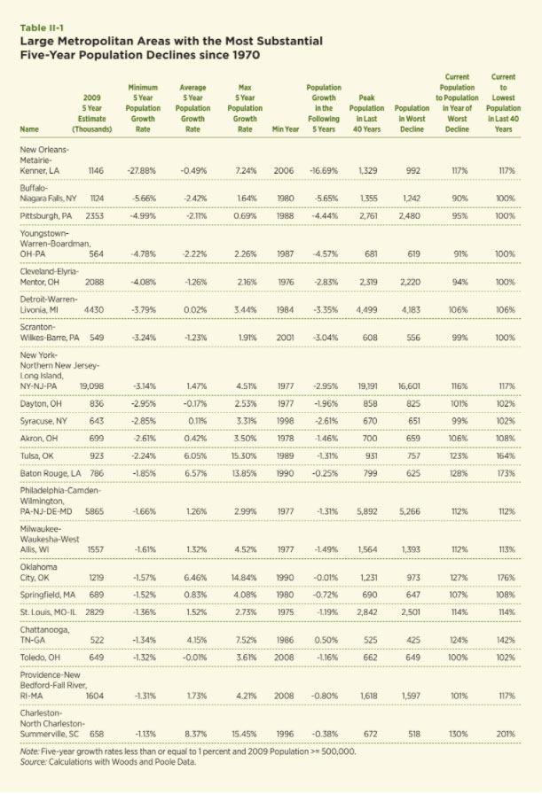
Now attention is focused upon a particular empirical exercise designed to highlight the prevalence of declining cities and their typical recovery patterns within the United States. The exercise involves reviewing the population patterns for 340 MSAs for the period 1970 to 2010. The goal is to generate some insights about the frequency of population declines and typical recovery patterns. For each MSA and each year since 1975, the previous five-year percentage change in population and the subsequent five-year population change are computed. The MSAs are ranked in terms of their largest five-year population declines. 134 of the MSAs experienced a five-year decline of at least one percent since 1970. Table II-1 contains the results for those with a population of at least 500,000. Twenty-two MSAs fit this pattern.
The top of the list by a large amount is the New Orleans MSA, which suffered devastating losses during and after Hurricane Katrina in late August of 2005. 1,836 people were killed and over $80 billion in property damages were recorded. The population in 2005 was 1,312,400; the following year population declined to 992,000. This made the period from 2001 to 2006 the one with the largest five-year percentage decline of –27.88 percent. The current population estimate for 2010 is 17 percent higher than the trough in 2006 but is still about 12 percent short of a recovery to its population at the time of the hurricane. In fact, New Orleans would have easily qualified as a declining city by the criteria used in Table II-1 without Katrina. Population declined by over four percent in the period 1985 to 1990 and had not fully recovered to its 1983 peak population of 1.33 million by the time Katrina hit in 2005. In 2010, this episode alone would have placed it among the top five worst MSA population declines since 1970 among those with populations of at least 500,000.
The next 10 MSAs on the list, with the exception of New York, fit the description of the traditional declining city discussed above. They include Buffalo, Pittsburgh, Youngstown, Cleveland, Detroit and other familiar examples of declining cities in the Rust Belt. Consider Cleveland, which experienced its worst five-year population decline from 1971 to 1976 of –4.08 percent. Its current population is 94 percent of its population at the end of that period (1976) and 90 percent of its peak population in the last 40 years (1971). The story is similar for the other traditional declining cities in this list. The New York MSA is the largest on this list by far and is on the list because of its population declines in the early and mid-1970s. The last year of this period of decline was 1977. Since then population has grown to exceed by a healthy amount its population in the mid-1970s and has experienced positive annual growth each year since the late 1980s.
The bottom part of this list includes some metro areas that might also fit the description of the traditional declining city and some that do not. For example, Oklahoma City is an area that was particularly hard-hit by the oil and savings and loan shocks that hit the Southwest in the early 1980s; however, its population today exceeds its population in the late 1980s by over 27 percent, indicating that a strong recovery has taken place. This case and others on the list highlight a simple fact about U.S. cities: a severe population decrease is not a sufficient condition for persistent and irreversible decline. Overall, this empirical exercise confirms a list of usual suspects for the label “declining city” and the fact that population growth for them, even during the relatively prosperous years since 1970, is much slower than in much of the rest of the nation and insufficient to return them to their previous peaks. On the other hand, keep in mind that this list only contains six areas that are still below their population levels as of the beginning of the period of decline, which is a small fraction of the 340-plus metro areas from which this list was compiled. That is, the classic experience of the declining city, using relatively large metro areas with populations of at least 500,000, is relatively rare in the last 40 years. Recoveries can and do happen.
A similar analysis of five-year changes in the number of households was also conducted. The resulting list includes many of the same metro areas as the one based upon population patterns, though two more Upstate New York metro areas are now on the list, Syracuse and Albany. New Orleans and Buffalo again top the list using these criteria. Another interesting result of the analysis of households is how few metro areas actually experienced declines in their household populations even when their total populations declined substantially. In fact, all but New Orleans and Youngstown have populations above their previous peak since 1970 and all have household populations above the number at the end of the worst five-year period of decline. Hence, the number of households recovers more quickly and more completely than population. This likely reflects the possibility that household size declines when there are ample housing vacancies, which presumably lowers housing costs for those who remain. It may also reflect a point raised by many authors, including Glaeser; that is, the ample supply of vacant housing in declining cities likely attracts new migrants with relatively lower incomes who are attracted to the lower cost housing.
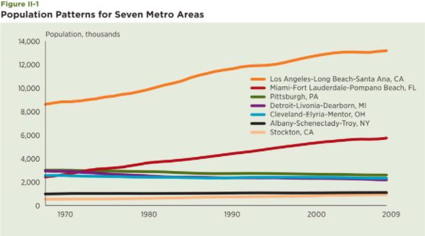
Seven metro areas are selected for scrutiny in order to provide a closer look at these various notions of a declining city. Four encompass cities and urban areas that fit the notion of the traditional declining city from the Rust Belt: Albany-Schenectady-Troy, New York; Cleveland-Elyria-Mentor, Ohio; Detroit-Warren-Livonia, Michigan; and Pittsburgh, Pennsylvania. The other three are among the fastest-growing metro areas in the country over the past 30 years. Two are very large: Los Angeles-Santa Ana, California and Miami-Fort Lauderdale-Miami Beach, Florida. The third is Stockton, California. These areas encompass 11 smaller metro areas and 29 counties. These are used throughout the paper to highlight differences in their growth patterns over the past 40 years and their experiences during the boom and bust period of the 2000s.
A comparison of these areas begins with a look at their population patterns since 1969 (see Figure II-1). The top two lines refer to Los Angeles and Miami, both of which increased substantially in size in the past 40 years. Los Angeles increased by 54 percent, Miami increased by 148 percent. Stockton is the line at the bottom. Though relatively small in comparison to the other metro areas in this group, it has grown by 136 percent since 1969. Contrast these patterns to the declining metro areas. The Cleveland, Detroit and Pittsburgh metro areas all declined in population during this period. Cleveland declined by nine percent, Detroit by 27 percent and Pittsburgh by 15 percent. The Albany metro area grew by 15 percent during this period but is included because it includes one of the best examples of a traditional declining city — Schenectady, New York. The city of Schenectady had a population of over 90,000 people in 1950, 78,000 in 1970 and just over 61,000 today.
A look at employment trends among these seven metro areas highlights an important point: population and employment are correlated, but not perfectly (see Figure II-2). While Detroit experienced nearly identical percentage declines in population and employment of about 27 percent, the other declining metro areas experienced gains in employment. Cleveland and Pittsburgh experienced positive employment growth rates of 16 and 26 percent, respectively. Employment also grew much more rapidly than population in Los Angeles (91 percent) and Miami (223 percent). Stockton’s large population growth over this period was matched almost exactly by its employment growth.

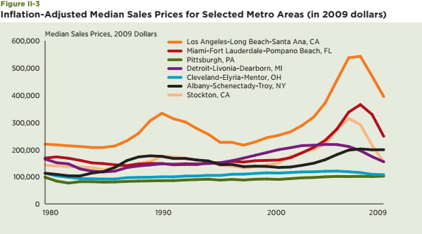
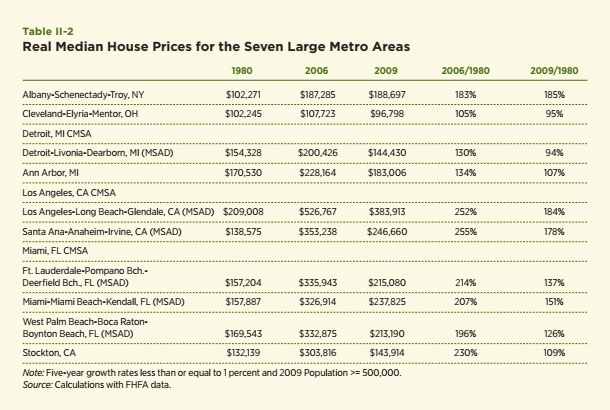
The last of this initial set of comparisons among the large metro areas offered in this section focuses upon house prices. These are available separately for each of the 11 smaller metro areas among the seven larger urban areas. Figure II-3 contains the median sales prices from 1980 through 2009 adjusted for inflation and are stated in terms of 2009 dollars.13 Selected values are contained in Table II-2.
The levels of house prices and their growth rates varied substantially among these metro areas in the last 30 years. This is especially true if attention is focused upon the values at the peak of the recent house price boom, 2006, relative to values in 1980 (see Table II-2). For example, real house prices in Los Angeles were 285 percent higher in 2006 than in 1980 and even after recent declines, stand at 185 percent of their 1980 values. In contrast, real house prices in Cleveland and Detroit are now five percent lower than in 1980, though they did briefly exceed the 1980 values for a period in the mid-2000s. The case of Stockton is particularly striking. The median house price in Stockton grew by 230 percent from 1980 to 2006, but is just nine percent higher today than in 1980 and about equal to the median house price in Detroit. Clearly, the Rust Belt cities did not experience the growth the Sun Belt cities did; but they also did not experience the same degree of decline.
This section discusses and presents evidence about the pattern of real estate values in metro areas that have experienced substantial and persistent declines in population and employment. A powerful narrative and strong empirical evidence suggest that house prices in such cities experience steep declines during the period of population and employment decline; furthermore, the recovery in house prices is very slow and incomplete. The intuition underlying this story is relatively simple and consistent with basic models of supply and demand: people move; houses, apartment buildings, offices and shopping malls do not. As a result, declining cities can expect to experience a steep decline in the demand for existing housing, which leads to much lower house prices given that the stock of existing housing is relatively fixed. Full recovery of house prices in such an environment requires either a reduction in the stock of housing or a resurgence in the size of the population.
The basis for this prediction has been examined in a large theoretical and empirical body of literature about the price elasticity of the supply of housing. The literature typically seeks to explain the response of house prices to shocks stemming from an increase in the demand for housing, which can be generated by increases in the main drivers of housing demand: population, household income and interest rates. Generally, the price of new housing is relatively elastic; that is, growth in demand leads to substantial increases in housing supply and relatively modest increases in house prices. Builders respond to a positive gap between the market price of housing and the cost of construction by increasing their production of new housing. As a result, substantial and prolonged above-normal rates of house price growth due to increases in demand are not the norm as long as space for additional housing is available and the regulatory environment is supportive of additional housing. If either of these conditions is not satisfied, then expansion of the supply of housing is inhibited and substantial and sustained price increases are possible.
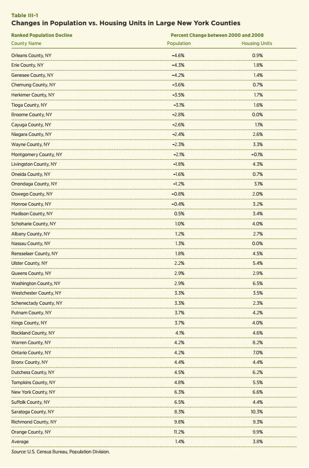
This study focuses on markets in which demand is in a state of persistent decline. What happens to house prices in these markets? Glaeser and Gyourko (2005) present both a comprehensive narrative and compelling empirical evidence that house prices in declining cities can be expected to decline sharply and recover slowly in their study of urban decline and urban housing. At the core of their view is a “kinked” supply curve, which is relatively flat (elastic) for additions to the housing stock and relatively steep (inelastic) for reductions in demand. In such an environment, persistent declines in demand generate substantial declines in prices. They offer two key pieces of empirical evidence. The first examines patterns of population change and demonstrates that population declines in cities tend to be persistent or lead to further population declines for a considerable period of time. The second shows that house price changes differ substantially among cities in the midst of a period of substantial and persistent population decline versus cities that experience population growth. Their empirical evidence involves the examination of 10-year changes in house prices for 321 city clusters using Census data for 1970, 1980 and 2000. The focus is upon the response of population and house price growth for each 10-year period as a function of the growth in the population of these cities. Strong empirical evidence of an asymmetric effect of population growth upon house price growth is presented. In particular, a decline in population growth by one percent leads to nearly a two-percentage point drop in real house prices over the decade. In contrast, real house prices grow by only about 0.23 percent per one-percent growth in population growth among growing cities. That is, the price decline over a 10-year period stemming from a one-percent decline in population is about nine times higher than the increase in house prices for a one-percent increase in population for the same period. Additional empirical evidence is presented in this section that both supports and expands upon the story told by Glaeser and Gyourko. The first exhibit is a simple examination of the correlation between growth in the size of the housing stock and growth in population for counties in New York State for the period 2000 to 2008 (see Table III-1). The counties are ranked by the size of population declines between 2000 and 2008. Sixteen counties experienced population declines during this period. Among this group, only one experienced a decline in the housing stock, and this was only –.01 percent for Montgomery County, which is a relatively rural county in the Albany-Schenectady MSA. Clearly, the people moved but the houses are still there.
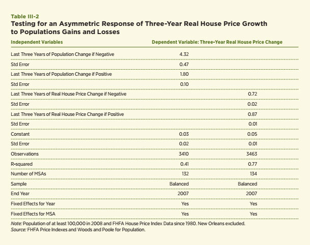
The second piece of empirical evidence focuses specifically on the relationship between real house price growth and changes in population growth. It mirrors the analysis of Glaeser and Gyourko, but uses a different and potentially richer data set on house prices. Real house price growth is measured using the Federal Housing Finance Agency (FHFA) house price indexes for metropolitan areas and population data from Woods and Poole.15, 16 The estimation uses data on 132 metro areas with population in 2008 of at least 100,000 people and with FHFA price indexes that begin in 1980 or earlier; the total number of observations is 3,410.17 The data include years 1980 to 2007. The dependent variable is the most recent three-year percentage change in real house prices. The independent variables include the most recent three-year percentage losses in population or gains in population. The measure of population loss is either a negative number or 0; similarly, the measure of population gain is either positive or zero. This allows the model to capture the asymmetric impact of population gains versus losses. The model also includes fixed effects for both the metro area and each year of data in order to control for all of the other variables that impact house prices. The results and key statistics are contained in the first column of Table III-2.
The results strongly confirm the basic hypothesis and the Glaeser and Gyourko results. The key coefficients are now 4.32 for a population loss and 1.80 for a population gain. Thus a one-percent population decrease is estimated to reduce house prices by 4.32 percent over a three-year period whereas a one-percent population increase is estimated to increase house price growth by only 1.80 percent. This asymmetric result is consistent with the basic narrative that people move faster than real estate.
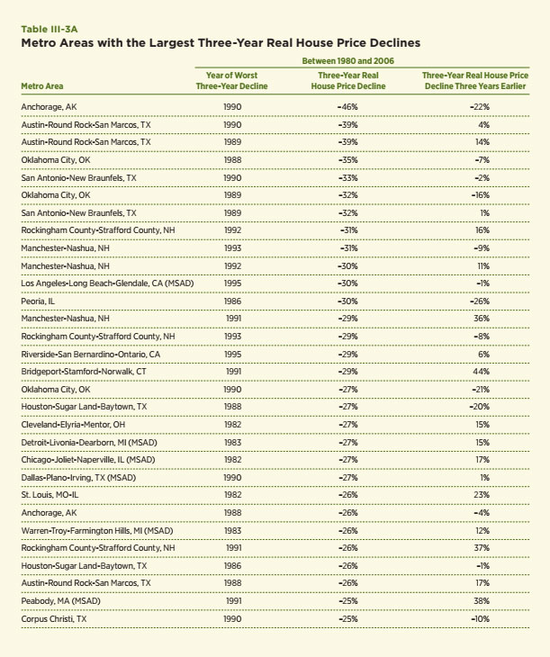
Now attention is turned to a different but related question: Does a period of substantial house price decline tend to be followed by another period of declining house prices? This is almost an inverse of a question addressed in a Federal Deposit Insurance Corporation (FDIC) study by Angell and Norman (2005) entitled “U.S. House Prices: Does a Bust Always Follow a Boom”? They conclude that a bust does not typically follow a boom using FHFA house price index data for the period 1979 to 2003. The most typical outcome after a period of substantial house price growth is a period of relatively flat house price growth. I address a similar but different question: Does a house price bust always follow a house price bust? The question is explored by estimating a regression equation similar to the one reported in Column 1 of Table III-3AB and using the same data to examine how three-year real price changes as functions of the most recent and lagged three-year real house price declines. The specification includes fixed effects for each metro area and each year in the sample. These results are contained in Column 2 of Table III-3AB.
The coefficients of the two lagged values of house price change do not exhibit the same asymmetry as found with population gains and losses. The coefficients on the two lagged values of real house price change are 0.72, if the lagged price change was negative and 0.87, if the lagged price change was positive. In fact, they suggest that the impact of a lagged price increase is actually larger than that for a lagged price decline.
Here is a potential explanation of these results and why we find an asymmetric response in the case of lagged population growth but not lagged house price growth. House price declines can be generated by a variety of variables that affect housing demand. These include increases in interest rates, tighter credit and lower average household incomes. In such cases, house prices can be expected to decrease, all else equal; however, declines in these nonpopulation factors have not typically been as persistent as the population decreases associated with declining cities so well articulated and documented by Glaeser and Gyourko and confirmed by the evidence offered in this paper. If so, house price declines generated by reductions in, say, average household income or increases in interest rates will be less asymmetric since reductions in household income or increases in interest rates do not necessarily bring about declines in population and a build up of excess housing stock.
In fact, a review of the experiences of the metro areas with the largest declines in house prices supports this view and also highlights the uniqueness of the last few years. Three-year changes in real house prices were computed for each of the 384 metro areas for which FHFA data are available.18 The left portion of Table III-3AB lists the 30 metro areas with the largest three-year declines in real house prices using data through 2008. All of these had declines of at least 25 percent over a three-year period. The largest decline was 46 percent for Anchorage, Alaska for the period 1988 to 1990. Note that two of those on the list fit the notion of a traditional declining city: Warren, Michigan, which is a metro area within the larger Detroit metro area and Detroit itself. The rest are heavily concentrated in the Sun Belt and, in particular, the Southwest. These include many that were particularly hard-hit by the oil and savings and loan crises of the 1980s, such as Austin, Oklahoma City, San Antonio and Houston. In fact, the experiences of this part of the country formed the worst regional house price decline in the United States until the current crisis and formed the basis of the house price stress test scenario used to evaluate the credit risk for the portfolios of Fannie Mae and Freddie Mac. However, these places do not fit the notion of the traditional declining city and the declines were more likely driven by relatively temporary declines in household incomes and rising interest rates during this period, rather than by persistent population declines. Most importantly, 17 of these metro areas had positive growth in the previous three-year period and the average growth rate in the prior three years was five percent; hence, a substantial period of house price decline does not appear to be a strong predictor of future house price declines. In addition, many of the places have recovered rather nicely since the late 1980s in contrast to the experiences of traditional declining cities. I view this as consistent with the narrative offered in the previous paragraph: house price declines are not necessarily or even usually self-perpetuating, rather they depend upon what caused them. If the cause is a persistent decline in population and employment that leaves a substantial excess supply, then a persistent decline in house prices can be expected. If, however, the causes of the decline are related to temporary declines in other drivers of housing demand, then house prices do seem able to recover with time in most areas..
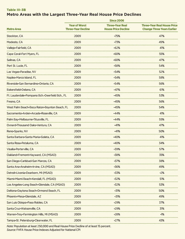
Now consider another lesson of this empirical exercise. When the list of metro areas is compiled using data through 2009 (see Table III-3B), the metro areas with the worst three-year house price declines are dominated by the period 2007 to 2009. Stockton and Merced, its nearby neighbor in the eastern portion of California, top the list with real price declines of nearly 75 percent. Most of the others on the list are metro areas in the Sun Belt. The only traditional declining cities on the list are, again, Detroit and Warren. Hence, the current housing crisis leads to a completely different list with declines that surpass the competition for the worst house price declines in the United States since 1980. Note, too, that the price declines in 2007 to 2009 for all but the two declining cities were preceded by a period of substantial house price increases in 2005 to 2007. The simple average of the price increases for this list in the period 2006 to 2009 was 45 percent. The simple average of the declines for the period 2007 to 2009 was almost the exact opposite, –44 percent. What we do not know at this time is whether house prices in these areas will soon or ever recover. History is still being written, though some like Celia Chen, who uses the models of Economy.com, do not appear to be optimistic about the pace of recovery for many of these areas.
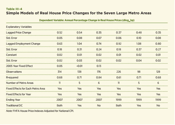
Some insights are sought by estimating a simple house price model for the metro areas discussed earlier. The model explains the growth rate in real house prices as a function of lagged house price growth, lagged employment growth and a set of fixed effects for each metro area and year. The 11 metro areas included in Table II-2 are the focus of attention. The model is estimated for all 11 using data through 2007 and then separately for the traditional declining cities and the Sun Belt cities. These three specifications are also used to estimate a model using data through 1999 to capture any substantial changes in the model since 2000. The estimation results are
contained in Table III-4.
First, I am struck by the similarity of the estimated coefficients on the lagged values of house price and employment growth. The declining metro areas appear to be modestly more responsive to real factors as captured by the coefficients for lagged employment growth (1.04 versus 0.74). The lagged house price appreciation is relatively more important in the declining metro areas (0.54 versus 0.35), but the differences are not large and both are substantially below unity. Coefficient estimates closer to 1.0 (unity) would be expected if recent house price growth by itself was a strong predictor of the future. Estimating the model using data prior to 2000 and the core years of the house price boom of the early and mid-2000s generates similar estimates.
Second, the most dramatic differences show up in the fixed effects for each year of data. In particular, the estimates of the fixed-year effects for the Sun Belt metro areas far exceed those for the declining metro areas in the early 2000s. For example, the fixed effect for the Sun Belt is 12.7 percent for 2005 versus –0.7 percent for the declining cities in this year. Clearly, something very different was happening in the Sun Belt that was quite out of the ordinary and, perhaps, unlikely to crop up in the near future. My inclination is to label this a sign of inflated expectations or the irrational exuberance in the Sun Belt in the early 2000s, though there were clearly other factors, such as the increased availability of mortgage credit and substantial immigration, involved.19 Otherwise, I was struck by the similarity of the core estimates for these two groups of seemingly very different metro areas with vastly different experiences during the past 30 years.
The key points of the analysis in this section are as follows. First, substantial price declines can be expected to occur at the MSA level in places that suffer substantial and persistent declines in population
and employment (see Table III-2). Second, the simple fact of a period of substantial house price decline
is not necessarily a signal of future price declines and a long and incomplete recovery (see Table III-
3). Third, estimates of a relatively simple econometric model of house price growth for the smaller
set of Rust Belt and Sun Belt metro areas reveal one particularly striking difference — a dramatically larger estimate of fixed effects for the early part of the 2000s, especially 2005. Overall, these results are consistent with the view that substantial price declines can be driven by a variety of factors that affect demand, not just population or employment. If these other factors are not persistently in decline, then house price declines in these areas need not be persistent either. For example, a return to more normal house price expectations and more normal access to mortgage credit relative to the early 2000s can be expected to reduce housing demand and house prices relative to the peak years of irrational exuberance. Once the “new normal” for these variables is reached, housing demand may well return to a positive growth rate and house prices will begin to recover. Of course, we are still in the midst of the current mortgage crisis and more time is needed to discover what that new normal will be in those areas particularly hard-hit during this crisis and when it will occur.
Do some neighborhoods within a declining city decline more than others? In particular, do some neighborhoods suffer extreme declines that threaten their long term viability? Such situations are sometimes called “tipping points,” which refers to situations in which a particular organization or neighborhood faces circumstances so severe it becomes no longer viable. What I have in mind is somewhat like the decisions being made within many Catholic dioceses about which particular parishes to close down due to a shortage of priests and aging and diminished congregations. This particular example is apparent in many declining cities within New York.
Much has been written about various patterns of intra-metropolitan decline. Some has focused upon the decline of the central city of a large metropolitan area relative to its suburban areas.20 Another large body of literature exists that features case studies of specific neighborhood declines and the challenge of identifying the key traits of a viable neighborhood. This approach is especially common within the field of urban and regional planning. The analysis offered in this section seeks to supplement these important contributions in two ways. First, the primary focus is upon smaller areas within the metro area such as Census tracts and zip codes. Second, attention is focused upon several specific metrics of real estate activity that are available for a large number of metro areas and offer the opportunity to provide some insight into the dynamics underlying neighborhood change during the current crisis in the mortgage and housing market.
Throughout the section, emphasis is upon the use of the metrics to describe and document widely disparate intra-metropolitan impacts. The possibility of widely disparate neighborhood outcomes within a declining city is especially important to households and businesses seeking to make long-term real estate investments and particularly important to lenders seeking to build a successful
mortgage lending business. All else equal, lenders prefer an environment with a relatively narrow set of possible future outcomes because the larger the dispersion of possible future outcomes for a particular neighborhood, the greater the risk for such investments and lending. Take for example a lender seeking to assess the mortgage credit risk of a loan in a declining city. The riskiness is directly related to the possible dispersion of outcomes. A situation in which 80 percent of the neighborhoods survive and return to normal activity within a fairly short period but 20 percent of the areas become no longer viable may be much riskier than a lending business targeted to an area in which the risk of a tipping point is less than five percent.
A Mortgage Banking magazine article by Follain and Sklarz (2005) may help explain this point. In that paper, we sought to highlight the additional credit risk of a metropolitan area in the midst of a house price bubble versus one experiencing a more normal rate of growth in housing prices. Those areas in the midst of a potential bubble faced greater probabilities of substantial declines in house prices than areas experiencing normal growth. Prudent lenders would seek to incorporate this additional source of credit risk into their pricing; hence, we titled our article “Pricing Market Specific Bubbles” and provided estimates of the additional credit risk spread needed to account for the additional credit risk due to the potential of a bubble bust. Essentially, the same kind of question or analysis might apply to neighborhoods within a metro area. If some face a disproportionate risk of a steep decline, then prudent risk management would seek to incorporate this finding into pricing and business models. Prudent risk management must also take into account the regulatory and litigation risk involved in such analysis, since fair lending experts typically warn lenders to avoid establishing lending criteria below the metro level for fear of being accused of redlining.
Of course, the possibility of a disproportionate impact among neighborhoods within a declining city is a critical question for government as well. A recent article by Mallach (2010) does an excellent job of highlighting what is at stake and offers his views about what government can do better. He states his major theme as this: “How these cities acknowledge the reality of being a smaller city, reconfigure their physical environment, reuse surplus land and buildings, and target their resources to capitalize on their assets will likely determine whether they will continue to decline, or will achieve vitality as smaller but stronger cities.” Though his focus is primarily upon cities rather than neighborhoods, implicit in his analysis is that some neighborhoods may not return to anything near their pre-decline levels. He offers a variety of potential governmental remedies to help, most of which involve putting more focus upon a smaller number of targeted programs that recognize that all neighborhoods do not face the same future prospects.
Neighborhoods can be and are characterized in a large number of ways. Some of the more obvious descriptors involve school quality, crime, resident incomes and access to transportation and jobs, but there are many other possible candidates. Hence, a metric for neighborhood decline requires both a choice of the descriptors of neighborhood decline and data for the chosen variables.
One particularly interesting case study of Flint, Michigan by Hollander (2010) offers great insight into the challenges of choosing a metric and a specific suggestion for a declining city. He argues that, “Conventional community development and planning responses have looked to reverse the process of
depopulation almost universally, with little attention paid to how neighborhoods physically change when they lose population.” He suggests, “an approach to study the physical changes of depopulating neighborhoods in a novel way. The approach considers how population decline creates different physical impacts (more or less housing abandonment, for example) across different neighborhoods. Data presented from a detailed case study of Flint, Michigan, illustrate that population decline can be more painful in some neighborhoods than in others, suggesting that this article’s proposed approach may be useful in implementing smart decline.” What is particularly striking about the approach is the enormous amount of qualitative steps taken to generate his suggested metric — housing units per acre. These included examining Census data, ground observations of neighborhood conditions and interviews with local officials, residents and community leaders. The efforts were largely confined to three neighborhoods within Flint. Though this study is very insightful and compelling, Hollander readily admits that it is difficult to generalize from this particular case study to all neighborhoods and all declining cities, but he surely and effectively champions the need for measureable criteria in order to develop sound public policy remedies.
The research in this paper considered a variety of neighborhood metrics and ultimately settled on four: vacancy rates, house prices, the number of housing sales and the value of the single-family housing stock. Each is selected because they represent plausible measures of real estate activity at the neighborhood level and because data are available to measure them. Three sources of data are used for these variables and the discussion of the empirical evidence is organized around each data source.
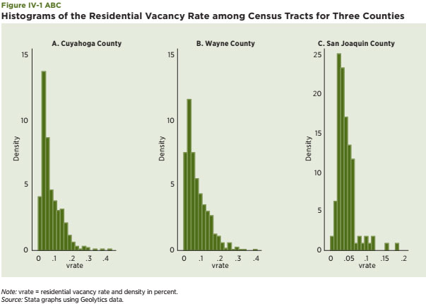
The Census-generated vacancy rate measures whether a housing unit was occupied at the time of the Census interview. It seems to capture a core notion of neighborhood decline and the explanations offered in the previous section about why house prices decrease in the traditional declining city — people move more quickly than housing units, a pattern that generates vacant housing units. It also captures the potential of extreme outcomes when all or most housing is vacant and the neighborhood is no longer considered viable. The source of information for this part of the empirical analysis is the information provided and compiled at the Census-tract level. This data product includes hundreds of variables for places all over the country, along with mapping capabilities, which are helpful in highlighting disparate neighborhood impacts. The vacancy rate is computed as the ratio of the total number of vacant housing units in a Census tract relative to the total number of housing units. The study used year 2000 data. Census-tract data for the seven metro areas discussed in previous sections are used for the analysis.21 These are chosen in order to have a mixture of traditional declining cities and Sun Belt cities particularly hard-hit by the current housing crisis. First, histograms of the distribution of the vacancy rate at the Census-tract level are generated for three counties: Cuyahoga, in the Cleveland metro area, Wayne County in the Detroit metro area, and San Joaquin, in the Stockton metro area (see Figure IV-1 A, B and C).22 They are designed to capture the dispersion of the vacancy rate in 2000 and highlight potential differences among these metro areas at that time. The key takeaway is that the tails of the vacancy rate distribution for Cuyahoga and Wayne Counties, both traditional declining cities, are much fatter and tilted toward larger values relative to that for San Joaquin County, which is the only county in the Stockton metro area and is the representative Sun Belt city in this group. Note, also, that vacancy rates in 2000 were also lower and more tightly bunched in San Joaquin County than in Cuyahoga and Wayne Counties.
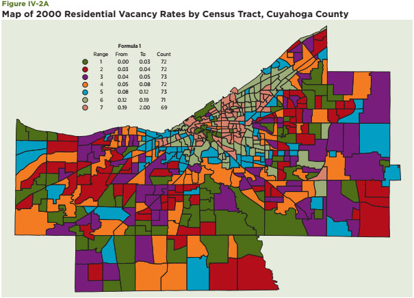
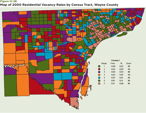
Second, maps of the distribution of the vacancy rate among all Census tracts within Cuyahoga and Wayne Counties are also presented to highlight the substantial dispersion of vacancies within these areas (Figure IV-2A and B).23 The sharp contrast in the areas in the upper center part of the map of Cuyahoga, which are generally within the city of Cleveland, captures this dispersion nicely. For the case of Wayne County, vacancy rates are highest in the northeastern portion of the map, which includes many Census tracts within the city of Detroit. Though vacancy rates are typically lower in the Census tracts outside the city to the west, examples of Census tracts with low vacancy rates are also apparent within the city of Detroit.
Maps are a helpful way to view the dispersion, but predictive methods benefit greatly from statistical measures of dispersion. The following generates a wide set of statistical measures of the vacancy rate distribution to capture the extent and character of the dispersion of vacancy rates within each county and among the 29 counties selected for scrutiny. They include the standard measures: mean, median and the standard deviation of the distributions, which are most helpful when distributions are rather stable and normally distributed. I also include two measures that shed light on the extreme values of the vacancy rate distribution: the 95th and 99th percentile values of the vacancy rate for each county. Lastly, they include two other measures specifically geared to capture whether a distribution is skewed in one direction or another from the mean — skewness — and whether the distribution is particularly narrow or peaked relative to the normal distribution — kurtosis. The larger the skewness measures, the more the distribution is tilted toward relatively large values of the vacancy rate. The larger the kurtosis measure, the more peaked and the tighter the distribution of vacancy rates around the mean value. Values in excess of three indicate that the distribution is less peaked or flatter than the standard normal distribution.
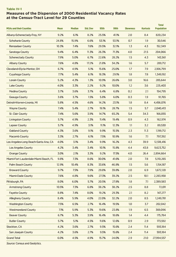
A few patterns emerge from this exercise, the results of which are contained in Table IV-1. First, as expected, the mean, median and standard deviations are lower in Los Angeles and Stockton — two growing metro areas at that time — than in the Albany, Cleveland, Detroit and Pittsburgh metro areas, which is expected. Second, the vacancy rates were also quite high in Miami. This highlights a potential problem with the vacancy rate as measured by the Census — its failure to distinguish seasonal vacancies related to tourists and second homes. Third, the extreme measures tend to be higher in many of the primarily urban counties within Cleveland, Detroit, Pittsburgh and Albany; however, the most extreme values are often in the relatively rural areas of each larger metropolitan area. Schoharie, New York is the best example of this point. Fourth, larger values of skewness, which indicate the potential tipping of the vacancy rate distribution toward larger values, are not confined to the counties associated with traditional declining cities. Similarly, large values of kurtosis, which would represent a relatively tight and sharply peaked distribution, are found for Los Angeles, Stockton and some of the suburban counties, but again, the pattern is affected by relatively rural areas and those with seasonal housing.
Overall, this exercise with residential vacancy rates from the 2000 Census offers good insights about the extent of their dispersion within declining versus Sun Belt cities. The analysis surely seems to confirm that their distributions at the Census-tract level depict a wide range of outcomes with what we would typically consider extreme values. A simple normal distribution of outcomes within these counties does not seem to be appropriate for many or even most counties. Even among the Sun Belt areas, there are examples of Census tracts with substantial vacancy rates. Nonetheless, this particular vacancy rate measure has several limitations. It is available only during Census years and only for residential units. Also, as is demonstrated in the next section, its failure to take into account the duration of vacancies seems a particularly important limitation since a substantial number of long- term vacancies is likely to be a hallmark measure of a neighborhood nearing a tipping point. The next data source to be considered on vacancy rates — the United States Postal Service (USPS) Vacancy Survey — offers the opportunity to improve the value of the vacancy rate as a metric for dispersion and, in particular, the identification of extreme outcomes.
The USPS has entered into an agreement with HUD to provide a “real-time, attribute-rich, parcel-based data system” to help monitor and address the critical issue of neighborhoods with substantial numbers of vacant and abandoned properties. The output of this agreement is a Metropolitan Area Quarterly Vacancy Report. Each quarter HUD receives Address Management System (AMS) ZIP+4 extracts of addresses identified by USPS carriers as having been “vacant” or “no-stat” and aggregates this data to the Census-tract level for release on HUD’s Office of Policy Development and Research web site. The USPS Vacancy Survey has been available for over 60,000 Census tracts on a quarterly basis from 2005 through 2010:Q2.
There are three particularly attractive features of these data relative to the Census-measured vacancy rates. First, they offer measures of the duration of vacancies. Second, vacancy rate information is available for both residential and business addresses. Third, they provide an excellent opportunity to study the evolving impacts during the current crisis. Each of these features is exploited to provide insights about the dispersion of vacancy rate changes within markets experiencing substantial declines in their housing markets.
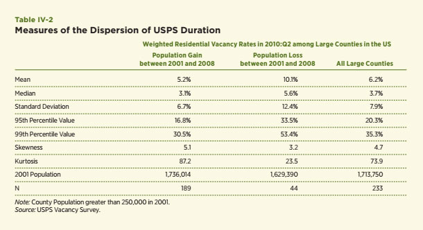
The USPS survey provides information about the total number of residential addresses and the number of vacant addresses, which allows computation of a Census-like measure of the vacancy rate, but the Census measure only indicates whether the property was vacant at the sampling date. The USPS measure also offers information about the average number of days that the units are vacant. This permits the computation of a more general and robust measure of vacancies. The definition used in this section (VR_days) is as follows: VR_days = number of vacant units × average number of days vacant / (365 × number of addresses). As such, VR_days measures the fraction of days that the residential housing stock was vacant during a year relative to 100 percent occupancy.25 This measure generally provides much higher estimates of vacancies than the Census measures. For example, the average Census vacancy rate among the 64,891 Census tracts in the 2010:Q2 USPS was 4.2 percent whereas the duration-weighted vacancy rate was 7.0 percent, which is more than 68 percent higher. We utilize this enhanced measure of vacancies to highlight differences in the various statistical measures of dispersion noted above. One comparison focuses upon the dispersion of VR_days among 233 counties with a population of at least 250,000 people in 2000. The distinction is made between those that grew in population between 2000 and 2008 (189 counties) and those that declined in population (see Table IV-2).
These results demonstrate a much more consistent and expected pattern than observed with the Census vacancy rate measure. Vacancy rates are much higher among the counties that have experienced population declines than among those that lost population. In particular, both the mean and the median of the duration-weighted vacancy rate among Census tracts for counties that experienced population decline are almost double those among counties that experienced population growth between 2000 and 2008 (10.1 versus 5.2 percent and 5.6 versus 3.1 percent). In
addition, the distribution of vacancy rates within the counties with population decline is much more dispersed, includes much larger extreme values and is flatter than the distributions within growing counties. This point is captured by differences in the standard deviations (12.4 versus 6.7 percent), differences in the 95th and 99th percentile values (33.5 versus 16.8 and 53.4 versus 30.5 percent) and differences in kurtosis or peakedness (23.5 versus 87.2). The only statistical measure at odds with this pattern is skewness, which measures the degree to which the distribution is tilted to the right of the average value toward larger values. I expected less skewness for the growing counties, but just the opposite was found.
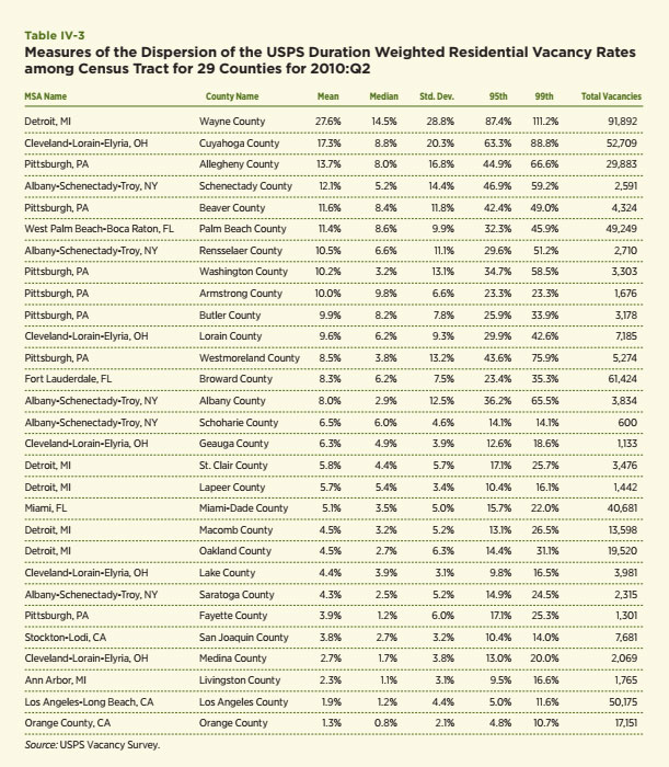
The same analysis is conducted at the Census-tract level for each of seven metro areas chosen for special attention in this study. Selected statistical measures are presented for each of the 29 counties within these metro areas (see Table IV-3). The counties are ranked by the mean average duration-weighted vacancy rate using 2010:Q2 data. The patterns in these results are striking and seem to offer strong confirmation of the central hypothesis of this section — declining cities have higher average vacancy rates and many more extreme values indicative of potential tipping points. This is most evident among the counties that encompass the central cities of the declining metro. For example, Wayne County, which includes the city of Detroit, has an average duration-weighted vacancy rate of 27.6 percent and five percent of its Census tracts have rates in excess of 87.4 percent. The 99th percentile value is an amazing 111.2 percent, a Census tract with a simple vacancy rate of 40 percent, but an average duration of residential vacancy that exceeded 1000 days, almost three years. The next three also fit the notion of a declining city or county — Cuyahoga, Allegheny and Schenectady. The duration- weighted vacancy rates exceed 12 percent and have standard deviations that are two to three times larger than their means. Two of the classic growing areas — Los Angeles and Orange County — are at the bottom of the list and the statistics confirm a much tighter and less dispersed vacancy pattern among them relative to any of the other areas by a large margin.
Another attribute of the USPS data is its ability to capture some of the changes occurring since the beginning of the Great Recession and the current crisis. This is done by comparing data in 2008:Q2 and 2010:Q2.26 Changes in the various vacancy rate measures are contained in Table IV-4 and again sorted by the largest to smallest changes in the duration-weighted vacancy rate.
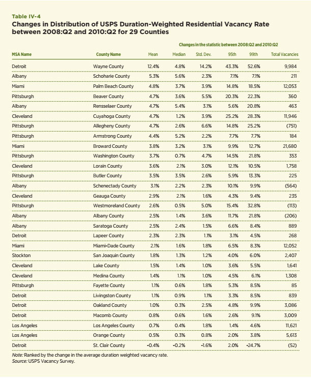
The results strongly support the notion that markets in decline — including both the Rust Belt and the Sun Belt cities — can expect to experience increases in vacancy rates. All but one of the counties shows an increase in the duration-weighted vacancy rate during this two-year period. Wayne County also tops this list with an increase of 12.4 percent (15.2 to 27.6 percent). Note, too, that the standard deviation measures have increased in every county except St. Clair County, which is a suburban county in the larger Detroit metropolitan area. Similarly, the two measures of the extreme percentiles have increased for every county except St. Clair. Still, the Sun Belt has yet to experience anything like the vacancy rates in the declining cities.
This paper, like most in the literature, focuses upon residential real estate owing to data availability. The USPS data offer an unusual opportunity to access and evaluate information about nonresidential property. It tracks the number of business addresses, the number of vacant business addresses and the duration of the vacancies. The same duration-weighted measure of business vacancies is computed using this information and provided in Table IV-5. The information includes 2010:Q2 data as well as changes since 2008:Q2 and are ranked by the 2010:Q2 business vacancy rate.
A striking feature of the data is the much higher business vacancy rates than residential vacancy rates. In fact, a simple investigation of the correlation between residential and business vacancies for the 6,518 Census tracts among these counties revealed a strong connection. A simple regression without a constant term shows that the business vacancy rate is about 50 percent higher than the residential vacancy rate and has an R2 of 50 percent, which suggests a strong relationship. Though this relationship warrants more study, one likely rationale for this close relationship is that many of the business addresses are those for small businesses that serve the local population, e.g. restaurants, laundries, gas stations, etc. When the demand for housing in the area declines, these small businesses are likely to be hard-hit as well. The data are consistent with this explanation.
Like residential vacancies, business vacancies have risen substantially during the Great Recession. A simple regression again confirms both the substantial rise and a strong correlation with vacancy rates in 2008:Q2. The duration-weighted business vacancy rate in 2010:Q2 is 64 percent higher in 2010:Q2 than in 2008:Q2 among the 6,533 Census tracts in the regression. R2 for the regression is 88 percent. This category of nonresidential real estate has been hit hard and appears to be closely related to patterns in the residential sector.
More direct measures of the vitality of neighborhoods within a housing market include measures of house prices, the volume of sales and the value of the housing stock. Ideally, such information would be available for a variety of neighborhoods and frequent time periods, which permit insights about how the dynamics of the neighborhood change over time. Unfortunately, such information has historically been rare and often nonexistent. Decennial information of the type used by Glaeser and Gyourko were often the best available to study any type of time pattern of housing data at the neighborhood level. We are in the midst of a data revolution in which such data are becoming increasingly available. The primary source of such information consists of public records data on house sales and property tax records, which have become increasingly available via various data aggregators who often use the data to generate automated valuation models (AVMs) of house values. The private vendors and companies who produce and develop AVMs generate income by selling the data and the AVM products. One of the leading firms in this arena — Collateral Analytics — is headed by a former colleague who has kindly provided valuable data for this study.
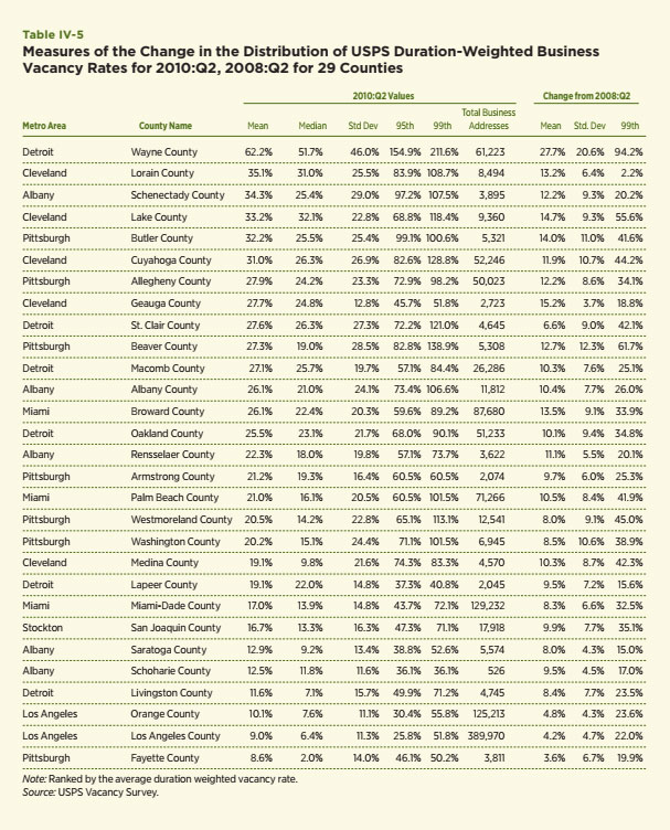
Three types of information have been provided for each zip code in two of the metro areas within the core group: Cleveland and Stockton. Data for these areas were requested to highlight recent patterns in two places with very different histories. Cleveland falls into the category of a traditional declining city. Stockton, on the other hand, had been among the fastest growing areas in the United States until the Great Recession and now it is among those areas particularly hard-hit by the crisis. Hence, these two provide an excellent opportunity to compare how two different types of places perform during periods of decline. The data provided are quarterly information since 2000 and through 2010:Q2 at the zip code level.
Information is provided about housing sales, which consist of what Collateral Analytics defines as regular (non-distressed or arm’s length) sales as well as Real Estate Owned (REO) and foreclosure sales and sales prices, which are also available by the three categories for both metro areas. Separate information is available for single-family transactions (one unit) and multifamily transactions, which typically refer to two- to four-unit properties. In addition, a special and unique set of calculations are provided for the Stockton metro area using Collateral Analytics’ retrospective AVM, which provides measures of the value of single-family housing stock at the zip code level from 2000:Q1 through 2010:Q2. A value of each property within each zip code is provided by their AVM each quarter. Data are available for this study from 2000 through 2010:Q2. This type of information is a relatively new and important development. The estimates are computed using the same set of models and calculations used to construct current AVM estimates. These include comparisons of comparable properties, simple hedonic models and application of weighted repeat sales methods. The critical output is a set of historical estimates of the values of the housing stock on a quarterly basis using uniform valuation methods. The estimate also takes into account the changing number of housing units in the stock at each quarter. The empirical analysis in this section utilizes this information to offer insights about the widely varying intra-metropolitan patterns of house prices and sales during periods of both substantial growth and decline for the two metro areas. One is the classic declining city — Cleveland — and the other, Stockton, has been hit as hard as any metro area by the current crisis and may represent a new type of declining city created by the Great Recession.
Table IV-6 includes the various sales figures for both places during the decade. Cleveland’s total sales are generally twice the number of Stockton’s through most of the decade, yet its population was three to four times larger than Stockton’s. Both increased by about 50 percent during the first five years of the decade. The number of regular sales in Cleveland peaked in 2005 while Stockton’s peak was reached a year earlier. The numbers for 2010 represent those through 2010:Q2.
The most dramatic aspect of the sales numbers is the change in the composition of sales in these two areas. Figure IV-3 highlights the changes by plotting the share of all single-family sales that were regular or nondistressed for both metro areas and a composite of the two. For Cleveland, the decade begins with regular sales as the dominant portion of all sales (about 94 percent), but regular sales diminish relative to REO and foreclosure sales over the next several years. The low point occurs at about 60 percent in 2008, but the increase since then is modest. The pattern in Stockton is much more dramatic. Regular sales dominated through 2006 but decline by half in 2007 and comprise only 11 percent of all sales in 2008. Recovery since then has been modest and regular single-family sales remain less than one-third of all sales.
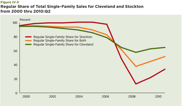
Figure IV-4 seeks to capture the extent of variation in house price changes among all of the zip codes in the two metro areas. The metric is the percent change in an average of sale prices inclusive of all three sales types from the peak year of 2006 through the 2010:Q2.29 The distributions of these changes are plotted for key percentiles of the distribution. The median decline in Stockton has been 56 percent, which is double the decline in Cleveland zip codes. The interquartile ranges (75th less 25th percentiles) are 16 (-25 to –41) percent declines for Cleveland and nine percent for Stockton (–53 to –62). Five percent of the zip codes in Stockton experienced declines in excess of 75 percent. Clearly, these declines are both substantial, on average, but also widely varying among both areas. The evidence seems to offer strong support for the basic idea raised in this section of the paper, that wide variations in the outcomes of neighborhoods within a declining city can be expected.

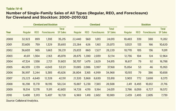
A previous study entitled “ZIPpity Do Da!” by Follain and Follain (2007) used similar data to study property price appreciation in Los Angeles County during the first six years of the 2000s. We sought whether zip codes representing relatively low- and moderate-income households, as measured by Census information in 2000s, experienced higher rates of house price appreciation during the boom years of the early 2000 than in areas with relatively higher incomes. The analysis found that they did. It also revealed an interesting factoid to highlight this finding — the zip code with the lowest rate of appreciation from 2000 through 2006 in Los Angeles County was the famous 90210 zip code that includes Beverly Hills and is the name of a popular television show from a few years back.
A simpler analysis is conducted in this paper for Cleveland and Stockton. The highlights are presented in Figure IV-5, which contains the average single-family house price generated by all three types of sales for several zip codes with relatively large numbers of sales. One line plots these values for the zip code (95376) in Stockton with the highest average values through most of the period. Average sale prices in this zip code more than doubled from 2000 through 2006 to about $480,000 per transaction.
Since then sale prices in 95376 have declined to about $200,000 and below values at the start of the decade. 95206 is a zip code with much lower average values. Prices more than tripled between 2000 and 2006 from $116,000 to $362,000 in this zip code before beginning their plunge to values only slightly above those at the beginning of the decade. Thus, the Stockton result is similar to what we found for Los Angeles County — the greatest appreciation was enjoyed among the relatively moderately priced areas.
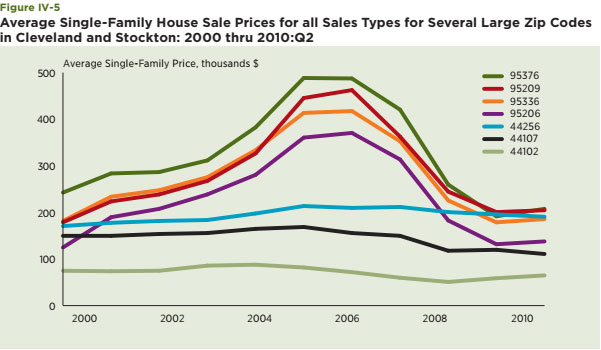
The pattern of house price changes within Cleveland seems quite different based upon a review of the zip code price data. Property values were generally lower in Cleveland than in Stockton and none of the selected zip codes showed anything like the appreciation experienced in Stockton. Zip code 44256 rose about 25 percent by 2006 but is now just above the average value in 2003. Zip code 44102, which is the lowest priced zip code in this group showed relatively little movement throughout the decade. First of all, price appreciation was much more muted in Cleveland. Second, property values among the low-priced tiers in Cleveland did not rise in relative terms as they did for Stockton.
A complete explanation for this pattern or its full implications is not offered with the data available. However, allow me to speculate. It could be that inflationary expectations were particularly exaggerated among low and moderate incomes in the Sun Belt, and something like a regional contagion effect was present and fueled expectations about the future growth of housing demand and house price. Of course, access to credit played a role in fueling demand since subprime products were particularly popular in California. The same inflationary fervor and appetite for subprime mortgage products may not have been present in Cleveland. Regarding the implications of the different pattern, one
possibility pertains to the impact of house price declines on household wealth. The patterns suggest that low-and moderate-income homebuyers in Stockton may be particularly hard-hit, whereas the pain may be more evenly distributed in Cleveland.
Documenting the changes in the number of sales and sales prices based upon transactions captures just part of the impact of the housing crisis on the local housing market. Perhaps a more fundamental measure is the impact on the housing wealth of residents in these areas who may never have engaged in a transaction. Collateral Analytics’ retroactive AVM provides a unique and very sobering measure of the value of the single-family stock of housing for Stockton (see Figure IV-6). The series indicates the valuation of single-family housing stock from 2000 through 2010:Q2 is driven by two major factors: changes in the number of single-family properties and changes in the valuations of these properties. The number of single-family properties at the beginning of the decade was 118,000 and increased to about 152,000 in 2010. The value of this stock of housing began the decade with a value of about $17 billion and the median value of these units was about $156,000. The value of this stock increased to about $65 billion in 2006 because of increases in both the number of units to 148,000 and their median value to $415,000. Since then the value of the stock has plummeted in value to $23 billion. This is about $6 billion or 35 percent above its 2000 values. About five percent of the change is due to an increase in the number of units since 2000. The rest is due to about a 30 percent increase in median values, which was just about the same increase in the overall consumer price index for the United States since 2000.
A theme of this section is that focusing solely on an aggregate for the metropolitan area tells just part of the story. The intra-metropolitan variations tell another. Eight representative zip codes are selected to help highlight this theme. Two are the ones in Stockton with the most valuable housing stocks as of 2010 — 95376 and 95377; the value of the housing stock in these two zip codes represent about 20 percent of the total value of Stockton metro area housing stock in 2010. Three are closer to the average share and collectively represent about 20 percent of the value of the total stock in 2010: 94207, 95209 and 95219. One, 95205, had the largest percentage decline in value since its peak during the 2000s (–79 percent). One, 95230, had the lowest percentage decline in value since its peak during the 2000s (–10 percent). And one, 95236, was selected because it had one of the lowest shares of the stock (0.57 percent) and experienced a decline of –35 percent since its peak. The value of the stock in each of these zip codes is plotted in Figure IV-7 for 2000 through 2010:Q2.
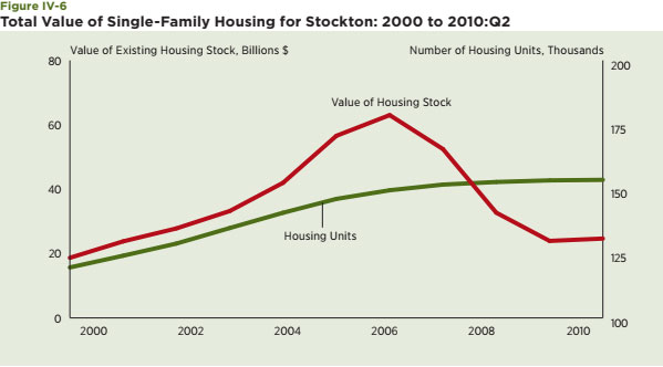
Following are some of the results that caught my attention and that highlight the wide variation among zip code experiences. The value of the housing stock in zip code 95376 doubled in value between 2000 and 2005, but the value of its stock of housing has since declined to a level below its value in 2000. In fact, three other zip codes now have lower values than in 2000: 95376, 95207 and 95231. The value of the stock in 95230 has increased by over 115 percent since 2000 and has only given back 10 percent since its peak in 2005. Values in 95320 are also up by over 100 percent since 2000, but experienced a 53 percent decline since their peak.
Such massive roller coaster rides in housing wealth among Stockton homeowners likely has an impact on their spending and the local economy. Indeed, much has been written about the marginal propensity to consume out of housing wealth.30 The most famous student of this issue is Alan Greenspan, former chairman of the Federal Reserve Board. He and a colleague at the Fed, Senior Economist James Kennedy, did an exhaustive study of the “Sources and Uses of Equity Extraction” for the U.S. economy as a whole. Among their findings is that equity extracted from homes was used to finance about one percent of personal consumption expenditures from 1991 through 2005. It has been particularly important since 2000. Equity extraction financed about 0.6 percent of personal consumption expenditures in the 1990s and over 1.75 percent between 2000 and 2005.31 If these numbers apply to consumers in the Stockton area and apply during periods of steep reductions in housing wealth, then the impact of the nearly $40 billion decline in house values would put a serious dent in their spending. Also, many of those who extracted their equity at the peak of the boom are likely deeply underwater in terms of their home equity.
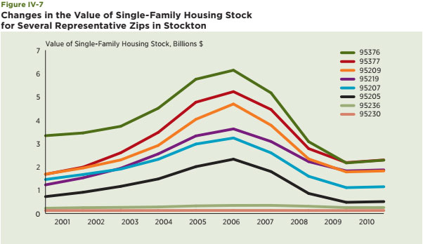
This section uses several measures and data sources to offer metrics of neighborhood change during the boom and bust period of the past 10 years. At a high level, the results strongly confirm that neighborhoods within a declining metro area can experience widely varying experiences. The extent of the decline is not shared equally or proportionately. The best examples offered in this section maybe the experiences at the zip code level for Cleveland and Stockton, which highlight wide differences in house price changes and housing wealth. The analysis of various vacancy-rate measures is another helpful example because it suggests the importance of moving beyond the standard definition of vacancy — no one occupying the unit at the time of an interview — to one that incorporates the duration of unit vacancy. The duration-weighted measure developed with the USPS Vacancy Survey data seems especially helpful in the identification of neighborhoods within declining cities at or near their tipping points.
The analysis also highlights the inherent complexity of measuring and monitoring neighborhood patterns. Looking forward, future analysis of real estate markets ought to be able to become more granular than was possible just 10 years ago because of great improvements in the quality and availability of public records data and the information in the USPS Vacancy Survey and other sources. Geographic Information Systems (GIS) or mapping techniques may be of help as well. On the other hand, there is still one major limitation in the available data — limited time-series or high-frequency information about the traits of households in these markets. On this issue there is also some room for optimism since the results of the 2005–2009 American Community Surveys, which are to be released in December 2010, will provide information about households that can be merged at the Census-tract level with these other data sources and perhaps, offer even more frequent, granular and complete pictures of neighborhood evolution than ever before.
This section focuses upon a related but more difficult question than the previous section; one that is critical to the development of successful household neighborhood choices, prudent risk management by lenders and government units charged with combating urban decline. The question is whether households, lenders and governments have or can develop credible models capable of predicting which specific neighborhoods are likely to experience the most extreme outcomes, one of which includes the possibility of being abandoned? The question is important to each of these groups for a variety of reasons and has important policy implications. Households make housing decisions simultaneous with the choice of a particular neighborhood in which to live and raise families. Uncertainty can lead to costly mistakes and price drops in neighborhoods whose futures are more uncertain. Lenders seeking to price mortgage credit risk prudently benefit from better models of neighborhood price dispersion. Absent such information, lenders will be incented to avoid those neighborhoods with particularly uncertain futures, even if regulation prohibited such actions. Government officials face similar challenges in deciding how to allocate scarce resources to promote neighborhood sustainability. Indeed, one of the themes in HUD’s recent neighborhood stabilization programs is “evidence matters.”32 Multiple regulations may need to be re-examined in light of these data: forcing lenders to make risky loans in declining markets was certainly not the intent of the Community Reinvestment Act (CRA) and other legislation. Here is one example that may help explain what is at stake. Credit scores are often highly correlated with racial and ethnic characteristics. Credit scores are also found to be an important driver of mortgage default. Lenders have been able to incorporate credit scores into the pricing of mortgage credit risk because substantial and credible empirical evidence has been accumulated to demonstrate that a legitimate business motive exists to charge higher mortgage rates to those with lower scores even though this means that, on average, certain racial and ethnic groups will pay higher rates than white nonHispanic borrowers, all else equal. Absent such evidence, they are subject to claims that such a policy has a disparate impact on minority borrowers.
The same kind of issue applies to an analysis of potential neighborhood decline if such decline tends to be highly correlated with the racial composition of neighborhoods. If such a correlation exists, regulators will require lenders to provide strong evidence to justify differential pricing among neighborhoods. Absent strong evidence to distinguish between the core economic causes of decline within neighborhoods and their racial composition, lenders may choose to substantially increase underwriting standards in all neighborhoods within a metropolitan market particularly hard-hit by a major negative economic shock until it becomes more clear which neighborhoods remain viable and which ones are less so. Such behavior, though potentially justifiable by a lender seeking to maintain a prudent risk profile, may in itself hinder recovery efforts for the metro areas and the neighborhoods most in jeopardy. Thus, it is not a question of whether credit supply will be reduced in these markets, but by how much and by what process.
There are a number of serious challenges to the development of the kind of information that might reduce this kind of uncertainty about neighborhood choice. Many are highlighted in the previous section: limited data, especially high frequency and highly granular data, and the many ways in which neighborhood quality can be measured. Another is that severe neighborhood decline is an extreme event that is particularly difficult to predict. Awareness of the complexity surrounding the prediction of extreme events has grown dramatically in recent years. Gladwell (2000) made this point by describing a wide variety of both positive and negative extreme events in his book, The Tipping Point. He tells one particularly dramatic story about the powerful effects generated by changes to police enforcement of relatively minor laws such as crashing subway gates.
Nicolas Taleb’s book, The Black Swan: The Impact of the Highly Improbable (2007), has more recently led the charge to highlight the difficulty of predicting extreme economic events. He claims that economists typically overstate their (our) confidence in predicting the probability and consequences of extreme economic events and offers a serious justification for this view built upon modern behavioral psychology, empirical evidence and longstanding ideas in the philosophy of social science. I wrote a paper recently that investigates his claim for an important dimension of mortgage credit risk – establishing measures for capital adequacy.33 The greater the likelihood of a severe downturn in house price, the larger will be the amount of capital that lenders must set aside for their mortgage lending. These costs can represent one-third or more of the credit spread that lenders need to earn in order to meet their return on equity targets. I found that the arguments of Taleb did apply for capital rules based upon my own professional experiences in such a search. Follain and Giertz (2010) present a specific econometric model and simulation process designed to highlight the challenges associated with the measurement of extreme or stressful scenarios in house prices. Based upon the analysis, we offer a recommendation that is well beyond what regulators of the Government Sponsored Enterprises (GSEs) utilized prior to their collapse in September 2008, but our final recommendation also comes with a number of caveats and judgments and calls for additional research and data that characterize the difficulty underlying such recommendations.
George Galster has written a set of papers over the past 10 years or so that are specifically designed to answer the kind of question addressed in this section and, in my opinion, are at the frontier of what has been done and needs to be done in order to provide policymakers with the tools to better manage neighborhood outcomes.34 Galster, Hayes and Johnson (2004) search for robust and parsimonious neighborhood indicators. Four indicators emerge from their analysis: mortgage approval rates, loan amounts, loan applications and Dunn and Bradstreet data on businesses. Galster, Cutsinger and Lim (2007) focus on the dynamic patterns of neighborhood development. They investigate how neighborhoods respond when they are upset by transient, exogenous shocks. Using annual Census-tract data for five cities for the years 1988 to 2003 they find that stability was quickly established for most of the indicators analyzed. The exception was crime rates, which proved to take longer to return to their original state, especially in neighborhoods with high poverty rates. Galster and Tatian (2009) also use a panel-data set to examine whether large increases in house values at the neighborhood level can be predicted with statistical models. They use year-to-year neighborhood price dynamics for Census tracts in Washington D.C. for 1995 to 2005. The results suggest that proximity to stronger neighborhoods, a robust metropolitan housing market and inflows of higher-status home buyers are key predictors of home price growth in disadvantaged neighborhoods. Galster, P. Tatian and J. Accordino (2006) do something similar using a unique data set for Richmond, Virginia, and offer credible evidence that targeted and sustained neighborhood revitalization programs can have positive impacts on the residential investment climate in targeted areas.
Each of these papers offers excellent examples of the kind of data that can be collected in some places and from various sources, the wide range of potential neighborhood indicators that can be considered, many compelling results and insights and a guide to how future work might proceed. What are particularly impressive are their hunt for local data sources, championing the power of carefully done case studies and the recognition of the critical role of local factors or “context.”
Another specific and highly pertinent example of what is needed is a product developed by Dennis Capozza and his associates at University Financial Associates LLC.35 Capozza’s product measures the probabilities of mortgage default and prepayment at the zip code level. These measures are offered on a quarterly basis and pertain to a standard 30-year fixed-rate mortgage. The key elements of the predictions are equations to predict default and prepayment behavior using zip code level economic, legal, political, demographic, morbidity and demographic data. The model and its results are proprietary, but he agreed to share his predictions for Cleveland and Stockton. Figure V-1A plots these predicted probabilities of default and prepayment for 2000 through 2010:Q2 for selected zip codes within the Cleveland metro area and Figure V-1B does the same for Stockton. The most encouraging message of these results is that the predictions captured the steep rise in default and foreclosure activity prior to the peak of house prices in 2005 and 2006. This is especially clear in his predictions for the Stockton metro area. What remains to be seen is whether the very low predictions for the last couple of years of business will come to pass. We need more time and data to reach this judgment. Also, the dispersion of the predictions among zip codes seems quite small in Stockton. Capozza and his team will soon be releasing an updated version of their product to address this issue.
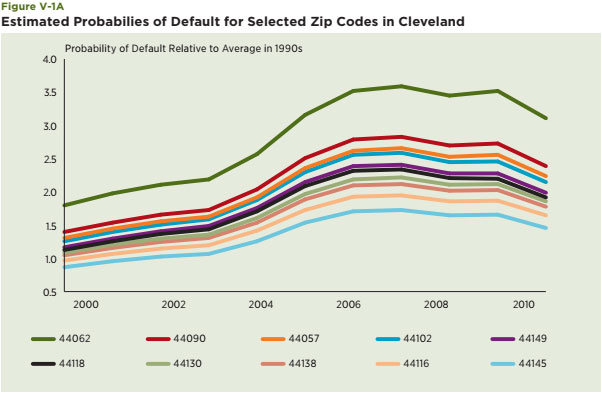
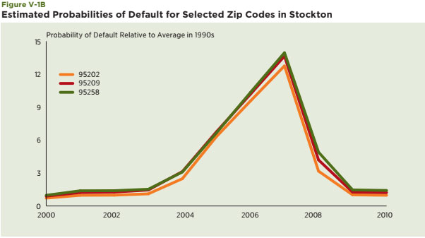
The remainder of this section utilizes some of the same data used in previous sections to highlight the nature of the challenge facing analysts seeking to model future neighborhood outcomes. Examples of such models are presented, estimated and evaluated. Particular attention is paid to their predictions of extreme events or outliers. The first is a model of the cross-sectional or point in time variation in vacancy rates among Census tracts using a wide variety of 2000 Census information about these tracts. The second is a model of the changes over time in house prices and sales and uses the Collateral Analytics panel data at the zip code level for Cleveland and Stockton and mirrors some of the work done by Galster and his colleagues. Each is discussed in turn.
The purpose of this section is to develop and evaluate a simple model to explain variations in the Census-measured vacancy rate among the 6,500 Census tracts within the 29 counties in the seven selected metro areas. Particular attention is focused on whether the model does a good job of predicting neighborhoods with extremely high vacancy rates. This is a cross-section exercise because there are no time-series data available for the estimation of the model readily available. Stepwise regression was used to select a large number of variables designed to generate model with high explanatory power. The explanatory variables in the model include a number of likely drivers of the vacancy rate as well as some likely to be highly correlated with it. These include: total population, median age, number of black non-Hispanics, number of Hispanics, homeownership rate, housing unit density, median household income and distance and distance squared from the City Hall of the central city of the metro area. These are all based upon 2000 Census data and are part of the Geolytics database. The results for four different specifications are contained in Table V-1. Fixed effects for either the county or the metro area are included. The last two columns distinguish between counties in traditional declining metro areas versus those in growing metro areas.
Does this analysis suggest that we can predict with confidence which Census tracts will experience very high vacancy rates? The results raise serious concerns. For example, though most of the estimated coefficients for this rather lengthy list of potential drivers of the vacancy rate are statistically significant, the explanatory power of the estimated models is only modest in three of the four cases — about one-third of the variance in Census tracts is explained by these three models (R2 = 0.33). The explanatory power for the model that focuses just on traditional declining cities (column 3) is higher, but still explains less than half of the variability of vacancy rates. Most importantly, the model does not do a particularly good job of explaining Census tracts with extreme or very large vacancy rates, which is critical to being able to predict tipping points. For example, among those Census tracts in the declining cities with high vacancy rates (greater than or equal to 20 percent), the predicted vacancy rate is only 11.8 percent versus the actual average of 29.5 percent. Almost the same results are obtained for the Sun Belt; the actual rate among Census tracts with high vacancy rates is 2.5 times higher than the amount predicted for them with the model (32.6 versus 12.6). The tendency of the model to substantially under-predict vacancy rates in high vacancy-rate neighborhoods is demonstrated by plotting the unexplained residuals (prediction errors) from the model against the actual vacancy rates among the Census tracts (see Figure V-2). Note that the errors are largest in those areas with the highest vacancy rates. In sum, these models do a particularly poor job of explaining or predicting “extreme outcomes.”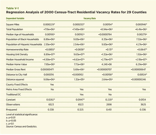
The analysis now turns to the second model, which examines the evolution of the number of house sales and house prices over time for a highly granular set of locations within Cleveland and Stockton. This is possible using the quarterly data from Collateral Analytics at the zip code level for the Cleveland and Stockton MSAs. These data are used to estimate two separate equations. The dependent variable in the first equation is the growth rate in the total number of sales of all types and the dependent variable in the second equation is an index of house prices based upon all sales types.36 Both models include four lags in the lagged growth rates in the dependent growth rates of house prices, dummy variables for the year of the sale, fixed effects for each of the zip codes and a dummy variable for quarters in which house prices for some zip codes are missing values. Data are limited to those with at least 500 sales over the 10-year period. The models are estimated with data through 2007, which includes 107 zip codes and 2,889 total observations (27 time-series observations per zip code). The model results are contained in Table V-2.37
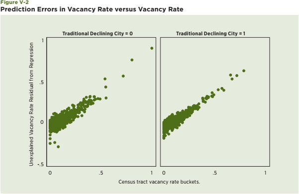
The estimated coefficients of the four lagged price-growth terms are statistically significant for both equations. The sum of the four coefficients is about –0.6 for the sales growth equation and –0.95, which implies growth processes with substantial reversion to the mean, especially for house price growth for these years. The year-indicator variables also capture some of the substantial growth in the number of sales through 2006 and the decline that began in 2006. For example, the year-indicator variables for the sales equation change from +5.292 in 2004 to –13.48 in 2007. Similarly, these year-indicator variables show the buildup of average prices through 2005 and the very steep decline that begins in 2006. The overall explanatory power of the model for sales is reasonable; it explains 42 percent of the variation in the growth of zip code level house sales, i.e. R2 = .42. The explanatory power of the equation for house price growth explains much less of the variation among house prices; R2 is only .175. Surely some additional tinkering with this specification might lead to modest improvements in this model. Also, more zip code level information would no doubt improve these models, but the lack of such information for a time-series model of this type is at the heart of the prediction problem. Overall, the results suggest to me that these are plausible though obviously simplified models. An important focus on this section is upon the predictive power of models such as these. This is done by examining the residuals or prediction errors of the model, which are expressed as a percentage of the total number of sales or the average price of housing in the zip code. Table V-3 contains the distribution of these errors for two years for both models: 2006 (a within-sample set of predictions) and 2008 (a forecast of the model for a year outside the sample). Predicted growth rates in sales in 2006 tend to be larger than actually occurred; the mean error is 9.3 percent and the median is 4.4 percent. The interquartile range in 2006 for sales is 30 percent (21.5 + 8.3) and the standard deviation is 33.9 percent, both of which are rather large, indicating that the model did not do a particularly good job in 2006, which was near the peak of the boom. Note, too, the outlier values; the 10th percentile (–22.7) and 90th percentile (43.8) values indicate substantial errors for 20 percent of the population. The values of the distribution of the error terms for 2008 generally indicate that the model understated the depth and breadth of the declines during the first full year of the Great Recession. The average errors were –9.0 percent (mean) and –7.6 percent (median). The standard deviation is about the same, but rather large. The outliers are particularly large but they shifted to even larger and more negative values for 2008. For example, the first percentile error in 2008 for the growth rate in house sales was –113.6 percent, double the error for 2006.
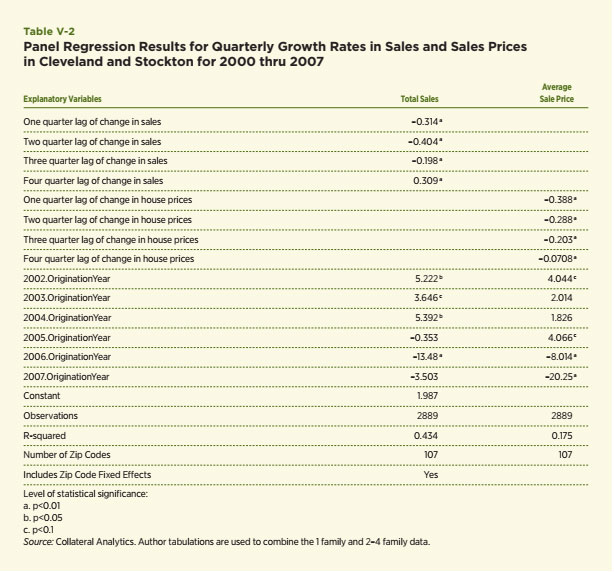
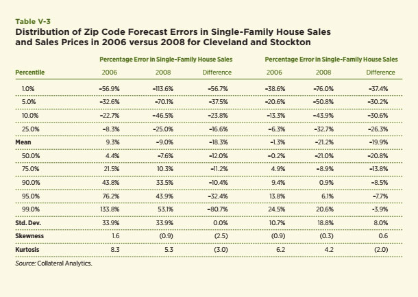
Turning to the results for the growth in house prices, the errors for 2006 are quite small on average. 12 percent. However, even within the sample period the models contain substantial prediction errors. The errors for the 10th and 90th percentiles are –13.3 and 9.4 percent, respectively. The predictions show an expected result — the model greatly overestimates house price growth for 2008, which underscores the limitations of models such as these during tumultuous times or as predictors of tumultuous declines (or booms). The mean and median errors are about –21 percent, which indicates that the model overestimated house price growth in 2008 by 21 percent, on average. The interquartile range is 42 percent, which is over three and one-half times larger than that for 2006. The errors in 2008 exceed –43.9 percent for 10 percent of the zip codes. The model actually underestimated house price growth by 10 percent, but these errors pale in comparison to the rest of the distribution.
Another attempt to capture the difficulty of predicting outliers is offered in Figure V-3. The graph plots the 2008 prediction errors for each zip code in both MSAs. They are clustered below zero, which simply means that this model underestimated the severity of the decline that occurred in 2008. What the graph also captures is the wide dispersion of the errors among zip codes. Many zip codes experienced declines more than 50 percent larger than the model predicted in both Cleveland and Stockton.
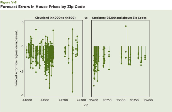
In sum, this section presents estimates of two types of models designed to capture within-city variations using three potentially valuable indicators of neighborhood condition — vacancy rates, house sales and house prices. The performances of the models leave much to be desired. Part of this is because of limited data to monitor the many facets of neighborhood change over time, which is the main problem in the time-series and cross-section models estimated for Cleveland and Stockton. However, the models are particularly weak in their predictions of extreme values and in capturing the extreme change of tumultuous events such as the ones that began to unfold in 2007 and 2008. Though more and better data may be on the horizon to help improve the predictions of neighborhood-oriented models such as these, my sense is that the best answer at this time to the question posed in this section is, no.
Though the Great Recession is still unfolding, the likelihood seems high that many neighborhoods within the metro areas hit hardest by the current crisis may or have already reached a tipping point that will threaten their long-term viability. This, I think, is a critical point that will likely be well understood by potential buyers searching for a home and lenders seeking to make home loans. Many potential buyers will have a tendency to avoid places that appear plagued by high foreclosures, vacancies and a deteriorating quality of the housing stock due to deferred maintenance, even if prices are relatively low. Lenders who are prudent about risk management will also be necessarily concerned about the potential of severe neighborhood decline. The flip side of this prediction is that potential buyers and lenders will favor those markets where information about the neighborhood’s future vitality is readily available. More simply put, uncertainty about the future directions of some neighborhoods and, especially, the potential of a severe negative decline seems both unusually high and justified given the difficulty of predicting these extreme outcomes. Indeed, such uncertainty is in itself a hindrance to a speedy and full recovery.
Government may be able to play a role in helping potential homebuyers and lenders make prudent decisions about neighborhood choice, but it surely will require some difficult decisions of its own in terms of where to target resources, which is a strong and consistent theme of the literature on helping declining cities recover. Mallach is a particularly strong advocate of such a view. On the other hand, as suggested by Anne C. Kubisch of the Urban Institute, government will also have to show short- term successes in order to breed confidence about the potential of long-term recovery. As such, the “evidence matters” theme espoused by HUD is a move in the right direction. Prudent people will want to see evidence to support the implementation of certain actions and evidence of their effectiveness after the policies are put in place. Two specific policy issues are discussed in the final part of this section to highlight these challenges. The first pertains to an aspect of appraisal guidance that calls for an assessment of the neighborhood in which the property is located and in particular, whether the market is in decline. The second is the ambitious neighborhood stabilization programs being supported by HUD. Though each of these policies can become very helpful tools, some suggestions are made that may help them move toward a more speedy recovery.
The Guidance for Lenders and Appraisers offered by Fannie Mae in April 2009 is an example of an appraisal guidance policy.38 This 26-page document includes guidelines and rules that lenders and appraisers who sell mortgages to Fannie Mae must follow in the appraisal of the properties underlying the mortgages. Most of it is relatively consistent with previous policies. Six pages are devoted to a “Neighborhood Section,” designed to enable appraisers not only to identify the factors that influence the value of properties in the market area, but also to define the area from which to select the market data needed to perform a sales comparison analysis. Fannie Mae’s appraisal report forms and guidelines do not require rating or judging the neighborhood. However, appraisal reports must provide objective neighborhood analysis by identifying neighborhood boundaries, neighborhood characteristics and factors that affect the value and marketability of properties in the neighborhood. My sense is that portions of the appraisal guidance will benefit from much more research and data in those areas in the midst of substantial decline. Recall, for example, that regular sales as a fraction of total sales inclusive of REOs and foreclosures sales comprised almost 20 percent of total sales in many neighborhoods in Stockton in the past few years. This is an unprecedented situation and the old rules will need to be greatly upgraded to meet the purpose of the guidelines.
One particular dimension of the guidance is entitled “Declining Markets,” and is an example of where much more data, clarity and experience are needed to evaluate with more confidence and precision what this term seeks to capture. The discussion begins with an acknowledgement that a widely held industry definition of this term does not exist, but appears to settle on what I find to be a confusing and incomplete definition: “In general terms, a ’declining market’ is one in which home prices are currently declining.” House prices may have declined and may be expected to decline in the future, but “currently declining” does not seem to fit either category very clearly. Also, focusing primarily upon only the most recent trends in house prices seems to omit the possibility that such declines may represent a perfectly appropriate market move to a lower and more stable level of house prices. Instead, I would like to see more emphasis upon specific and empirically tested models and processes that focus on future house price movements and, more generally, offer criteria and resources to help better define declining neighborhoods, especially those thought to be most at risk. For example, an article by Follain and Follain in 2007 — “Are We There Yet?” — offers insights about the future path of house prices in selected zip codes by examining rent-to-value ratios of condo housing in neighborhoods located in Miami, Florida. Work along these lines could be replicated for more places; perhaps a database of rents in selected markets might be developed to aid the appraisers.
The guidance does encourage the use of certain market indicators, which include indexes of house prices at the metropolitan level such as the Case-Shiller index, the FHFA price indexes and the National Association of Realtors (NAR)’s median sales prices. While these are surely plausible and state-of-the-art measures of past house price movements at the metropolitan level during normal times, their reliability is surely affected in areas with large numbers of distressed sales. Also, substantial movements of these indexes within the metropolitan area is to be expected during normal and, especially, distressed times for those cities hit hard by the crisis. Moving to more granular indexes at the zip code level seems both superior and attainable in many markets. Finally, the appraisers and lenders who decide that a neighborhood is on the verge of a substantial decline can expect to be challenged if the neighborhood contains substantial populations of minority households because of fair lending laws. Absent strong and compelling evidence, these agents will be susceptible to the claim of disparate impact under existing fair lending laws. This is an area in which the government may be of help by providing more data, guidelines for forecasts and evidentiary standards.
In sum, the current appraisal guidance reflects a reasonable business concern, but the details and resources available to lenders and appraisers to make such judgments seem highly incomplete. Without such improvements, I fear that lenders will find ways to avoid this problem by, perhaps, curtailing credit to entire metropolitan markets thought to be high risk by greatly tightening underwriting criteria and down payment requirements throughout the entire metro area. The second policy offered as an example of what is needed and where improvement seems possible is HUD’s Neighborhood Stabilization Program (NSP).39 The NSP provides grants to address the problems associated with homes that have been foreclosed upon and are creating economic problems for their communities. Specific rules were developed using Home Mortgage Disclosure Act (HMDA) data, the USPS Vacancy Survey and other sources to help in allocation of the $1.93 billion NSP2 program that was intended to fund state, local or non-profit grantees in the implementation of neighborhood stabilization programs to address the problems associated with homes that have been foreclosed. The scores were geared to provide more grants to neighborhoods in which relatively large numbers of high-cost (subprime) loans were originated to borrowers with relatively high mortgage-to-income ratios. This is another example of a well-motivated policy designed to reduce the risk of severe neighborhood decline, but also one that yearns for more and better data to guide the allocations and to assess their success or failure. The “evidence matters” theme is critical to the success of this program. In fact, HUD has developed a most interesting opportunity to do this. For example, one can go to HUD’s web site, search for grantees in an area, and find reports provided by the awardees.40 Though the information was illuminating regarding specific accomplishments such as the number of houses actually fixed or repaired, I saw little systematic information provided about the improvements to neighborhoods themselves. I hope that HUD is planning to provide such outcome performance measures in its reviews of this particular program.
More generally, and while acknowledging that the goals that I am espousing may be very difficult to accomplish, investments in the development and dissemination of better data for this purpose seem warranted. For example, the USPS Vacancy Survey is an example of a good investment. I would hope that HUD would continue to work with the USPS to improve the precision of the data. Also, the development of larger databases that merge the USPS data set with other neighborhood indicators seems a highly desirable development. This might include matching HMDA data or the Census-tract information soon to be released in the 2005–2009 American Community Survey and making such information publicly available. HUD has also taken some nice steps to disseminate information. One particular example is a page on its web site entitled “Visualizing Housing Information,” though even more granular geographic presentations of these and other housing and neighborhood data than seem attainable and desirable.41 A recent article by Renner and Wolf (2010) is another example of what have in mind. They combine USPS vacancy data with foreclosure data for Las Vegas to show visually the strong correlation of zip codes with rising vacancies and high foreclosure rates.42 More of this type of work would be helpful.
Lastly and to follow up on a suggestion regarding appraisal guidance, I would encourage the government to be more clear about the evidentiary standards for cases that involve potential neighborhoods’ specific leading criteria. This is a very difficult issue at all times. My fear is that lenders faced with uncertainty surrounding the potential of tipping points may simply back away from larger metro areas or severely tighten underwriting criteria in declining cities. There is a story that I have heard from various sources to highlight what I have in mind. Until the mid–1990s, the GSEs were effectively able to alter their lending to certain metropolitan areas in which housing price declines were underway. They only did this indirectly and with the assistance of mortgage insurers. The GSEs were required to have mortgage insurance on all loans with loan-to-value ratios in excess of 80 percent; hence, if the mortgage insurance (MI) companies decided to withdraw from a market deemed to be in distress, the GSEs were not required to make loans with loan-to-value ratios in excess of 80 percent. My concern is that some large lenders may be tempted to do the same in order to avoid the risk of lending in areas with substantial chances of serious decline. Rather than go to this undesirable extreme, perhaps government can help clarify and articulate conditions and evidence that lenders can use to make the tough decisions about their lending patterns among neighborhoods within declining cities. This will be difficult, but it may help speed recovery.
This section addresses whether credible models are available to explain and predict widely varying neighborhood outcomes. Particular attention is focused on the ability of these models to capture the most extreme outcomes, one of which includes the possibility of neighborhoods becoming no longer viable. The evidence offered in this section is not very encouraging. One of the models developed seeks to explain cross-sectional variations in the 2000 residential vacancy rate for the 6,500 Census tracts within the 29 counties focused upon in this study. Even with the inclusion of a large number of reasonable drivers of the vacancy rate, the model generates large prediction errors of Census-tract vacancy rates within the sample for many zip codes. The errors are particularly stark for those Census tracts with relatively large vacancy rates; that is, the model does a relatively poor job of estimating the vacancy rates for those neighborhoods with outlier or extremely high vacancy rates. A similar conclusion is obtained using a model of a different set of neighborhood indicators with both time-series and cross-section data for Cleveland and Stockton. Evaluation of the model predictions for 2006 and 2008 uncover substantial limitations. As one might expect, they underestimate the depth of the decline that occurred in 2008, but the point of particular interest in this section is the ability of the model to capture extreme outcomes. Here the performances of the models seem particularly weak and several aspects of the predictions are cited to make this point. Statistical models of this type can generally be tweaked to generate reasonable predictions within sample observations during stable times and with a substantial list of solid explanatory variables. Nonetheless, the analysis presented is quite consistent with the view that models of this type are particularly weak as predictors of extreme outcomes. This is especially true during times of great turmoil and decline. Surely better and more data will help and are needed, but households, lenders and government leaders are wise to recognize that predicting real estate outcomes at a granular level during periods of substantial decline is a challenging assignment. The section concludes with a discussion of two particular policies that might be improved to help home buyers, lenders and governments deal with this uncertainty. One pertains to appraisal guidance regarding declining neighborhoods. The other is the large NSP led by HUD. Both are examples of well-motivated policies designed to reduce the risk of severe neighborhood decline and assist in the identification of neighborhoods facing such prospects. I offer suggestions to help improve them.
Three main conclusions stem from the empirical analyses and the review of the literature on real estate markets in declining cities and in particular, traditional declining cities.
An important question in today’s difficult environment is whether the experiences of traditional declining cities offer any substantial insight about how to combat the current housing and mortgage crisis and speed the path to recovery for other markets. The answer to this question depends ultimately upon whether the substantial negative shocks to housing markets experienced in the past few years, especially in the places hardest hit by the crisis, is likely to be as persistent as the employment and population declines that hit places like Cleveland, Detroit, Buffalo and Pittsburgh during portions of the 20th century.
My sense is that the decline in demand is likely to be substantial and persistent in some areas because several factors will keep housing demand well below the levels reached prior to the bubble bust.
Regardless of whether the average level of house prices among metro areas hit particularly hard by the current crisis ultimately conform to the traditional city experiences or recover more quickly than I anticipate, the analyses in this paper do suggest there will be and already have been major and substantial threats to the viability of certain neighborhoods. Though the Great Recession is still unfolding, the likelihood seems high that many neighborhoods within the metro areas hit hardest may reach a tipping point that will threaten their long-term viability. This, I think, is a critical point that will likely be well understood by potential buyers searching for a home and lenders seeking to make home loans. They will have a tendency to avoid places that appear plagued by high foreclosures, vacancies and a deteriorating quality of housing stock due to deferred maintenance. The flip side of this prediction is that potential buyers and lenders will favor those markets where upbeat information about the neighborhood’s future vitality is readily available. More simply put, neighborhood choice is likely to become a relatively more important component of housing decisions by prudent buyers and lenders.
Government may be able to play a role in helping potential homebuyers and lenders make wise decisions about neighborhood choice, but it surely will require some difficult decisions of its own in terms of where to target its resources, which is a strong and consistent theme of the literature on helping declining cities recover. Mallach is a particularly strong advocate of such a view. On the other hand and as suggested by Anne C. Kubisch of the Urban Institute, government will also have to show short-term successes in order to breed confidence about the potential of long-term recovery. As such, the “evidence matters” theme espoused by HUD is a move in the right direction. Practical people will want to see evidence to support the implementation of certain actions and evidence of their effectiveness after the policies are put in place. I also offer a discussion of two policies — appraisal guidance for declining neighborhoods and HUD’s NSP — that have the potential to help homebuyers, lenders and governments make better decisions about neighborhood choice.
Lastly, the fundamental problem facing today’s new breed of declining cities and their neighborhoods seems very similar to a problem in many parts of government seeking to manage our economic recovery. That is, investment and lending are seriously hampered by great uncertainty, which in itself hinders the speed of recovery to the “new normal.” Better data and analysis will help everyone become more confident of where we are headed. Data that assess these programs should be made more available to a wide range of institutions committed to objective analyses of the programs. Absent such information, I fear the recovery will be longer and the number of failed neighborhoods greater than they might otherwise be.
1. The generic definition of a city or metro area is an area with relatively large population density relative to rural areas. Government statistics include a variety of definitions of an urban area and income unincorporated areas. The MSA also features a “central city,” which is the largest city within the MSA. I try to limit the jargon by using city and metro area almost interchangeably. In cases where the distinction is important to understand the data, more precise language is used.
2. “Can Buffalo Ever Come Back?” can be accessed at: www.city-journal.org/html/17_4_buffalo_ny.html
3. This can be found at: http://metrostudies.berkeley.edu/pubs/proceedings/Shrinking/11Pallagst_PA_final.pdf
4. See the presentation by Kubisch at: www.brookings.edu/reports/2007/08neworleansindex.aspx
5. www.rockinst.org/pdf/disaster_recovery/gulfgov/gulfgov_reports/2009-06-02-Whos_in_Charge.PDF
6. http://portal.hud.gov/portal/page/portal/HUD/press/testimonies/2010/2010-08-26
7. www.huduser.org/portal/datasets/ahs/ahsdata09_metro_intro.html
8. www.mortgagebankers.org/files/News/InternalResource/38647_HurricaneKatrinaDamageStudy.pdf
9. Krugman (2009) offers an update of his Nobel Prize talk in the June 2009 American Economics Review. Here is another and simpler presentation of some of his ideas: http://nobelprize.org/nobel_prizes/economics/ laureates/2008/illpres.html#krugman.
10. Here is a link to a short article about the pattern and 20 cities retirees like as retirement homes: http://money.usnews.com/money/blogs/planning-to-retire/2009/04/01/the-20-cities-where-the-most-baby-boomers-will-retire.html.
11. www.nabe.com/rt/real/events.html
12. See the recent presentation by Celia Chen of Economy.com at: www.nabe.com/rt/real/events.html
13. These are obtained by adjusting 2008 Median Sales Prices by the FHFA house price indexes for each
metro area.
14. Widely cited papers in this literature include the work of Kain and Apgar (1979), Muth(1960), Follain (1979),
Blackley (1998), Blackley and Follain (1991), Harter-Dreiman (2004) and Malpezzi (1996) and (1999).
15. FHFA House Price Indexes for all transactions can be obtained at: www.fhfa.gov/Default.aspx?Page=87.
16. Woods and Poole data were obtained at: www.woodsandpoole.com/main.php?cat=country.
17. New Orleans is excluded from this regression because its population decline in 2005 was an extreme and environmentally generated event.
18. The time periods available for each MSA vary because the FHFA indexes begin at different times. Data from the mid-1990s to compute three-year price changes are available for over 300 metro areas. Data are available for 146 of these metro areas since 1983.
19. Robert Shiller (2006) and Case and Shiller (2004) have long-championed this concept in the housing market.
20. The early days of the field of urban economics focused on the issue of suburbanization and the literature was led by Richard Muth (1960) and John Kain (1979). Follain and Malpezzi (1981) highlight the issues at stake in the debate at that time. Ongoing reports and measures of urban “hardship” indexes are provided by the Rockefeller Institute: see David J. Wright (2009).
21. Geolytics software system was used to generate the data (www.geolytics.com).
22. San Joaquin County is the only county in the Stockton MSA, which is the metro definition or unit used in this paper.
23. The mapping is also done with Geolytics software.
24. Here is a link to a quick guide with some graphs: www.itl.nist.gov/div898/handbook/eda/section3/eda35b.htm.
25. It also generates what at first seems like an implausible measure of a vacancy rate in excess of 100 percent. This can happen if the duration of the vacant units exceed one year, which is quite a common occurrence in the survey. Consider the simple case of a Census tract with one unit that has been vacant for two years; the duration-adjusted measure offered in this section would be 200 percent.
26. 2008:Q2 is the first survey that fully incorporates a three-year potential vacancy rate.
27. I had a very interesting opportunity to participate in this industry and learn much about it during my time with Fidelity Hansen Quality and in a series of writing assignments I completed with my wife, Barbara, for http://qa-ext.cyberhomes.com/content/contributors/follains.aspx.
28. I am most grateful to Michael Sklarz, President of Collateral Analytics, for providing the data for this study. I am also quite familiar with the AVM models underlying these data since I worked closely with Mike Sklarz and his team during our time together with Fidelity Hansen several years ago.
29. One adjustment is made to address a common problem in data such as these — few observations in particular zip codes for some time periods. The adjustment involves the creation of two separate series that combine single-family and multifamily properties as well as the three types of sales. Though the particular aggregation is based upon some judgments and experimentation, the patterns that emerge seem both plausible and consistent with certain types of sensitivity analysis conducted in zip codes with large amounts of single-family sales. The empirical evidence offered in this section highlight patterns at the metropolitan level since both places have been hard-hit by the current crisis. In addition and as done in the previous portions of this section, evidence is offered to highlight the intra-metropolitan patterns that have emerged during the remainder of the decade.
30. Barbara Follain and I discuss this issue and relevant literature in “Home Equity Risks Revealed” www.cyberhomes.com/newsDetail.cfm/380/2010-08-05/Home-equity-risks-revealed. We also conduct a case study of a particularly wealthy community also hit hard by the current housing crisis, Greenwich, CT.
31. Greenspan and Kennedy (2007).
32. See: www.huduser.org/portal/evidence.html
33. See Follain (2010).
34. George Galster offered numerous insights to me during the process of writing this paper and provided me with several specific examples of his work that fit the themes of this paper. He has written much more. Indeed, many other examples of his work on the topic for cities inside the U.S. and in other countries can be found at his web site: www.clas.wayne.edu/faculty/galster
35. www.ufanet.com/Dennis_Capozza.htm I am grateful to Dennis for sharing the information with me for this paper.
36. The Collateral Analytics data distinguish between single and multifamily properties; however, the multifamily properties are typically two- to four-unit properties. Since single-family is generally defined to include properties with one- to four-units, I included both types in the definition of the dependent variables, which makes the dependent variable more consistent with the standard definition of single family as a structure with one- to four-units. Using a variable that combines both also provides more data for particular zip codes that had substantial numbers of two- to four-unit sales but few one-unit sales. In order to do this, some assumptions had to be made about the typical mix of units within a two- to four-unit property since the data available for this exercise did not provide the exact number of units in multifamily properties.
37. The model was estimated using Stata’s xtreg procedure.
38. The document can be seen at: https://www.efanniemae.com/single-family/guides/ssg/relatedsellinginfo/appcode/pdf/appraisalguidance.pdf
39. See this web site for information about the program: www.huduser.org/nspgis/nsp.html
40. http://hudnsphelp.info/index.cfm?do=viewGranteeAreaResults
41. www.huduser.org/portal/periodicals/ResearchWorks/RW_oct_10_1.html#4
42. www.huduser.org/portal/periodicals/cityscpe/vol12num1/ch6.pdf
Principal of James R. Follain LLC is also a member of the Advisory Board of FI Consulting (www.ficonsulting.com) and a Senior Fellow at the Rockefeller Institute of Government (www.rockinst.org).
Dr. James R. Follain is the principal of James R. Follain LLC, which was established in 2006. Follain was recently appointed to be a Senior Fellow at the Nelson A. Rockefeller Institute for Government (www.rockinst.org). This new relationship offers an excellent opportunity to maintain a strong and policy-oriented research agenda with one of the premier public policy institutes in the country. Dr. Follain is also an advisor to FI Consulting (www. ficonsulting.com), which is headed by his son, Thomas Follain and Roman Iwachiw, who was a student of Dr.Follain’s at Syracuse University. Barbara Follain works alongside her husband as a part-time employee of the LLC. Prior to the establishment of the LLC and move to the Capital Region of New York in 2005, Dr. Follain had a number of rich experiences as an academic and with various business, government and policy-oriented organizations. He served as a professor of economics at Syracuse University from 1988–98 and was department chair from 1988–93. He also served as a professor of finance at the University of Illinois at Urbana-Champaign and director of its Office of Real Estate Research from 1984–88. More recently, he served as a Professor of Economics at Siena College (2007–08) and as an adjunct professor of finance at the University of Albany. He held senior positions with Freddie Mac, the Board of Governors of the Federal Reserve and Fidelity Hansen Quality between 1998 and 2006. Early in his career, he held positions with the Urban Institute and the Federal Home Loan Bank of San Francisco. He served as president of the American Real Estate and Urban Economics Association in 1989.
Dr. Follain’s career has long maintained a focus upon the analysis of housing and mortgage markets. More recently, his work has dealt with the measurement and management of risk associated with lending and investing in the mortgage and housing markets and public policies in the area. One example is an article published in a 2005 Mortgage Banking magazine with Mike Sklarz entitled “Pricing Market Specific Bubbles.” He is widely published in the leading academic journals in the field, which include Real Estate Economics, the Journal of Real Estate Finance and Economics, the Journal of Urban Economics, the Review of Economics and Statistics, the Journal of Housing Economics, Regional Science and Urban Economics and the National Tax Journal. He testified to Congress in 2005 regarding the competitive impacts of the proposed Basel II. His recent c.v. is available at: www.rockinst.org/about_us/staff/researchers/follain_j.aspx and references to many of his publications can be obtained at: http://Scholar.Google.com. Dr. Follain received his B.A. in Economics from the University of San Francisco in 1971 and his Ph.D. from the University of California at Davis in 1976.