
November 2007
Nelson A. Rockefeller Institute of Government — Urban & Metropolitan Studies
Our prior report in this series, An Update on Urban Hardship (2004), examined the largest cities within the most populated metropolitan areas in the nation, and compared them to themselves and one another over a thirty-year period, from 1970 to 2000. The crux of the analysis is the Intercity Hardship Index, a composite that permits comparison between metro areas over time, based on unemployment rates, the proportion of nonworking-age residents, educational attainment, income per person, poverty levels, and the extent of crowded housing.
In contrast with conventional images of widespread urban decay, that study found that social and economic conditions improved in relative terms from 1970 to 2000 among nearly three-quarters of the central cities in the most-populated metropolitan areas in the US. High or very high levels of relative hardship in 2000 were not common — found in 15 percent of these cities. And only about one in five had worsening conditions of hardship from 1970 to 2000. Cities with relatively higher degrees of social and economic hardship were found more frequently in the Northeast and Midwest than in the South and the West. But at the same time, Southern and especially Western cities increasingly reflect hardship conditions that older cities in the Northeast and Midwest have already experienced. Cities able to expand their borders to capture growth on their suburban peripheries have lower levels of social and economic hardship than places where larger shares of the metro-area population live outside the city’s boundaries. Conversely, higher levels of racial segregation and older housing stock relate strongly with higher levels of social and economic hardship.
This new study reports that similar improvement is also evident on a measure of poverty concentration called Poverty Impaction — the share of poor residents in a metro area who live within areas of extreme poverty, defined as census tracts where 40 percent or more of the residents have incomes below the poverty level. Poverty impaction declined between 1990 and 2000 in more than three-quarters of the places studied, and declined significantly in over two-thirds of them. But the longer-term trend is less favorable. Levels of concentrated poverty increased strongly from 1970 to 2000 for nearly half of the areas studied, about twice the share where poverty concentration decreased significantly. Although increasing concentration of poverty was found to be typical among cities in the Northeast and Midwest, decreases were common in the South, with an almost even split between increasing and decreasing impaction of poverty evident among areas in the West. We have seen that conditions in central cities show improvement compared to one another and to themselves over time. However, social and economic conditions in suburban areas improved even more markedly. Social and economic conditions of hardship are not common among the most-populated metropolitan areas in the US. Like the central cities, about half the metropolitan areas had low or very low levels of hardship in 2000. Slightly more than ten percent of the metropolitan areas have high or very high levels of hardship, compared to over 15 percent of the central cities.
The pattern of regional variation in levels of hardship among the metropolitan areas is quite different from what we reported among the central cities. The South had the largest share of cities with low hardship and smallest share of places with high hardship. By contrast, the South has comparatively high levels of Metropolitan Hardship relative to other regions. The opposite is true in the Northeast, where cities are most likely to have high or very high levels of Intercity Hardship compared with those in other regions, but where metropolitan areas are less likely than those in other regions to have very high levels of Metropolitan Hardship. In most — 53.5 percent — of the metropolitan areas, hardship conditions improved or improved strongly over the 1990s. More than seven in ten of these places have stable or improving Metropolitan Hardship from 1990 to 2000. That pattern of improvement was slightly stronger among central cities, with a higher share — 61.6 percent — of the cities classified as improving or strongly improving, and 80 percent stable or improving during the 1990s.
From 1990 to 2000, almost nine in ten study areas in the Midwest and six in ten in the South had improving or strongly improving Metropolitan Hardship. On the other hand, over six in ten areas in the Northeast and half of those in the West had increasing or strongly increasing levels of Metropolitan Hardship. None of the study areas in the Northeast have strongly improving Metropolitan Hardship but over 60 percent have declining or strongly declining metropolitan conditions. This is a much more negative trend than we reported with respect to Intercity Hardship for the Northeast, with 28.6 percent of the cities having increasing or strongly increasing Intercity Hardship over the 1990s. The report finds a close relationship between change in Metropolitan Hardship and Intercity Hardship levels. Areas with strongly improving levels of Metropolitan Hardship during the 1990s were comprised entirely of places with central cities experiencing improving or strongly improving levels of Intercity Hardship.
The trend during the 1990s in Urban/Suburban Disparity — the degree of difference in Hardship Index conditions between the most-populated central city and the balance of the metro area — is split. Roughly half of the metro areas have growing differences during the 1990s in hardship levels between the central city and the surrounding areas. And, in about half of the metro areas in the study, social and economic conditions in the central city and suburbs grew more alike over that decade. For cities in the Northeast and Midwest, limited educational attainment, poverty, and crowded housing drove increasing disparities between central cities and their surrounding metropolitan areas. Places with most notable improvement in Urban/Suburban Disparity levels over the 1990s tended to be from the West, with improvement fed by changes in the share of population considered dependent (those under 18 or over 64), educational attainment, and employment. The longer-term trend in disparity between cities and their surrounding metropolitan areas is more downbeat. Urban/Suburban Disparity scores worsened significantly from 1970 to 2000 for more than eight in ten areas studied. More than a quarter declined in rank on this disparity score, illustrating their decline relative to one another in terms of falling further behind their own suburbs. Several points of intersection are found between these four perspectives on hardship.
Areas with greater disparity in social and economic conditions between their central cities and surrounding metropolitan areas saw less improvement in Intercity Hardship. And, like Intercity Hardship, we find Poverty Impaction and Urban/Suburban Disparity are significantly and negatively related to border elasticity and population concentration. Cities able to expand their borders to capture growth on their suburban peripheries have less concentrated poverty and less disparity in social and economic conditions between their central cities and surrounding suburbs than places with larger shares of metro-area population living outside the city’s boundaries. Much in the same vein as established for Intercity Hardship, we find Poverty Impaction and Urban/Suburban Disparity to relate strongly with racial segregation and age of housing stock. Places with higher levels of racial segregation in housing and higher shares of older housing stock have strong tendencies toward higher levels of concentrated poverty, and toward having larger levels of disparity in social and economic conditions between central cities and their surrounding metropolitan areas. A primary challenge to cities is their ability to keep up with their suburbs. Although central cities show improvement compared to one another and to themselves over time, there is even more marked improvement in social and economic conditions outside of central cities in metropolitan areas. The combination of sprawl and government fragmentation have contributed to the spiraling decline in the tax base of inner-cities and inner-ring suburbs, the inefficiency of layered general purpose governments, and environmental degradation from longer and longer commute times.
Challenges confronting cities and suburbs have been far easier to raise than to resolve. But a number of well-intended and well-designed initiatives have been advocated, and some successfully pursued. Although city-specific development efforts can be positive, regional and metropolitan-level approaches are essential. Stronger connections between cities and their surrounding suburban areas, as has been shown in this study, are clearly linked to better social and economic conditions at city and metropolitan levels over time.
Yet, despite the examples of regionalism’s successes, the powerful force of localism persists. Proposals to consolidate city and county governments have been rejected far more often than accepted by voters. Land-locked older cities with established, separately incorporated areas as their immediate neighbors are hard-pressed to do much about making their borders more flexible. If annexation and consolidation are beyond the reach of some, however, other opportunities for regionalism are to be had. Cross-governmental agreements for shared services and tax-pooling — benefit- and burden-sharing — are among the most promising.
Cities and suburbs are hard-pressed to put together regionalism initiatives on their own, however. While the interest may begin at the local level, municipalities and counties are themselves the offspring of state governments, and a host of policies at the state level wield influence, directly and indirectly, on the need for regional efforts and the likelihood of their success. More research is needed on the character and comparative merit of state policies toward urban and metro areas.
American cities, when portrayed at all, tend to be depicted in popular media as places rife with decay and danger, to be set off from the rest of the nation by moats — or perhaps the modern equivalent, Interstates and Beltways. But the United States is an increasingly metropolitan nation. More than four in five Americans live in metro areas, with central cities at their core. And whatever the perceived distances, the history and future of city, suburb — indeed country — is bound up together.
Federal urban and community development programs do not have a happy history. Pre-1960 US urban policy sought “improvement” through blight clearance and redevelopment, but it came to be recognized more for the effect of destroying neighborhoods, eliminating small businesses and displacing residents. Post-1960 urban programs show marked evolution: from categorical to more flexible, formula-based block grants; from displacement to resident participation and leadership; from fragmentation to the creation of separate administrative structures outside the traditional government bureaucracy; and from piecemeal approaches to comprehensive initiatives. But one thing that is shared by such efforts — Community Action, Model Cities, Urban Development Action Grants, Community Development Block Grants, and Empowerment Zones — is their performance falling well short of needs and expectations.
The state role in urban and particularly metropolitan policy is emerging, considerable, and not yet well understood. Plainly more research is needed on the character and comparative merit of state policies toward urban and metro areas. Researchers at the Rockefeller Institute have initiated a study gauging state policies with bearing on cities, metropolitan areas, and regionalism initiatives encompassing such matters as governmental foundation; sources of revenue, financial management and oversight; regionalism incentives on shared services support for pooling of revenues; land use planning; transportation and environmental regulation; and direct expenditures for programs of particular interest to metro areas.
Properly appraising the condition and outlook of America’s metro areas requires perspective one needs a long and a comparative view. In our Update on Urban Hardship, we examined the largest cities within the most populated metropolitan areas in the nation, and compared them to themselves and one another over a thirty-year period, from 1970 to 2000.1 Key to the analysis was the Intercity Hardship Index, which draws together six key factors into a composite index permitting comparison between metro areas over time. The factors include:
Unemployment, defined as the percent of the civilian population over the age of 16 who were unemployed;
Dependency, the percentage of the population that are under the age of 18 or over the age of 64;
In contrast with conventional images of widespread urban decay, we observed that in relative terms, social and economic conditions improved from 1970 to 2000 among nearly three-quarters of the central cities in the most-populated metropolitan areas in the US. A high or very high level of relative hardship in 2000 was not common — found in 15 percent of these cities. Only about one in five had worsening conditions of socioeconomic hardship from 1970 to 2000. Cities with relatively higher degrees of social and economic hardship were more common in the Northeast and Midwest than in the South and the West. But at the same time, Southern and especially Western cities increasingly reflected hardship conditions that older cities in the Northeast and Midwest already experienced.
We also found that cities able to expand their borders to capture growth on their suburban peripheries have lower levels of social and economic hardship than places where larger shares of metro-area population live outside the city’s boundaries. And, we saw that higher levels of residential segregation by race and higher shares of older housing stock were related strongly with higher levels of social and economic hardship.
Here, we offer three additional perspectives on urban hardship. The first view focuses on concentrated poverty — what we term poverty impaction. This is defined in terms of the percentage of poor people who live within census tracts where 40 percent or more of the population have household incomes below the poverty level.3 The second perspective employs a wider view, measuring change in metropolitan hardship through an index of social and economic indicators for the most-populated metropolitan areas in the US. The third view involves a comparison of the degree of disparity in social and economic conditions between central cities and their surrounding metropolitan areas. This Urban/Suburban Disparity Index involves the contrast between conditions in the single most-populated city in each metropolitan statistical area, taken as urban, compared with the remainder of each metro statistical area, used to define suburban areas. The discussion extends from our report on urban socioeconomic conditions between 1970 through 2000, which updated the Intercity Hardship Index advanced by Nathan and Adams.
Poverty impaction generally increased from 1970-1980 among the central cities studied by Nathan and Adams. An overall population decline in the central cities was accompanied by an increase in the number of people living below the poverty level, with an even larger increase in the number of people living in concentrated poverty areas. Nathan and Adams found poverty impaction rates in 1980 were highest in cities in the Northeast and Midwest, and they found a positive statistical correlation in both 1970 and 1980 between high poverty impaction rates and high levels of socioeconomic distress, as measured by the Intercity Hardship Index.
The degree of disparity in socioeconomic hardship levels between cities and their surrounding suburbs also generally increased from 1970-1980 among the central cities studied by Nathan and Adams. A relatively small handful of cities had better socioeconomic conditions than did their suburbs, Nathan and Adams found, and those that did grew appreciably smaller in number over the 1970s. Disparity in hardship levels between central cities and suburbs was especially pronounced in the Northeast and North Central regions, and was found to have a strong positive statistical correlation with high levels of socioeconomic distress for both cities and suburbs.
This paper expands on these earlier findings in several ways. First, the comparative analysis is updated with data drawn from the Decennial Census of Population and Housing for 2000 and 1990. Second, the analysis covers a more extensive array of 86 areas — the largest cities in the most populated metropolitan areas in the United States. Third, for those places in the early study, the paper provides a thirty-year trend analysis on concentrated poverty, socioeconomic hardship, and disparity in conditions between cities and suburban areas in the most-populated metropolitan areas in the US.
The report is divided in ten parts. Section I outlines poverty impaction as of 2000. Section II looks at changes in poverty impaction from 1990 to 2000. Section III takes a longer view, and examines changes in poverty impaction from 1970 to 2000. Section IV broadens the discussion to cover metropolitan hardship in 2000, and Section V follows with a look at change in metropolitan hardship over the 1990s. The report then turns attention to Urban/Suburban Disparity and a look in Section VI at differences between socioeconomic conditions in cities and their surrounding suburbs in 2000. Section VII explores the trend in Urban/Suburban Disparity levels over the decade of the 1990s, and Section VIII follows with an appraisal of longer trends from 1970 through 2000. Section IX considers relationships between concentrated poverty, city/suburb socioeconomic disparity, and several other factors, including elasticity of city boundaries, population dispersion, racial segregation, age of housing stock, and rates of reported crime. The paper concludes in Section X with a final word on this research.
The spatial concentration of poverty has been a subject of considerable interest since the early 1980s. Associated with such concepts as “ghetto poverty” and, more controversially, “the urban underclass,” the concentration of poverty and the relative absence of better-off residents in high-poverty communities have been linked to social isolation of these areas, and persistent, intergenerational perpetuation of poverty and associated social pathologies.
Extreme poverty areas are defined by the U.S. Census Bureau as census tracts in which at least 40 percent of the resident population lives below the poverty level. Here, we define poverty impaction rates in terms of the share of poor people within a city or metropolitan area living in these extreme poverty areas.
The 86 cities in our study are the largest cities within the most populated metropolitan areas in the nation. We included every metropolitan area with populations greater than 480,000 in 1990, and those central cities that comprised more than 11 percent and less than 89 percent of their total metropolitan area’s population.
The view of concentrated poverty in large metropolitan areas for 2000 is mixed. The good news is that half of the 86 cities in our study have low or very low levels of poverty impaction (Figure 1). The bad news is that over one-fifth of the cities have high or very high poverty impaction rates.
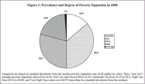
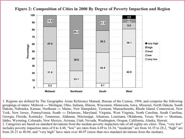
Figure 2 illustrates how poverty impaction among the study cities varies according to region.
About one-fifth of the cities in our study (18 out of 86) had high levels of poverty impaction in 2000. One of those cities, Fresno, had a very high level of poverty impaction. Table 1 lists these cities with their corresponding poverty impaction rate.
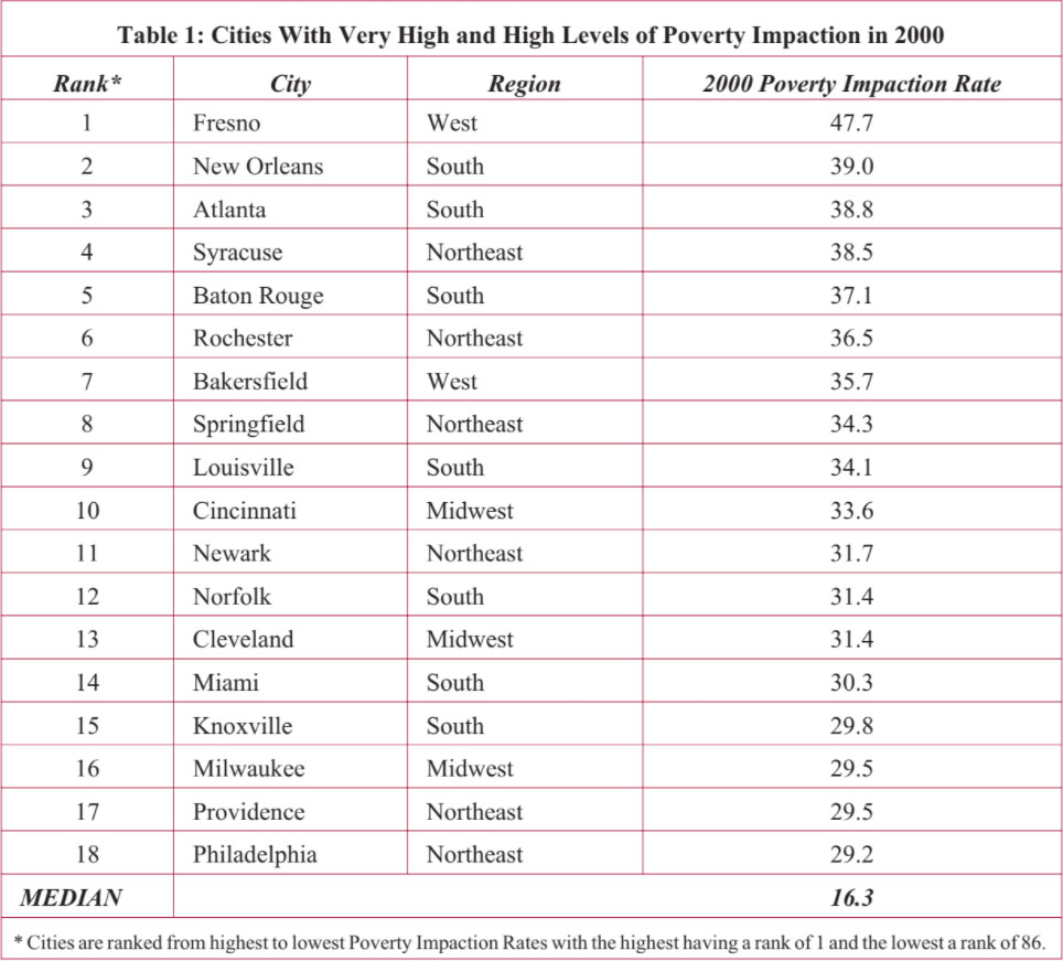
Fresno is the only city in our study to have a “very high” level of poverty impaction in 2000 (pegged at two standard deviations above the median). With nearly half of all its poor residents living in high-poverty areas, Fresno’s concentration of poverty is high indeed. As discussed in the first report of this series, Fresno has had to deal with a high level of urban hardship mainly affected by population dependency — an exceptionally high proportion of youngsters relative to working adults — and rising unemployment.
Many of the cities with high levels of poverty impaction are not among the usual suspects listed when discussing cities in distress, which often tend to be larger, older cities. Most of the cities in Table 1 are at the smaller end of the spectrum in terms of population size. Eight of the eighteen cities have 2000 populations under 250,000 — Syracuse, Springfield, Providence, Knoxville, Rochester, Baton Rouge, Norfolk and Bakersfield — and another eight cities have 2000 populations under 500,000. Only Milwaukee and Philadelphia are at the larger end of the spectrum in terms of population size with 2000 populations of 596,956 and 1,517,550, respectively.
Urban centers in the South and the Northeast dominate the list of cities with highest concentrations of poverty. Seven of the eighteen cities with high poverty impaction rates are from the South (New Orleans, Atlanta, Baton Rouge, Louisville, Norfolk, Miami, and Knoxville), and six are from the Northeast (Syracuse, Rochester, Springfield, Newark, Providence, and Philadelphia). Only four of the fifty states have more than one city among this list of those with highest levels of concentrated poverty. These include California in the West, Louisiana in the South, New York in the Northeast, and Ohio in the Midwest.
Thirty percent of the cities in our study had moderate levels of poverty impaction in 2000 and are listed in Table 2. Ten of these twenty-five cities, or 40 percent of all cities with moderate poverty impaction, are located in the South (Fort Lauderdale, Birmingham, Newport News, Orlando, Memphis, Washington, Baltimore, Richmond, Tampa, and El Paso). Nine cities, or 36 percent of all cities with moderate poverty impaction, are in the Midwest (St. Louis, Minneapolis, Chicago, Columbus, Dayton, Detroit, Akron, Youngstown, and Gary).
Only five of the states have more than one city among this list of places with moderate levels of concentrated poverty. Ohio has the most, with four: Columbus, Dayton, Akron, and Youngstown. Florida is next, with three: Fort Lauderdale, Orlando, and Tampa. And California (Los Angeles, San Diego), New York (Buffalo and New York), and Virginia (Newport News, Richmond) each have two cities listed among those with moderate poverty impaction levels in 2000.

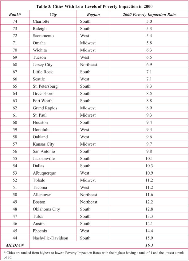
the cities with low poverty impaction are small, with populations under 500,000. All but two cities (Dallas and Houston) in Table 3 have population under one million.
Many of the cities with high and moderate poverty impaction as shown in Tables 1 and 2 are in the South. At the same time, however, the South is the most common region among cities with low poverty impaction: 45.2 percent of the cities with low levels of poverty impaction are from the South. The West also represents a large proportion — over one-quarter — of the cities with low levels of poverty impaction.
Seven states have more than one city listed. Texas has the most, at five, followed by North Carolina with three, and two each in Arizona, California, Florida, Oklahoma, and Washington.
Five of the cities categorized with very low levels of poverty impaction in Table 4 have no poverty impaction at all; thus, there are no census tracts in these cities where 40 percent or more of the population have household incomes below the poverty level. Seven of the twelve cities with very low poverty impaction have populations under 500,000. Only San Diego and Houston have populations over one million.
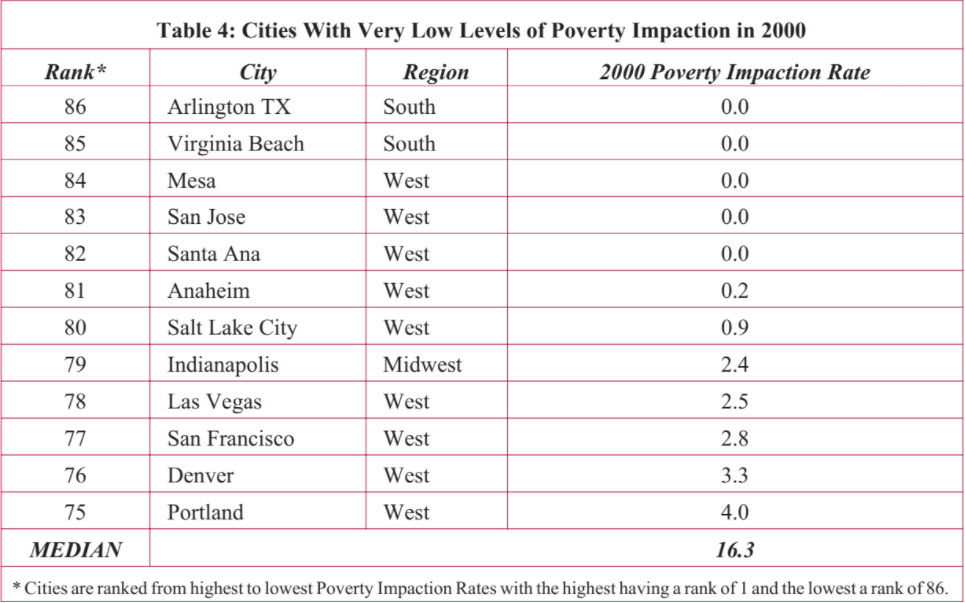
Three-quarters of the cities with very low levels of poverty impaction in 2000 are located in the West, one third from the state of California alone. This represents 43 percent of all Western cities in our study. Of the remaining cities with very low levels of poverty impaction, Arlington andVirginia Beach are located in the South and Indianapolis is the only Midwestern city. Noticeably absent are Northeastern cities.
Five of the cities with very high to high poverty impaction in 2000 also have very high to high Intercity Hardship in 2000. More than half of the cities presented above in Table 1 have moderate levels of Intercity Hardship. When we analyzed levels of poverty impaction with the six subcomponents of the Intercity Hardship Index, we found correlations between very high/high levels of poverty impaction and five of the economic subcomponents. Thus, cities in Table 1 were also more likely to have problems of lower education levels, higher unemployment, more dependents, lower income, and higher number of people living below poverty for the city as a whole (not just within the areas of extreme poverty). In fact, if we look at the percent of children — a component of the dependents variable — living below poverty in our 86 cities, we find that there is a statistically significant correlation between a high percent of children living in poverty and cities with a high level of poverty impaction.
Cities with moderate levels of poverty impaction in 2000 are not associated with a specific category of Intercity Hardship. Hartford is the only city in Table 2 with very high Intercity Hardship in 2000. Of the cities with moderate levels of poverty impaction, six had high levels of Intercity Hardship, 9 had moderate, 8 had low, and one (Columbus) had very low Intercity Hardship. As for subcomponents of the index: four of the cities with moderate poverty impaction had among the highest levels of limited educational achievement recorded for any of the cities in the study — Hartford, Los Angeles, Baltimore, and El Paso. Four of these cities — Hartford, Gary, Detroit, and Buffalo — had among the highest levels of unemployment of any city. Youngstown, Gary, El Paso and Detroit had high percentages of a dependent population (under the age of 18 or over the age of 64).
Twenty-one of the low poverty impaction cities (or 68 percent) in Table 3 also had very low or low Intercity Hardship and none had more than a moderate level of Intercity Hardship. Cities with low poverty impaction also tended to fare better than cities with higher poverty impaction in the areas of education, unemployment, and dependency. On average, low level poverty impaction cities had the highest per capita income — even higher than very low level poverty impaction cities. Most of the cities in Table 4 with very low poverty impaction in 2000 also had low Intercity Hardship Index scores. Interestingly, even though Santa Ana had no poverty impaction in 2000, it had the highest Intercity Hardship of all 86 cities in our study. Apart from Santa Ana, with a very high Intercity Hardship in 2000, and Anaheim with moderate Intercity Hardship, the cities with very low poverty impaction levels also had very low to low Intercity Hardship levels. Very low poverty impaction cities fare the best on the following Intercity Hardship indicators in 2000: unemployment, dependency, poverty, and, if Santa Ana is removed from the analysis, education. However, very low poverty impaction cities on average rated the highest in crowded housing.
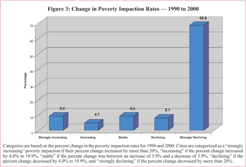
When we compare poverty impaction levels for each of the 86 largest metropolitan areas in 1990 and in 2000, we see that poverty impaction declined in more than seventy-five percent of the cities, and significantly declined in over two-thirds of the cities. Less than ten percent of the cities had a significant increase, as measured by the percent change in their poverty impaction rates over the 1990s.
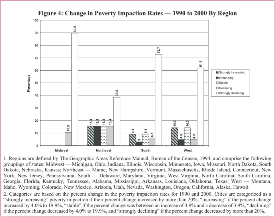
While major metropolitan areas in general experienced declines in poverty impaction from 1990 to 2000, certain regions of the country were more affected than others. Figure 4 shows the change in poverty impaction over the 1990s by region. Within the Northeast, over 30 percent of the cities had increasing poverty impaction with 15.4 percent of them having strongly increasing poverty impaction. In the West, 14.3 percent of the cities had strongly increasing poverty impaction. In contrast, there are no cities in the Midwest with increasing poverty impaction over the 1990s and only about 12 percent in the South increased.
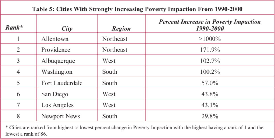
Only eight cities had strongly increasing poverty impaction from 1990 to 2000 (defined as a greater than 20 percent increase). As illustrated in Table 5, two are in the Northeast and three each are in the South and West regions.
The largest percent increases were in Allentown, Providence, Albuquerque, and Washington DC. While half of the cities in Table 5 have populations in 2000 under 200,000 (Allentown, Fort Lauderdale, Providence, and Newport News) other cities have quite large populations. Los Angeles is the second largest city in our study with a population over 3.5 million, San Diego has over 1.2 million, and Washington DC has over half a million residents.
All of the cities in Table 5 had very low to low poverty impaction levels in 1990. By 2000, however, only two — Allentown and Albuquerque — still have low levels of poverty impaction. Most have now moved into moderate levels of poverty impaction, and one — Providence — now has high levels of poverty impaction. However, all of the cities is Table 5 have 2000 poverty impaction rates of less than thirty.
Only four cities made it into the increasing poverty impaction category for 1990 to 2000. Two are in the Northeast, one is in the South, and one in the West. Even though Boston had an 11.2 percent increase in its poverty impaction rate, the city still has a relatively low level of poverty impaction. Orlando also remained in a moderate level of poverty impaction for 1990 and 2000 despite its 16.1 percent rate increase. Bakersfield and Rochester, however, moved from having moderate levels in 1990 to high levels in 2000.
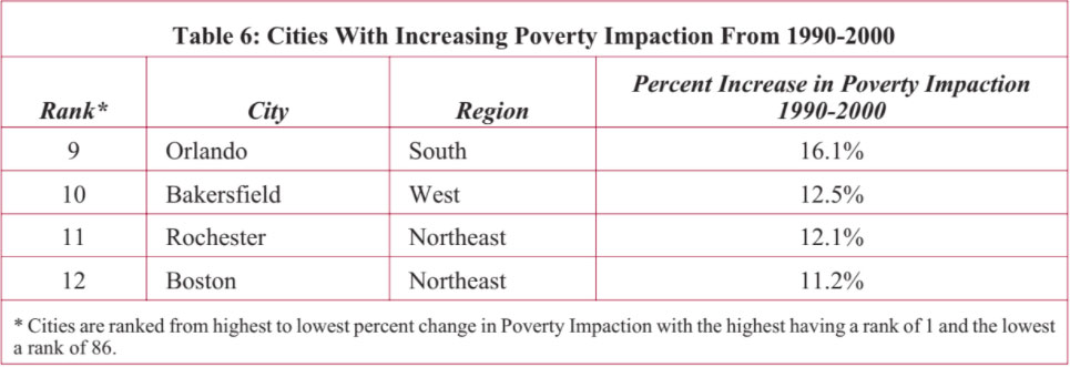
Table 7 presents the cities whose poverty impaction levels remained relatively stable throughout the 1990s. Three are in the South, three are in the West, and two are in the Northeast.
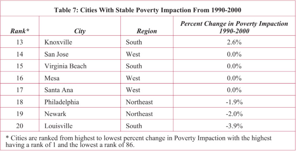
Of these eight cities, half had no poverty impaction in 1990 and 2000: San Jose, Virginia Beach, Mesa, and Santa Ana. The remaining cities, however, continued to have moderate to high poverty impaction levels throughout the 1990s.
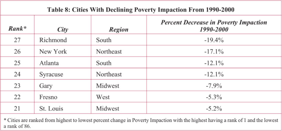
As we see in the next section, the majority of the cities in our study significantly improved their poverty impaction by a change in rate of 20 percent or more. The cities presented in Table 8 improved but to a lesser extent (a decline of 4.0 to 19.9 percent in poverty impaction rates). The cities vary in geographic location and population size. There are two cities in each of the South, Midwest, and Northeast regions and one city in the West. Gary is one of the smallest cities in our study sample with a 2000 population of 102,746 and New York is the largest in our study at over 8 million residents.
Almost 70 percent of the cities in our study had significant declines in their poverty impaction rates from 1990 to 2000. As illustrated earlier in Figure 4, about 9 out of 10 Midwest cities, 7 in 10 South cities, 6 out of 10 West cities, and about 4 out of 10 Northeast cities had significant improvement in poverty impaction over the 1990s.
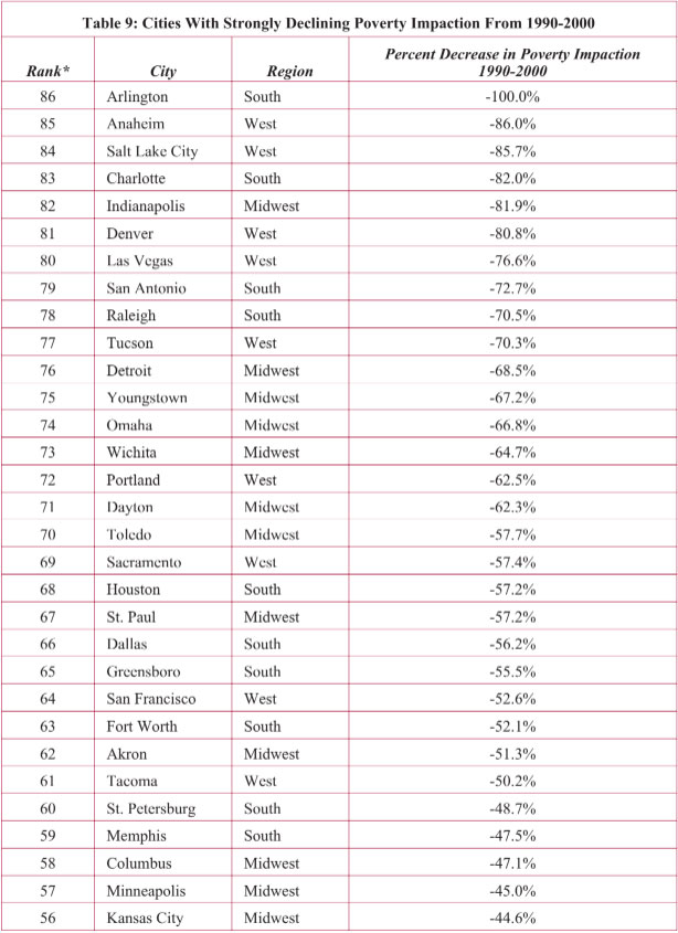
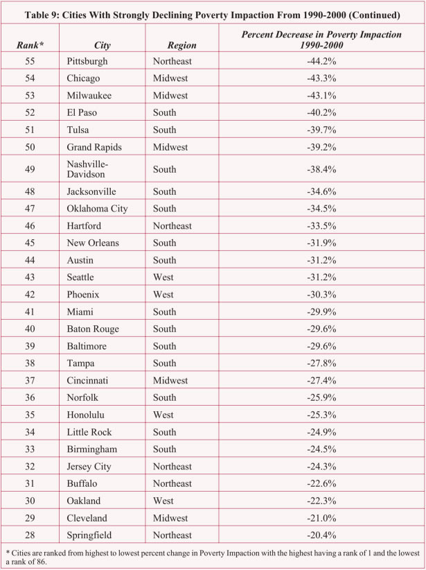
Twenty-six of the 59 cities with strongly declining poverty impaction from 1990 to 2000, presented in Table 9 had more than a 50 percent change in their poverty impaction rates. Nine of these cities with more than a 50 percent change are from the Midwest, 9 are from the West, and 8 are from the South.
Only 14 percent of the cities in our study experienced higher levels of poverty impaction over the 1990s, compared to 22 percent of the cities we found in 2004 to have increasing Intercity Hardship. Thirty-one percent of the Northeast cities in our study and 19 percent of the cities in the West had worsening poverty impaction over the 1990s. Only 13 percent of the Southern cities in our study worsened.
This is a different pattern from the regional variations in higher Intercity Hardship over the 1990s. One-third of the cities in the South had increasing Intercity Hardship from 1990 to 2000. The next highest percent are cities in the Northeast with 29 percent experiencing increases in Intercity Hardship, and 14 percent of the cities in the West.
Eighty-six percent of the cities in our study had stable to improving poverty impaction over the 1990s, with 77 percent improving. This is higher than the 62 percent of the study cities that we found to have improving Intercity Hardship.
Every Midwestern city in our study had improving poverty impaction from 1990 to 2000. Seventy-nine percent of the cities in the South improved, 67 percent in the West, and 54 percent in the Northeast also improved. Improvements in Intercity Hardship follow a similar pattern with 83 percent of the Midwest cities, 58 percent of the cities in the South, 62 percent in the West, and 43 percent in the Northeast improving.
Consistent with national trends, most of the cities in our study had declining levels of poverty in general over the 1990s. Fifty-three of the 86 cities (or 62 percent) had a reduction in their poverty rates. A curious pattern emerges, however, when we analyzed the cities’ poverty rates in relation to their poverty impaction levels. Cities with worsening poverty impaction had more of an improvement in their overall poverty levels — with an average decline from 1990 to 2000 of 6.7 percent — than cities with improving poverty impaction over the 1990s, which an average decline from 1990 to 2000 of less than one percent in their overall poverty levels.
In their original analysis, Nathan and Adams found that poverty impaction in general increased from 1970-1980.8 The highest poverty impaction rates in 1980 were found in cities in the Northeast and Midwest. In this section, we examine the change in poverty impaction rates for 49 cities (the maximum number of our study cities for which 1970 data are available) from 1970 to 2000.
We found that almost 47 percent of the cities had poverty impaction levels that strongly increased in this 30-year time frame. However, a nearly equal proportion of cities, almost 45 percent, had declining poverty impaction levels.
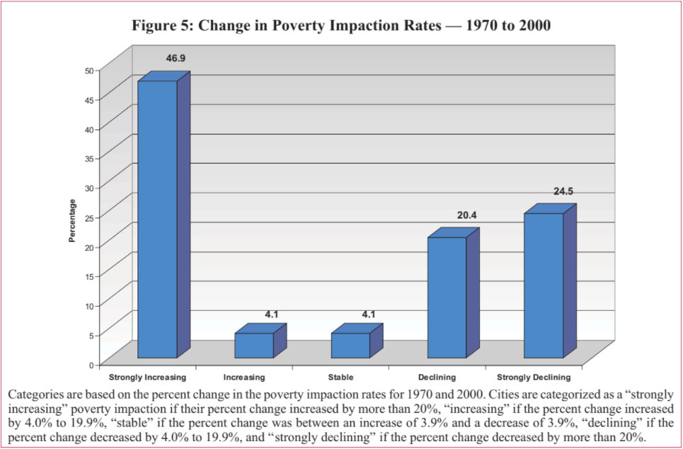
Figure 6 presents the total distribution of the 49 cities by their level of poverty impaction for each decade, 1970 to 2000. Overall, the results demonstrate that poverty impaction is becoming less pronounced among many of the largest metropolitan areas of the nation.
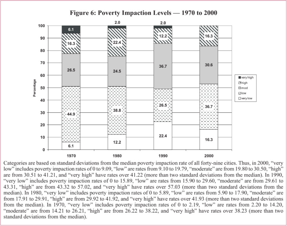
Figure 7 below illustrates the regional variation in poverty impaction rate change from 1970 to 2000.
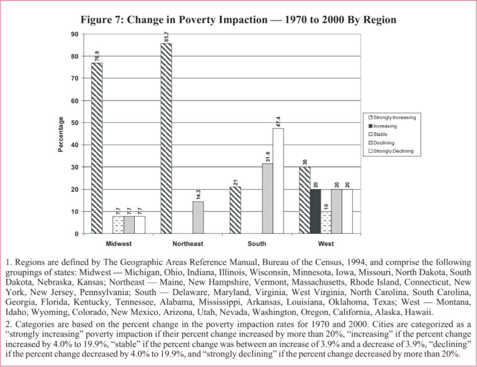
Table 10 lists the cities that had strongly increasing to increasing poverty impaction rates between 1970 and 2000. All but Seattle and Oakland had strongly increasing (over 20 percent) poverty impaction. Rochester, Buffalo, and San Diego had extremely high increases in poverty impaction over these three decades. In 1970, these three cities had the lowest poverty impaction rates, but by 2000 Rochester has the sixth highest poverty impaction rate and both Buffalo and San Diego jumped to moderate levels of poverty impaction.
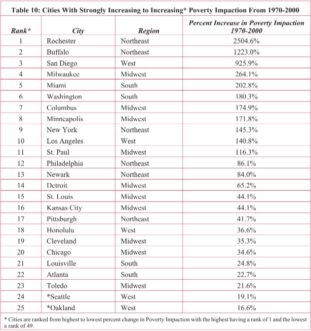
Most of the cities with the greatest increases in poverty impaction had low or very low rates of poverty impaction in 1970 but by 2000 had risen to moderate and high rates of poverty impaction. Four of the cities with the largest increase in poverty impaction from 1970 to 2000 — Rochester, San Diego, Washington, and Los Angeles — are also on the list of cities (see Tables 5 and 6) with the largest increases in poverty impaction from 1990 to 2000, indicating that the trend of higher poverty impaction rates had already begun by 1990. On the other hand, the majority of the cities with increases from 1970 to 2000 had strongly declining rates between 1990 and 2000. Poverty impaction affected these cities more intensely within a shorter time span from 1970 to 1990.
Increases in poverty impaction from 1970-2000 affected the cities in the Northeast and Midwest the most. Eighty-six percent of the Northeast cities and 77 percent of the Midwest cities had increases in poverty impaction over the thirty year time span, though the Midwest begins to recover in the 1990s (see Figure 7 above).
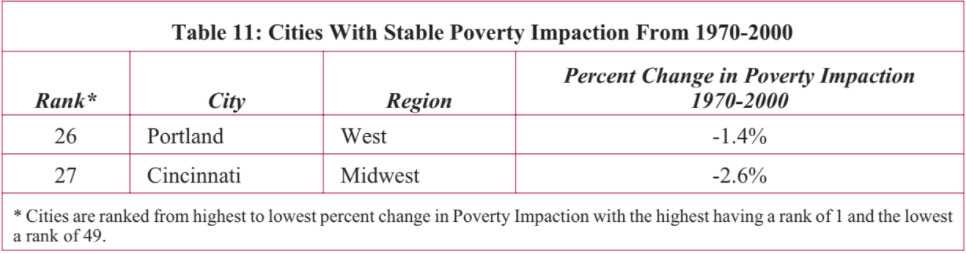
Two cities, listed in Table 11 below, had stable poverty impaction rates for thirty years. Portland remained in low levels of poverty impaction and Cincinnati remained in high levels, though both cities had strongly declining poverty impaction rates in the 1990s.
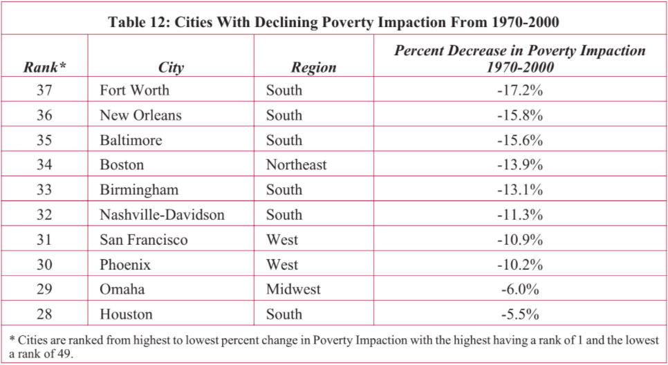
The remaining 45 percent of the cities in our 1970 to 2000 study had overall declining levels of poverty impaction. Table 12 presents those cities that had a 4.0-19.9 percent decline in their poverty impaction rates. Cities from the South dominate Table 12, and in fact, 79 percent of the Southern cities had some level of improvement in their poverty impaction rates.
With the exception of Boston, each of the cities in Table 12 that had declining poverty impaction from 1970-2000 also had strongly declining poverty impaction from 1990 to 2000. In the 1990s, Boston experienced increasing poverty impaction (see Table 6 above), though it still fell within a low level of poverty impaction by 2000.
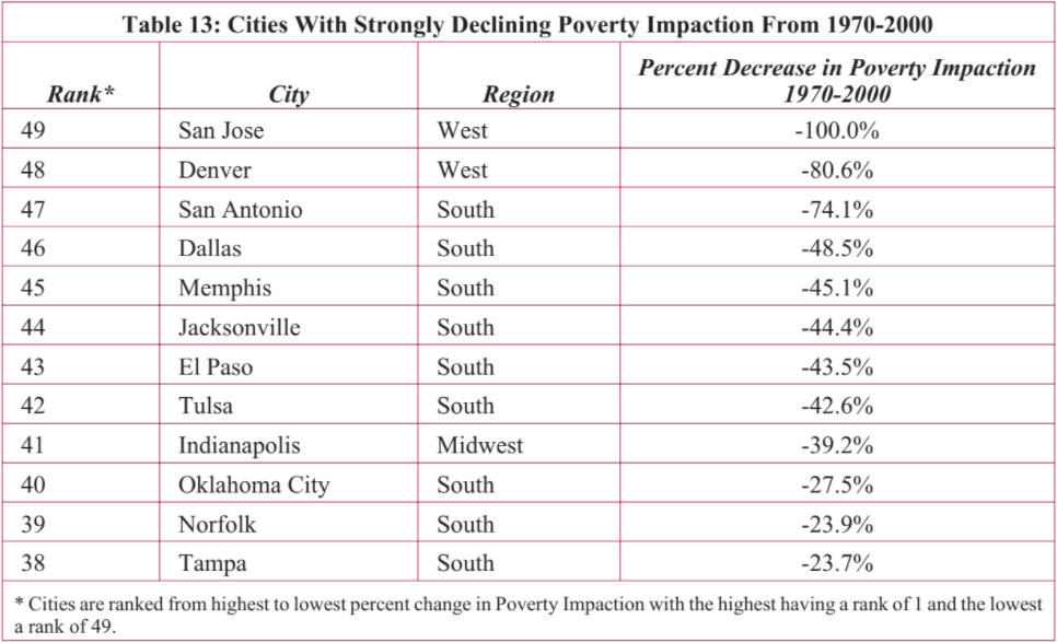
As presented in Table 13 below, almost one-quarter of the 49 cities had strongly declining poverty impaction from 1970-2000. Again, cities in the South dominate this list. Forty-seven percent of the cities in the South had strongly declining levels of poverty impaction from 1970-2000. All of the cities that had strongly declining poverty impaction from 1970-2000 also had strongly declining poverty impaction from 1990-2000 (except San Jose with a stable level) indicating the trend of improvement has continued over the thirty years.
The preceding section and our prior report in this series focused on central city areas. But these cities lie within metropolitan regions that they influence heavily, and are influenced by in return.
A Metropolitan Hardship Index was constructed, drawing together six key factors into a composite index permitting comparison between metro areas over time. The same factors were used as were employed for the Intercity Hardship Index, which include:
In our first paper in this series, we discuss the finding that — contrary to extreme stereotypes — urban hardship is comparatively uncommon: half of the central cities in 2000 had low or very low levels of Intercity Hardship. When we look at the entire metropolitan area that these cities are within, we see a similar pattern. Figure 8 shows that almost half — 48.8 percent — of the places in our study have low or very low levels of Metropolitan Hardship in 2000. A somewhat smaller share of metropolitan areas than central cities fall at the opposite end of the spectrum. Slightly more than ten percent of the metropolitan areas have high or very high levels of Metropolitan Hardship, compared to over 15 percent of the central cities.
About six in ten metropolitan areas in the Midwest meet the definition for having low or very low levels of Metropolitan Hardship. Contrary to reports that areas in the Rust Belt are faring poorly, we see that none of the areas studied in the Midwest have high or very high levels of Metropolitan Hardship. The Northeast and the South each had about 38 percent of their study areas falling in the category of low and very low Metropolitan Hardship — the smallest share among the regions.
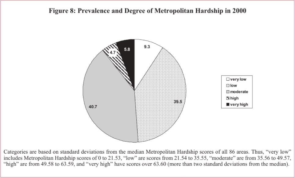
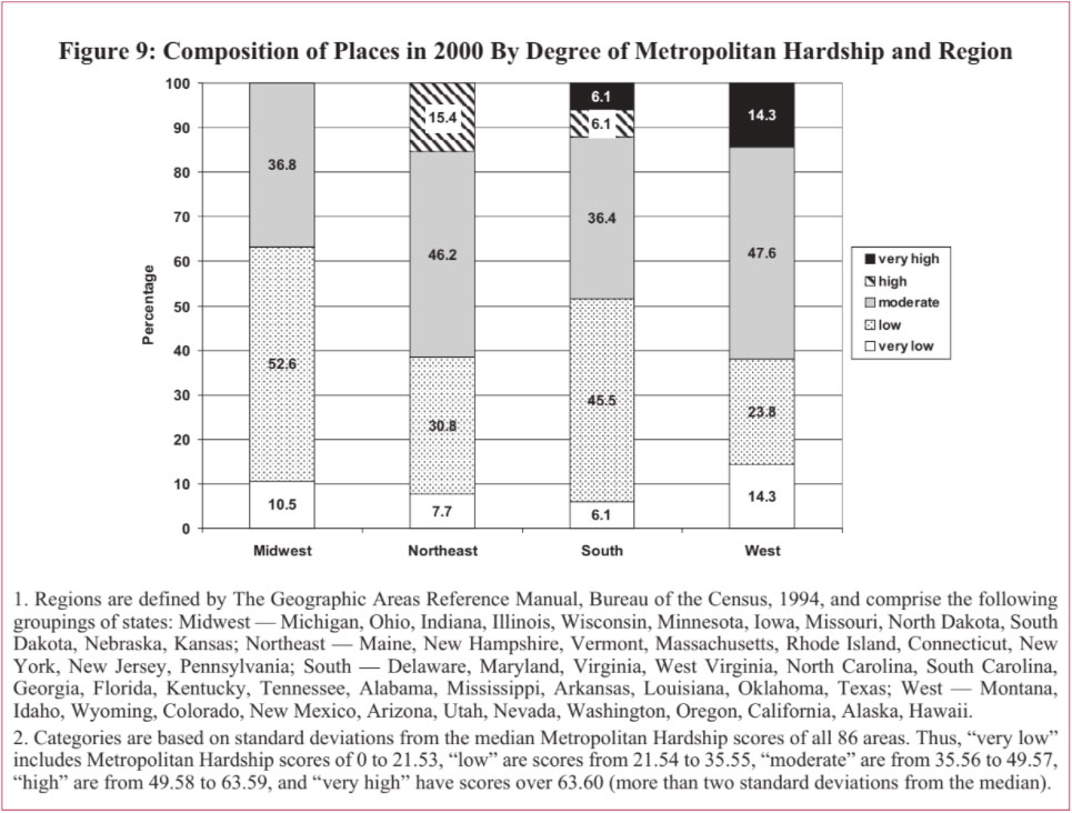
Highest levels of Metropolitan Hardship are most common among areas in the West and South. While the West has no areas categorized as having high Metropolitan Hardship, it has the largest share of places — 14.3 percent — with very high levels of Metropolitan Hardship. The South followed, with over 12 percent of its areas categorized as having high or very high levels of Metropolitan Hardship. Although more than 15 percent of the areas studied in the Northeast had high levels of Metropolitan Hardship, none met the definition for having very high levels of Metropolitan Hardship.
The pattern of regional variation in levels of Metropolitan Hardship is quite different from that of Intercity Hardship levels. As we previously reported, cities in the South fared best as a group compared with those in other regions. The South had the highest share of cities — over 65 percent — with low or very low Intercity Hardship levels and the lowest share of cities with high or very high levels of Intercity Hardship among the regions. By contrast, the South’s metropolitan areas have comparatively high levels of Metropolitan Hardship relative to areas in other regions.
The Northeast emerges as something of a mirror image to the South. Cities in the Northeast are most likely to have high or very high levels of Intercity Hardship compared with other regions. But the opposite is true for metropolitan areas in the Northeast, which relative to those in other regions tend to be far less likely to have very high levels of Metropolitan Hardship.
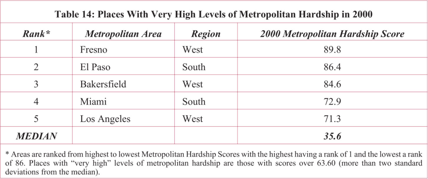
Table 14 below lists the areas with very high levels of Metropolitan Hardship in 2000. Three of the five places with very high Metropolitan Hardship are in the West and the remaining two are in the South. Fresno, Miami, and Los Angeles were similarly situated in a comparison of cities for high levels of Intercity Hardship for 2000, though only Miami had very high levels of Intercity Hardship for that year. Fresno, Los Angeles, and El Paso had high (rather than very high) Intercity Hardship in 2000, while Bakersfield had a moderate level of Intercity Hardship.
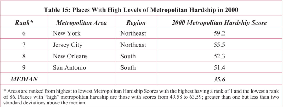
The places categorized as having high levels of Metropolitan Hardship in 2000 are listed in Table 15. Half of them are in the Northeast and half are in the South. By contrast, the central cities at the core of each of these respective metropolitan areas had moderate rather than high levels of Intercity Hardship in 2000. This would indicate that conditions of hardship for the metropolitan areas encompassing each of these four cities are more dire relative to other metropolitan areas that they are for the central cities themselves, compared to other central cities.
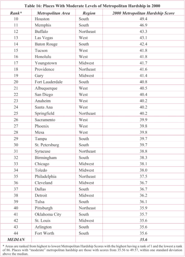
Over forty percent of the areas in our study had moderate levels of Metropolitan Hardship in 2000 and are listed in Table 16, below. Twelve of these thirty-five areas are in the South, ten are in the West, seven are in the Midwest, and six are in the Northeast. Most of these places with moderate Metropolitan Hardship had moderate to low levels of
Intercity Hardship in 2000. The exceptions are Santa Ana, which had the highest level of Intercity Hardship in 2000, along with Gary, Detroit, Cleveland, Buffalo, and Birmingham, each of which had high levels of Intercity Hardship in 2000. Unlike its moderate metropolitan area score on hardship, the central city of Arlington, TX, fell in the very low category for Intercity Hardship.
Another forty percent of the areas in our study had low levels of Metropolitan Hardship in 2000. Fifteen of these thirty-four cities are in the South (which represents almost half of the Southern cities in our study), ten are in the Midwest, five are in the West, and four are in the Northeast.
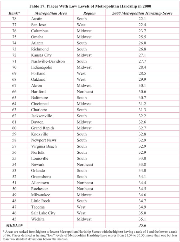
Most of the areas with low levels of Metropolitan Hardship in 2000 also have central cities defined as having low levels of Intercity Hardship for that year. However, two of the four cities with very high Intercity Hardship in 2000, Hartford and Newark, are in areas that have low levels of Metropolitan Hardship. On the other hand, although Milwaukee has a low level of Metropolitan Hardship, the central city had high levels of Intercity Hardship. The central cities of seven of the places listed in Table 17 have moderate levels of Intercity Hardship for 2000: Rochester, Baltimore, Oakland, Norfolk, Atlanta, Dayton, and Allentown. Six others from this table have central cities with very low levels of Intercity Hardship in 2000: Columbus, Greensboro, Charlotte, Little Rock, Austin, and Virginia Beach.
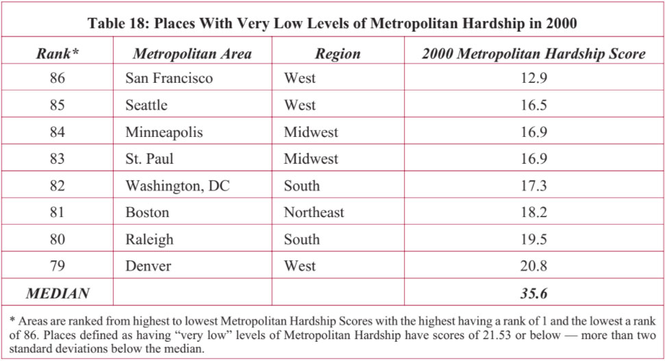
Almost ten percent of the areas in our study are categorized with having very low levels of Metropolitan Hardship. They are listed in Table 18. Three are from the West (San Francisco, Seattle, and Denver), two each in the Midwest (Minneapolis and St. Paul) and South (Raleigh and Washington, DC), and one in the Northeast (Boston).
The central cities in each of these areas, with the exception of Boston, have low or very low levels of Intercity Hardship in 2000. Boston has a moderate level of Intercity Hardship, St. Paul, Minneapolis, Denver, and San Francisco have low levels, and Raleigh and Seattle have the lowest levels of Intercity Hardship in 2000.
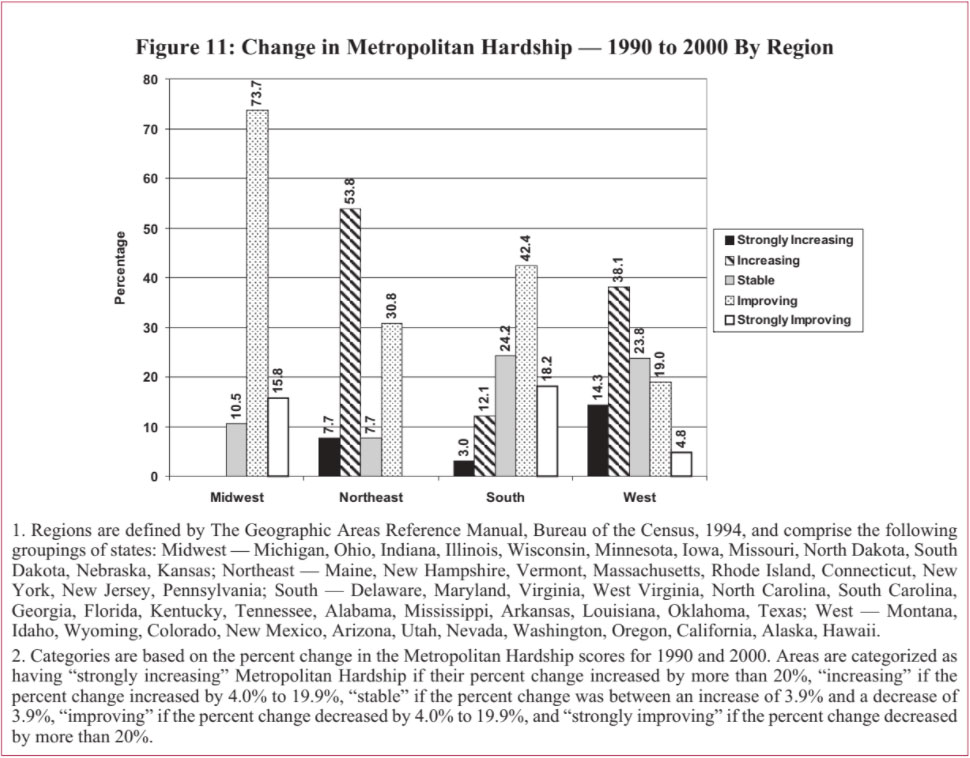
As illustrated in Figure 10, below, the majority — 53.5 percent — of the study areas are classified as having improving or strongly improving levels of Metropolitan Hardship over the 1990s. In fact, 72.1 percent of these places have stable or improving Metropolitan Hardship. We previously reported a similar but slightly stronger pattern of improvement during the 1990s among central cities, with a higher share — 61.6 percent — of the cities classified as improving or strongly improving on the Intercity Hardship scale, and 80 percent stable or improving. In Section H, below, we further discuss this relationship between improving central cities and improving metropolitan areas.
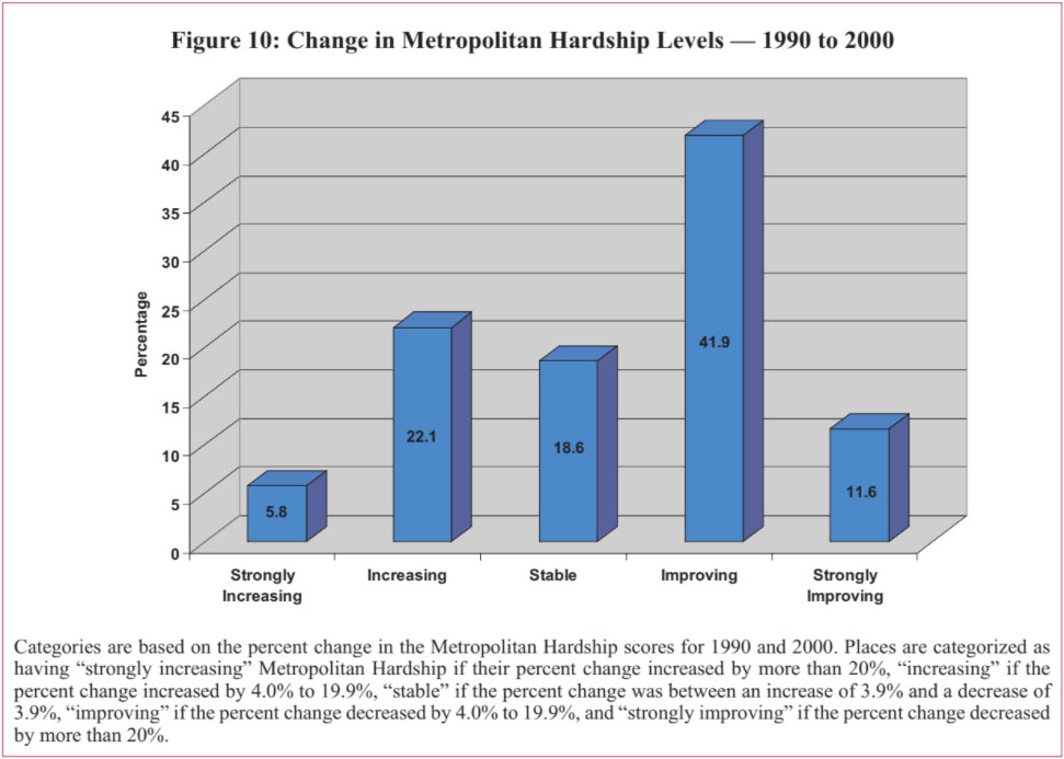
The average Metropolitan Hardship score decreased from 38.8 in 1990 to 37.2 in 2000. However, there are distinct regional patterns in the direction and strength of change in Metropolitan Hardship over the 1990s. From 1990 to 2000, almost nine in ten study areas in the
Midwest and six in ten in the South had improving or strongly improving Metropolitan Hardship. On the other hand, over six in ten areas in the Northeast and half of those in the West had increasing or strongly increasing levels of Metropolitan Hardship.
Previously, we reported that cities in the Midwest exhibited the most improvement in their Intercity Hardship measure from 1990 to 2000. Figure 11 illustrates a similar trend for the metropolitan areas in the Midwest as well.
Study areas in the West had more improvement in their Intercity Hardship than their Metropolitan Hardship. Almost 62 percent of the cities in the West are classified as having improving or strongly improving levels of Intercity Hardship over the 1990s. By contrast, only 23.8 percent of the areas in the West have improving or strongly improving Metropolitan Hardship over the same time period. In fact, more than half — 52.4 percent — of the places in the West had increasing or strongly increasing Metropolitan Hardship between 1990 and 2000. Only the Northeast fared worse in Metropolitan Hardship. None of the study areas in the Northeast have strongly improving Metropolitan Hardship but over 60 percent have declining or strongly declining metropolitan conditions. This is a much more negative trend than we reported with respect to Intercity Hardship for the Northeast, with 28.6 percent of the cities having increasing or strongly increasing Intercity Hardship over the 1990s.
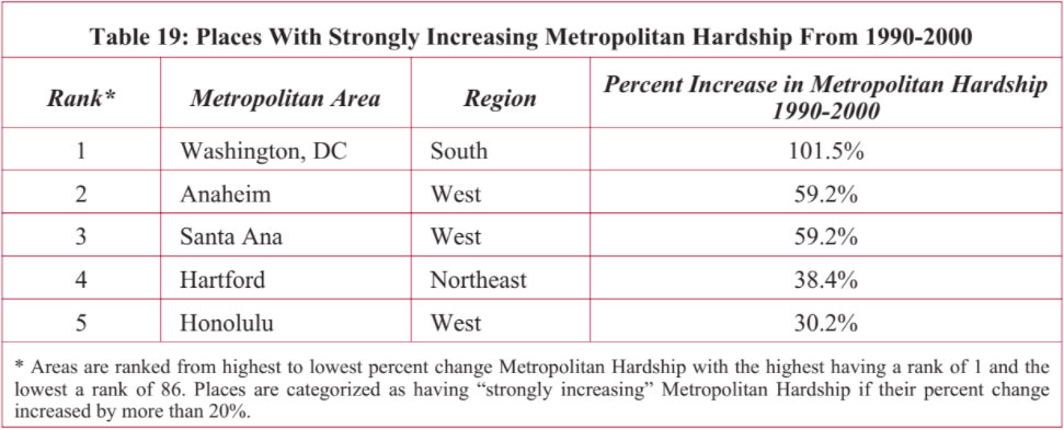
Of the five study areas listed in Table 19 with strongly increasing Metropolitan Hardship over the 1990s, three — Anaheim, Santa Ana, and Honolulu — are from the West. Washington, DC, in the South had the highest percent increase in their Metropolitan Hardship from 1990 to 2000, though by 2000 it is still classified as having, relative to other areas, very low levels of Metropolitan Hardship.
The degree of change in Intercity Hardship over the 1990s varies among these places. Honolulu and Anaheim were categorized as having strongly increasing levels of Intercity Hardship, and Hartford had increasing Intercity Hardship. However, Santa Ana and Washington, DC, had stable Intercity Hardship from 1990 to 2000 even though their Metropolitan Hardship strongly increased.
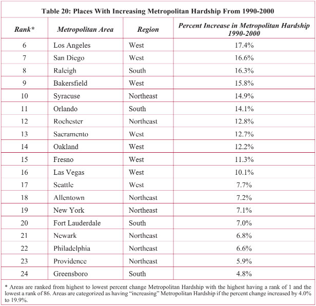
Over 22 percent of the places in our study had increasing Metropolitan Hardship over the 1990s. Of these nineteen areas, seen in Table 20, eight are from the West (Los Angeles, San Diego, Bakersfield, Sacramento, Oakland, Fresno, Las Vegas, and Seattle) and seven are from the Northeast (Syracuse, Rochester, Allentown, New York City, Newark, Philadelphia, and Providence). There are no study areas from the Midwest that had increasing or strongly increasing Metropolitan Hardship from 1990 to 2000.
We reported a pattern of change in Intercity Hardship that was similar for the Northeast — which figured prominently in both perspectives on increasing hardship — but different for the South. From 1990 to 2000, the greatest increases in Intercity Hardship are among cities from the South, home to six of the fourteen cities categorized with having increasing Intercity Hardship over that period.
Of the nineteen areas that had increasing Metropolitan Hardship over the 1990s, two — Raleigh and Greensboro — had strongly increasing Intercity Hardship during this period, and three — Syracuse, Allentown, and Bakersfield — had increasing Intercity Hardship. Two cities from Table 20 — Fort Lauderdale and Seattle — had strongly improving Intercity Hardship over the 1990s. The other twelve areas with increasing Metropolitan Hardship had stable or improving levels of Intercity Hardship over the 1990s.
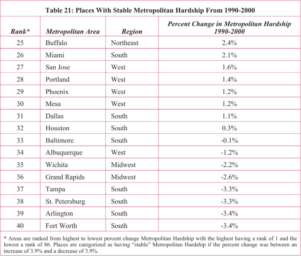
About nineteen percent of the areas in our study had stable levels of Metropolitan Hardship over the 1990s. Half of these sixteen places, listed in Table 21, are from the South, and five are from the West. Only one study area in the Northeast (Buffalo) and only two in the Midwest (Wichita and Grand Rapids) had stable Metropolitan Hardship levels from 1990-2000. By comparison, over sixteen percent of the central cities in the study had stable levels of Intercity Hardship from 1990 to 2000.
Nine of the places with stable Metropolitan Hardship listed in Table 21 had improving Intercity Hardship: Miami, Tampa, Baltimore, Portland, Wichita, Grand Rapids, San Jose, St. Petersburg, and Albuquerque. Arlington is the only city that had stable Metropolitan Hardship over the 1990s, but strongly increasing Intercity Hardship. Three cities — Houston, Dallas, and Buffalo — had increasing Intercity Hardship at the same time their respective levels of Metropolitan Hardship were categorized as relatively stable. On the other hand, Phoenix and Mesa had strongly improving Intercity Hardship over the 1990s, and stable Metropolitan Hardship.
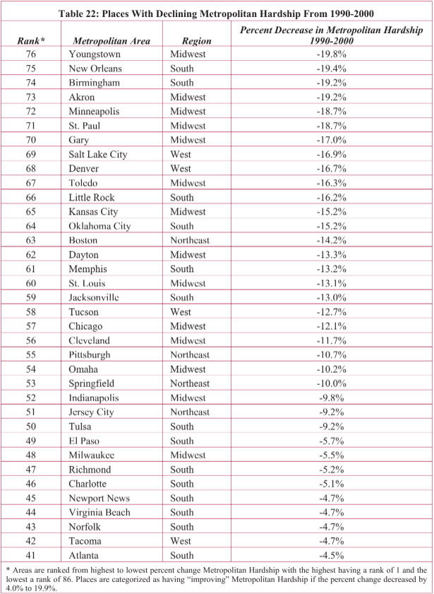
Almost 42 percent of the areas in our study had improving Metropolitan Hardship conditions with declining scores. Fourteen of the 36 places in Table 22 are from the Midwest and another fourteen are from the West. The Northeast and the West each have four areas with improving Metropolitan Hardship.
Slightly more cities were categorized as having improving Intercity Hardship over the 1990s than those categorized as having improving levels of Metropolitan Hardship. However, the majority of the areas with declining Metropolitan Hardship (indicating improvement) also had declining Intercity Hardship.
Twenty-one of the 36 areas in Table 22 had declining Intercity Hardship. Only one, Charlotte, had strongly increasing Intercity Hardship, and six (Norfolk, Virginia Beach, Birmingham, Milwaukee, Memphis, and Newport News) had increasing levels of Intercity Hardship even as they participated in improving conditions across their respective metropolitan areas. Richmond, Pittsburgh, St. Paul, Tacoma, and Cleveland all had stable Intercity Hardship over the 1990s and three cities — Youngstown, Oklahoma City, and Tucson — had strongly declining Intercity Hardship.
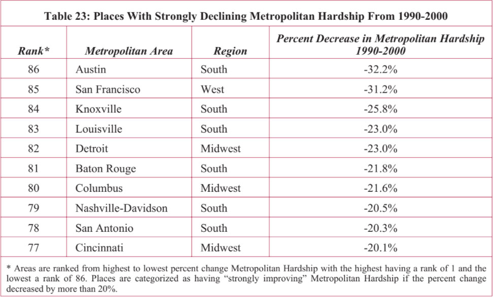
Ten areas in our study had strongly improving Metropolitan Hardship conditions over the 1990s. Of those ten, six are from the South and three are from the Midwest. San Francisco is the only study area from the West in Table 23 (see page 44)and there are no study areas from the Northeast that strongly improved their levels of Metropolitan Hardship between 1990 and 2000.
A similar regional trend was found with respect to strongly declining Intercity Hardship, with the majority of cities achieving the designation located in the South and West. Almost thirteen percent of the cities in our study were classified as having strongly declining Intercity Hardship over the 1990s.
Each of the areas listed in Table 23 as having improvement in metropolitan hardship between 1990 and 2000 also has a central city categorized as having declining or strongly declining Intercity Hardship over the 1990s. Baton Rouge, Nashville-Davidson, Columbus, Detroit, Louisville, and Cincinnati all had declining Intercity Hardship levels from 1990 to 2000. Knoxville, Austin, San Antonio, and San Francisco all had strongly declining Intercity Hardship over the 1990s.
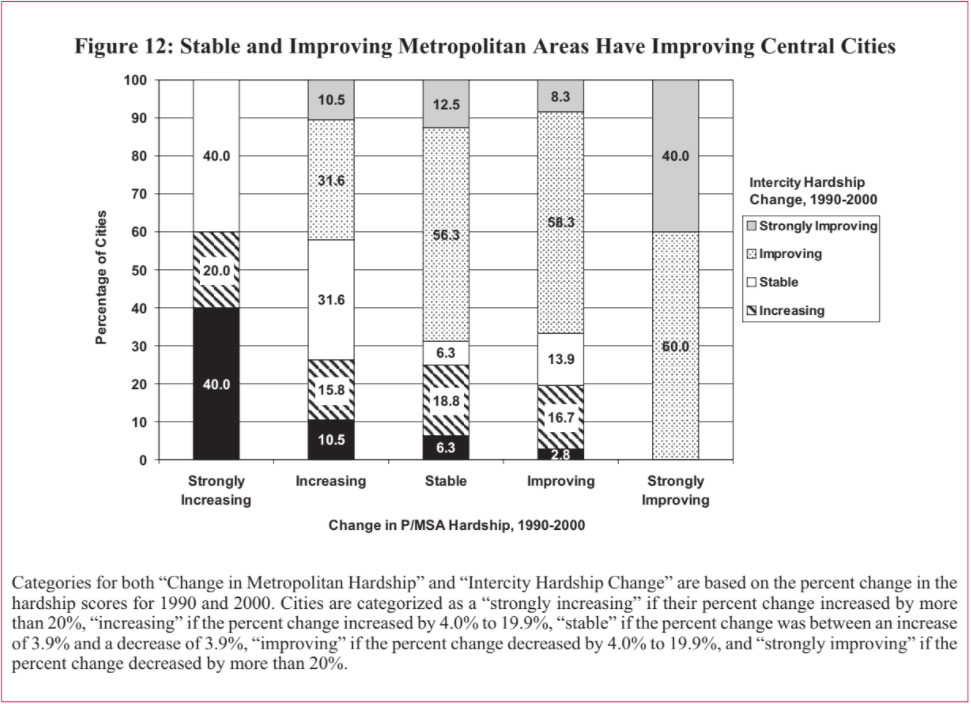
Abroader analysis demonstrates that there is a close relationship between change in Metropolitan Hardship and Intercity Hardship levels. We found a statistically significant positive relationship between change in Metropolitan Hardship and Intercity Hardship.9 Areas with strongly increasing Metropolitan Hardship over the 1990s had a four in ten chance of containing a central city with strongly increasing levels of Intercity Hardship, and an additional chance of two in ten of having increasing levels of Intercity Hardship. Although 40 percent of the areas in the study had central cities with stable levels of Intercity Hardship, none had improving or strongly improving levels of Intercity Hardship from 1990 to 2000.
On the opposite end of the spectrum, as illustrated in Figure 12, those areas with strongly improving levels of Metropolitan Hardship during the 1990s were comprised entirely of places with central cities experiencing improving or strongly improving levels of Intercity Hardship. This category contained not a single instance of a study area with a central city undergoing stable, increasing, or strongly increasing levels of Intercity Hardship. More than half — indeed, nearly 60 percent — of those areas with stable or improving levels of Metropolitan Hardship from 1990 to 2000 had improving levels of Intercity Hardship among their respective central cities.
Our previous report in this series noted that levels of urban hardship in 2000 tended to be low or very low among the central cities studied, in contrast to the prevailing stereotypes about America’s large urban areas. But placing these cities in their metropolitan context produces a decidedly less rosy view of how their hardship levels compare to their suburbs; how disparity in urban-to-suburban hardship compares across metropolitan areas, and how that disparity has changed over time.
An Urban/Suburban Disparity score is calculated for each area, taking into account relative values on six factors — unemployment, dependency, educational attainment, per capita income, crowded housing, and poverty — combined as a Hardship Index, as described above and elsewhere. An added step distinguishes the degree of disparity in Hardship Index levels between each central city and its respective suburban area: each area’s composite Urban/Suburban Disparity score is divided by that of a hypothetical central city identical to its surrounding Metropolitan Statistical Area in all six factors.10 In this manner, we are able to distinguish cities that compare favorably to their surrounding metropolitan area by scores that fall below 100 with those that compare unfavorably by scores that are over 100. That is, the higher the Urban/Suburban Disparity Index score, the greater the difference in how far socioeconomic conditions in the central city lag behind those for the rest of the metropolitan area.
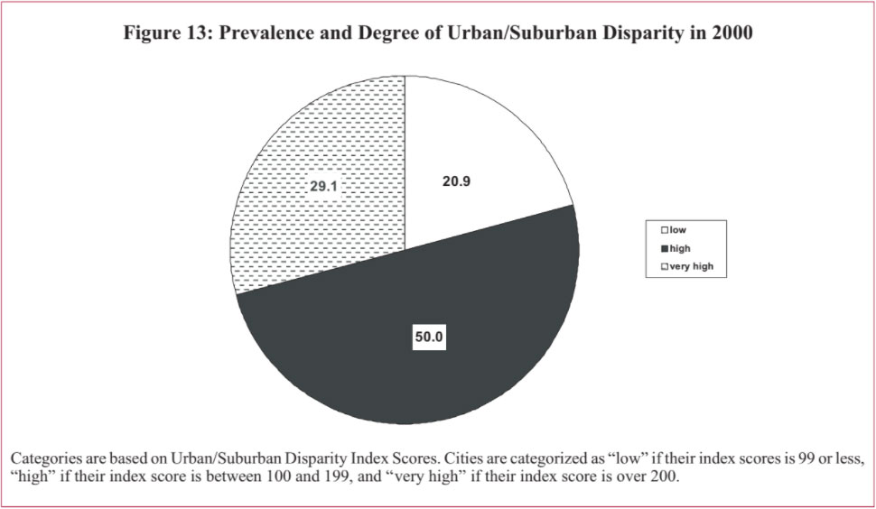
The results of our previous paper in this series, An Update on Urban Hardship, revealed that most central cities in 2000 have low or very low levels of urban hardship. However, compared to the socioeconomic conditions of their surrounding metropolitan areas, only a handful of cities actually fared well in 2000. As shown in Figure 13, half of the 86 areas in our study had high levels of Urban/Suburban Disparity — measured by greater negative differences in socioeconomic conditions between the central city and the rest of the metropolitan area. An additional 29.1 percent of these areas had very high levels of Urban/Suburban Disparity. In only about one-fifth of the places, 20.9 percent, did we find Hardship Index levels of central cities faring well in comparison to their surrounding metro area.
Figure 14 shows the regional variations in Urban/Suburban Disparity levels in 2000 (see page 47).
Disparities in socioeconomic conditions between central cities and suburbs were most pronounced in the Northeast, followed by metro areas studied in the Midwest. In every area studied in both the Northeast and Midwest, every city compared unfavorably to its surrounding metropolitan area on measures of hardship.
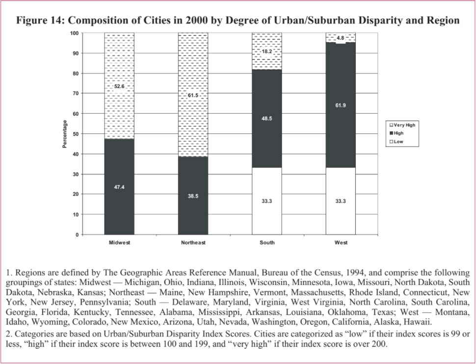
Metropolitan areas studied in the South and West fared better. Two-thirds of the areas studied in the South and West had high to very high levels of Urban/Suburban Disparity. But in one-third of the areas studied across the South and West, there were low levels of socioeconomic disparity between the central cities and their surrounding metropolitan area. Metro areas in the West appeared to have comparatively lower levels of disparity — at least very high levels of Urban/Suburban Disparity were less common there than in other regions.
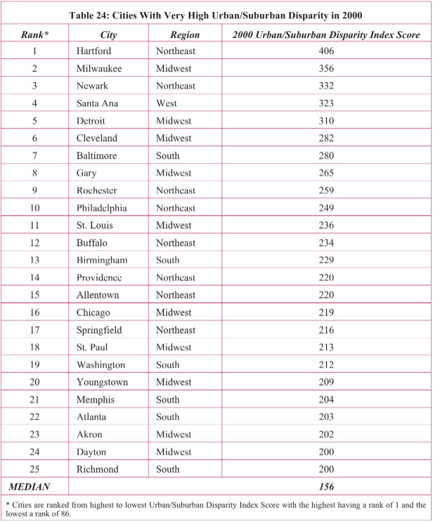
Table 24 presents the 25 cities in our study that have a significant socioeconomic disparity between their central cities and surrounding areas. The list is dominated by cities in the Northeast and Midwest. More than six in ten of the cities in the Northeast and more than half in the Midwest have very high Urban/Suburban Disparity.
Only four states have more than one on this list of metropolitan areas with highest levels of urban to suburban socioeconomic disparity. Ohio has most, with four areas on this list: Cleveland, Youngstown, Akron, and Dayton. Two each are found from New York (Rochester and Buffalo), Pennsylvania (Allentown and Philadelphia), and Illinois (Chicago and Springfield).
Hartford, Milwaukee, Newark, Santa Ana, and Detroit are at the extreme end of the very high index scores. For Hartford, the disparity between urban and suburban socioeconomic conditions reflected in their Urban/Suburban Disparity Index score is found in each of the measures we used to construct the index: unemployment, dependency, educational attainment, per capita income, crowded housing, and poverty. For Milwaukee, the disparity is mainly in poverty and unemployment. For Newark, it is the difference in per capita income. For Santa Ana — the city that also had the highest Intercity Hardship in 2000 — the disparity is in the areas of income, education, and dependency.
All but Santa Ana have had very little growth occurring within the urban areas with static city boundaries. As discussed further in Section VII, below, the cities with very high Urban/Suburban Disparity tend to have low percentages of the metropolitan population living within the urban areas, high levels of residential segregation, and high levels of older housing stock within the urban areas.
Table 25 presents the 43 cities with high levels of socioeconomic disparity between central cities and suburbs in 2000 (see page 50). Clearly, for many cities in the nation, there is a differentiation between the lower socioeconomic conditions in the central cities and the higher socioeconomic conditions in the surrounding areas.
Topping this list are Toledo, Syracuse, Louisville, Oakland, Boston, New York, Cincinnati, Fort Worth, Dallas, and Anaheim. The urban-suburban difference in Toledo is high in the following socioeconomic factors: dependency, education, poverty, and income. For Syracuse, the differences are mainly income, poverty and crowded housing. Louisville has a high level of Urban/Suburban Disparity mainly due to substantial differences in levels of dependency, unemployment, and income. Oakland mainly has urban-suburban socioeconomic differences in education and income.
Boston’s urban-suburban divide is high on all measures of Hardship. New York’s disparity is concentrated in education, unemployment, and crowded housing measures. Unemployment and poverty are the factors affecting Cincinnati’s disparity; dependency, income, and education are affecting the urban-suburban disparity in Fort Worth; educational attainment is the main factor in Dallas; and dependency and income are affecting Anaheim. Of these cities, Toledo, Syracuse, Louisville, Boston, New York, and Cincinnati have also had static city boundaries with growth largely occurring in the suburban area.
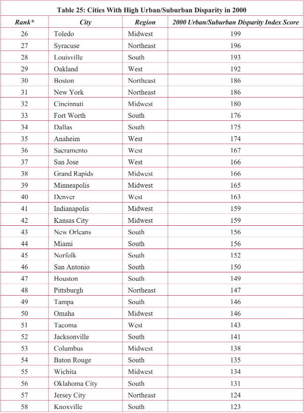
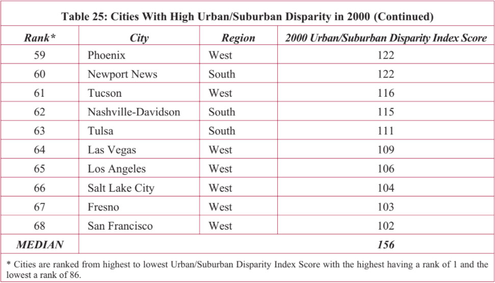
At least 38 percent of the cities in each region have high levels of Urban/Suburban Disparity. Cities in the West dominate the list in Table 25 with 62 percent of all Western cities having a high disparity between their central cities and suburbs in 2000. Almost half of all cities in the South and Midwest have high Urban/Suburban Disparity.
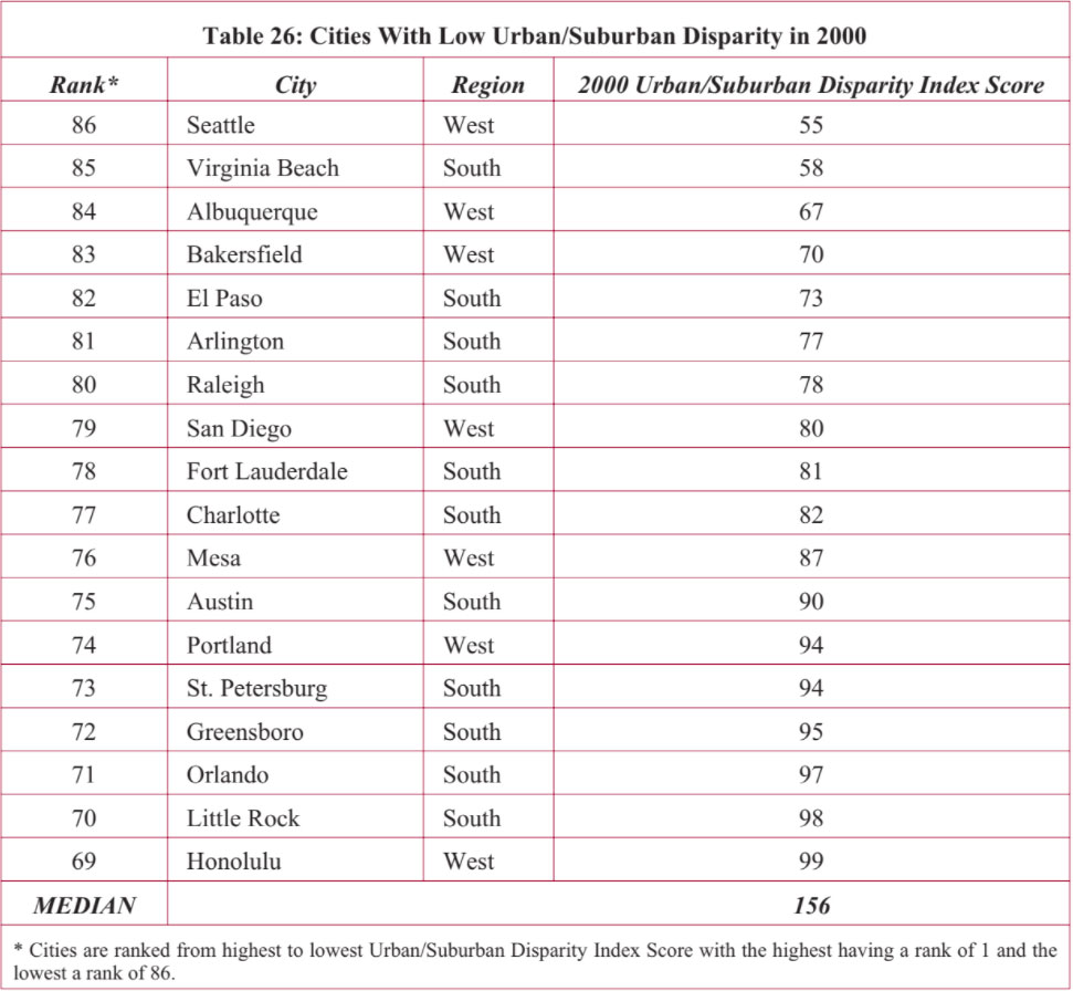
Cities whose Urban/Suburban Disparity Index Score is under 100 have low socioeconomic disparity between residents within the central city and those residing in the surrounding metropolitan area. About one in five cities have low Urban/Suburban Disparity scores and are listed in Table 26. All are from the West and South. One-third of all cities in the South and West have low levels of Urban/Suburban Disparity. Most have small central city populations under 500,000 and half have low total metropolitan area populations under 1.5 million.
Of the cities with the lowest scores in Table 26, Virginia Beach and Bakersfield had low levels of disparity in all of the Hardship Index variables between central city and suburban areas; Seattle is mainly affected by low disparity in dependency and income; Albuquerque had very low levels of disparity in poverty and crowded housing; and El Paso had low disparity in educational attainment, unemployment, poverty, and crowded housing.
Comparing the degree of disparity in Hardship Index levels between cities and the rest of their metro areas in 1990 to 2000, we see a largely divided picture. In a little more than half of the 86 study areas, change in the degree of socioeconomic disparity between central cities and their surrounding metropolitan areas was either equal or positive. As Figure 15 illustrates, 10.5 percent of the areas were stable, 32.6 percent had improving Urban/Suburban Disparity levels from 1990 to 2000, and an additional 8.1 percent had strongly improving levels of disparity over the 1990s.
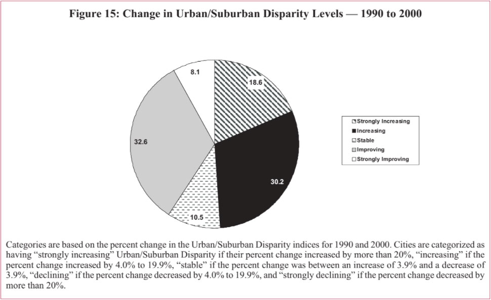
By contrast, nearly half — 48.8 percent — of the areas in the study witnessed growing, negative disparity in hardship levels between central city and suburb over the 1990s. More than 30 percent had worsening Urban/Suburban Disparity Index levels and an additional 18.6 percent had strongly worsening disparity in hardship levels.
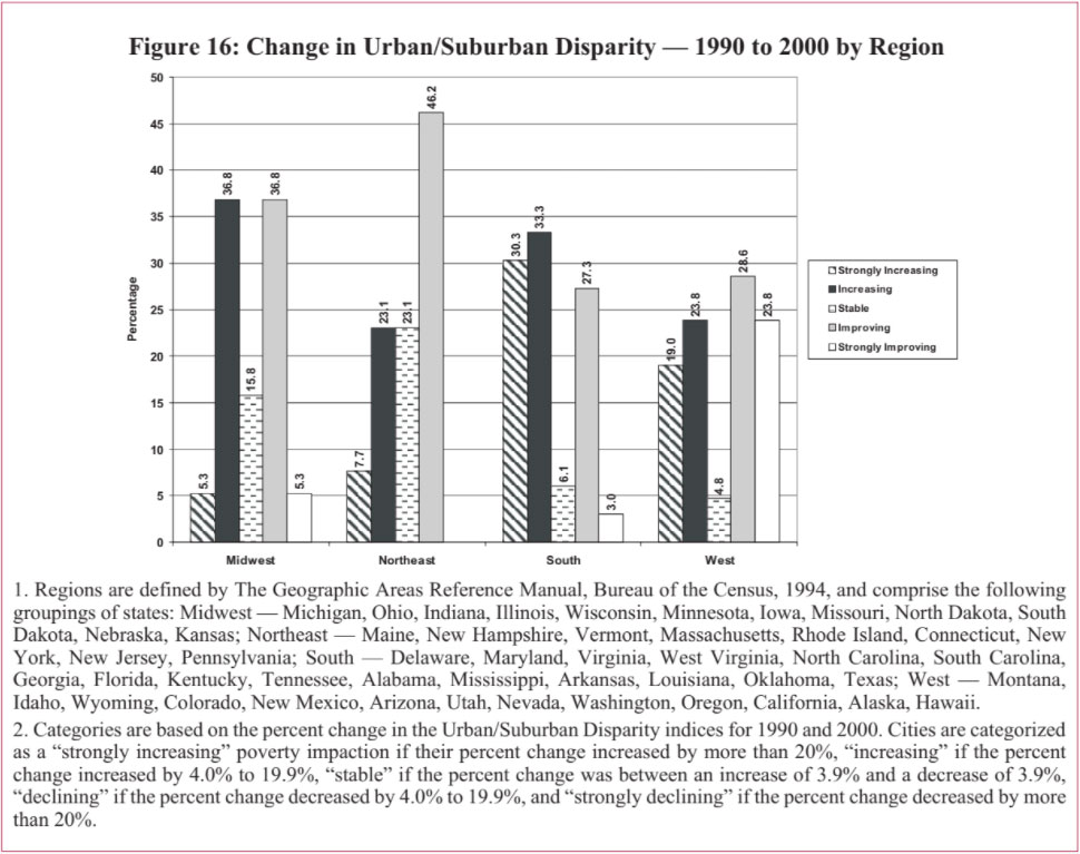
Although the Midwest and Northeast regions had the highest levels of Urban/Suburban Disparity scores in 2000, these regions witnessed much improvement in their average Urban/Suburban Disparity scores from 1990-2000. And the two regions that have the lowest levels of disparity between their central cities and suburbs in 2000 — the South and West — had the largest relative increases in urban/suburban socioeconomic disparity over the 1990s. As shown in Figure 16, 52.4 percent of cities in the West, 46.2 percent in the Northeast, 42.1 percent in the Midwest, and 30.3 percent in the South showed improvement in their Urban/Suburban Disparity levels from 1990 to 2000.
Cities in the South had the largest relative increase in Urban/Suburban Disparity, though areas in this region still fare better than those in the Midwest and Northeast. As we reported previously in An Update on Urban Hardship, cities in the South had the largest increases in Intercity Hardship as well, indicating that conditions for areas in the South — both urban and suburban — are declining relative to large metro areas in other regions.
If we look at the change for 1990 to 2000 in the individual subcomponents that make up the Urban/Suburban Disparity Index, there are certain patterns that emerge. All regions saw conditions worsen in all subcomponents except in the unemployment subcomponent in which the Midwest, Northeast and West all saw improvements from 1990 to 2000. The worsening of Urban/Suburban Disparity in the Northeast and Midwest were mainly in the subcomponents of crowded housing, poverty, and education.
Sixteen cities had strongly increasing Urban/Suburban Disparity from 1990 to 2000 (greater than 20 percent increase in their index score), indicating socioeconomic conditions in their central cities are getting worse compared to their suburban areas. More than half the cities in Table 27 are from the South. Indeed, 30 percent of all Southern cities had strongly declining Urban/Suburban Disparity over the 1990s.
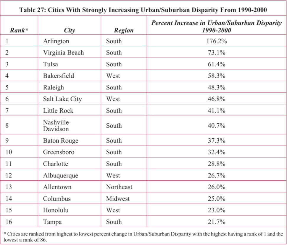
Over 80 percent of the cities that strongly declined in the 1990s began with low levels of Urban/Suburban Disparity. Even with an increase in their index score, the majority of those categorized as low relative to the other cities in 1990 remained so in 2000. Although Arlington had the largest percent increase in its own score, the city remained in the low category relative to levels of Urban/Suburban Disparity among all the cities for 2000.
Baton Rouge, Nashville-Davidson, Salt Lake City, and Tulsa were all categorized as having low levels of Urban/Suburban Disparity in 1990 and moved into high levels by 2000. Allentown had a high level of Urban/Suburban Disparity in 1990 and reached very high levels by 2000. Most of the metro areas that had strongly increasing Urban/Suburban Disparity over the 1990s had increases in shares of the “dependent population.” The urban and suburban areas of Allentown and Arlington had increased disparity between the respective proportions of people over the age of 25 with at least a high school education. Raleigh, Little Rock, Baton Rouge, Greensboro, and Tampa had an increase in disparity of unemployment levels in their urban and suburban areas. The rising difference in income between those living in the central city and suburbs is most pronounced in Arlington, Salt Lake City, and Allentown. Poverty increases are noticeable in Salt Lake City, Nashville-Davidson, Allentown and Columbus. Allentown also had significant increases in disparity between the city and suburban areas on the crowded housing variable of the Hardship Index.
Almost half of all the cities in our study had strongly increasing or increasing levels of Urban/Suburban Disparity over the 1990s. Table 28 presents the thirty percent that had between 4.0 and 19.9 percent increase in Urban/Suburban Disparity Index scores between 1990 and 2000.
All regions have at least 23 percent of their metropolitan areas experiencing widening disparity. The Midwest is highest, with 37 percent of the study areas in that region with increasing Urban/Suburban Disparity, followed by 33 percent of those in the South, 24 percent of those in the West, and 23 percent of those in the Northeast. Four of these areas — Austin, El Paso, Orlando, and San Diego — had low levels of
Urban/Suburban Disparity in 1990 and remained in the low category in 2000, yet are beginning to approach high levels. Fresno and Los Angeles were in the low category in 1990 but rose to high levels of Urban/Suburban Disparity in 2000. At the other end, Birmingham and Milwaukee’s very high levels of Urban/Suburban Disparity continued to increase over the 1990s. Disparity levels in Richmond, Memphis, St. Paul, and Springfield were high in 1990, and moved into very high levels by 2000.
The increases in Urban/Suburban Disparity for the cities in Table 28 are attributable largely to changes in levels of dependency, poverty, and crowded housing. Increasing differences in educational attainment are largest in Milwaukee, Springfield, Dallas, Minneapolis, and Wichita. All but one city (Phoenix) had relative decreases in the per capita income measure of their Urban/Suburban Disparity Index. The largest increases in the unemployment variable were in Birmingham, Richmond, Pittsburgh, Los Angeles, and Boston.
As shown in Table 29, of the nine cities with stable Urban/Suburban Disparity over the 1990s, all regions are represented. Most however are from the Midwest and Northeast. While their levels did not fluctuate much, all of these cities had high to very high Urban/Suburban Disparity over the 1990s.
It is interesting to note that when we examine the changes in the individual variables that comprise the Urban/Suburban Disparity Index, most of the cities in Table 29 had large increases in poverty and crowded housing, but were offset by improvements in dependency, educational attainment, and unemployment. For example, the relative poverty measure in Toledo increased by 17.5 and the crowded housing measure increased by 12.6. However, the relative unemployment measure decreased by 12.0. In Louisville, the relative poverty measure increased by 20.1 and crowded housing increased by 8.6. Much of those increases in Louisville were counterbalanced by improvements in the dependency measure and educational attainment.
Over 40 percent of the cities in our study had some degree of improvement in their Urban/Suburban Disparity over the 1990s, indicating a lessening of socioeconomic disparity between central cities and their suburbs. Most of the cities showing improvement had a 4.0-19.9 decrease in their Urban/Suburban Disparity Index scores. The cities and the percent decreases in their index scores are shown in Table 30.
Forty-six percent of cities in the Northeast, 37 percent in the Midwest, 29 percent in the West, and 27 percent in the South had improving Urban/Suburban Disparity from 1990-2000. Ten of the twenty-eight cities in Table 30 have 2000 central city population under 250,000 and an additional ten cities have fewer than 500,000. Although a couple of the largest cities in our study are also contained in Table 30 (New York City, Philadelphia, and San Antonio), there does appear to be a trend of smaller cities having improvements in Urban/Suburban Disparity over the 1990s.
Improvements are mainly in the unemployment variable of the Urban/Suburban Disparity Index, followed by dependency and educational attainment. Poverty showed the least improvement among the Index variables.
Table 31 presents the seven cities with significant improvements in their Urban/Suburban Disparity Index scores from 1990 to 2000. Five are located in the West.
Whether these changes in Urban/Suburban Disparity levels resonate varies by city. Seattle had the largest decrease, but was already categorized among places with low levels of Urban/Suburban Disparity and remained there throughout the 1990s. Chicago’s decrease still leaves it among areas with a very high level of Urban/Suburban Disparity in 2000. However, Miami and San Jose went from very high Urban/Suburban Disparity in 1990 to only high levels in 2000. Mesa and Portland moved from high levels in 1990 to low levels by 2000.
If we examine the change in the individual variables that comprise the Urban/Suburban Disparity Index, Seattle, San Francisco, Chicago, and Portland have the most improvements in dependency, educational attainment, and unemployment. The improvements for Miami were in unemployment, education, and income. Mesa had improvements in income and San Jose in unemployment and dependency.
Our study combines the results from Nathan and Adams’ original analysis to provide a thirty year view of the changing socioeconomic disparity between central cities and their surrounding areas in the most populated metropolitan regions in the United States. In this section, we examine the change in metropolitan hardship conditions of the original metropolitan areas presented in the Nathan and Adams’ study, present the findings by region, and examine the cities by their degree of change in Urban/Suburban Disparity from 1970 to 2000.
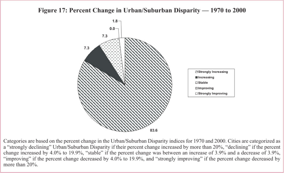
In our prior report in this series, we found the majority of the central cities themselves witnessed improvement in their Intercity Hardship Index scores from 1970 to 2000. However, when we look at the percent change in the Urban/Suburban Disparity Index scores from 1970 to 2000, illustrated in Figure 17, we see those scores significantly worsened in over 80 percent of the areas studied. Put simply, progress in socioeconomic conditions in the suburbs outpaced those in the central cities.
Another way to describe change in Urban/Suburban Disparity over time is with respect to changes in how metropolitan areas rank relative to one another. This method focuses less on changes in Urban/Suburban Disparity relative to an area’s own past and more on the change over time relative to levels of disparity in other metro areas. Figure 18 reports the change in Urban/Suburban Disparity rankings from 1970 to 2000.
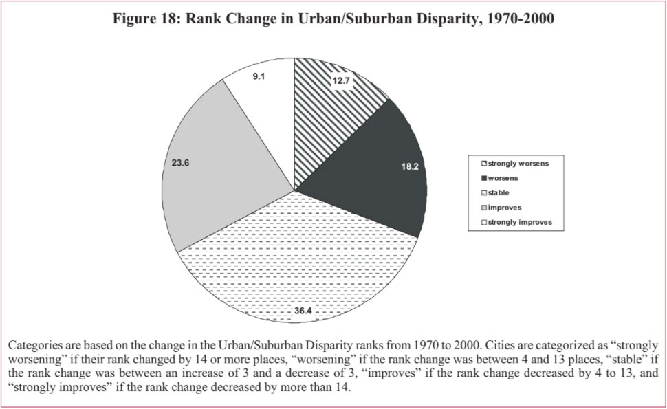
Relative to the other metropolitan areas in our study, 23.6 percent of the metro areas improved their rank standing from 1970 to 2000 and an additional 9.1 percent strongly improved their ranking. Still, about 40 percent of the metro areas declined in ranking relative to the other metro areas.
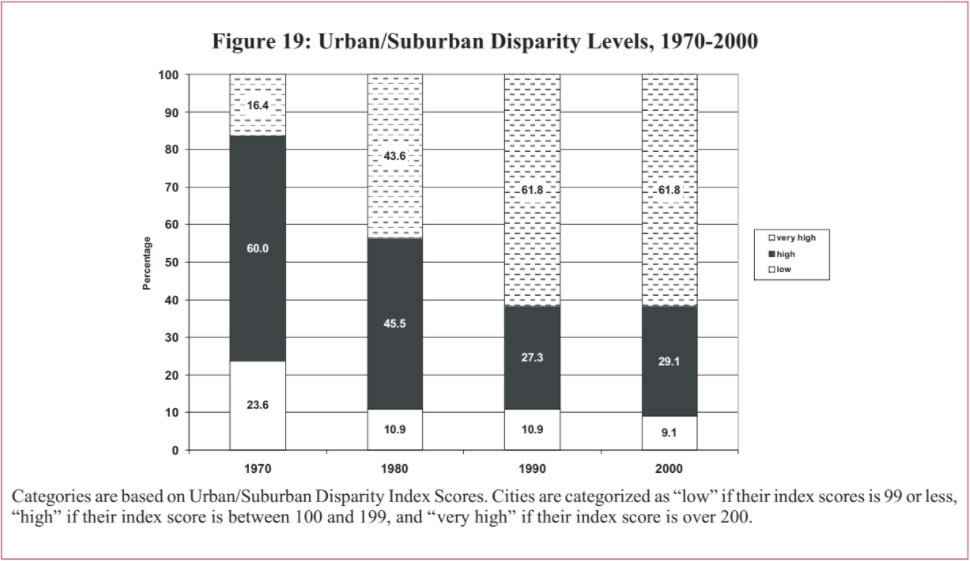
Figure 19 reports the level of Urban/Suburban Disparity for our group of metropolitan areas for each decade, 1970 to 2000. The proportion of metro areas with very high levels of social and economic disparity between central city and suburban areas increases each decade from 16.4 percent of the metro areas in 1970, to 43.6 percent in 1980, and 61.8 percent in both 1990 and 2000. The proportion with low levels of Urban/Suburban Disparity declined from a high in 1970 of 23.6 percent, to 10.9 percent in 1980 and 1990, to a low of 9.1 percent in 2000.
Next comes a regional breakdown on the share of metro areas whose rank on the Urban/Suburban Disparity Index strongly worsened, worsened, stabilized, improved, or strongly improved from 1970 to 2000. Certain patterns are evident.
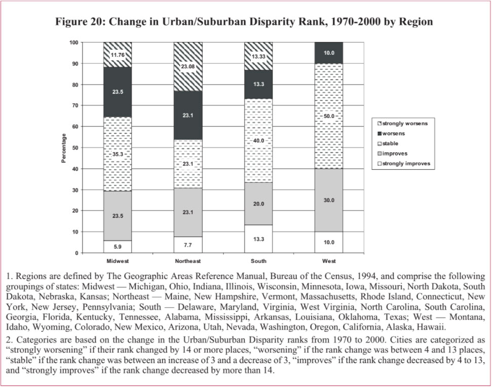
Metro areas in the West fared better than other regions. Forty percent of the metro areas improved their rank on disparity. Ninety percent remained stable or improved. No metro areas strongly declined, or worsened, in their disparity rank (see Figure 20).
Metro areas in the Northeast fared the worst of all regions. A total of 46.2 percent worsened their rank on urban/suburban disparity from 1970 to 2000 with half of those strongly worsening. Less than 30 percent of the metro areas in the Northeast improved.
Metro areas in the Midwest were slightly better off than the Northeast, but still did not fare well. Thirty-five percent worsened in Urban/Suburban Disparity ranking, with about 12 percent strongly worsening. Only 29.4 percent of the metro areas in the Midwest improved their ranking on Urban/Suburban Disparity.
In between are the metro areas in the South. One-third of the metro areas in the South improved. The South had about twice the proportion of metro areas than in the Northeast and Midwest that strongly improved on urban/suburban disparity. In fact, the South is the region with the highest share of metro areas with strongly improving ranking on disparity.
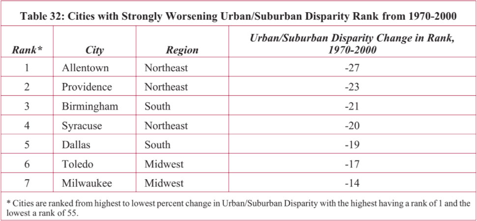
Table 32 presents the metro areas that had significant declines in their Urban/Suburban Disparity ranking from 1970 to 2000. Most of these areas had high levels of Urban/Suburban Disparity in 1970, except for Dallas and Syracuse with low levels but approaching high levels. By 2000, every one of these metro areas had very high Urban/Suburban Disparity Index scores.
In relation to the other metro areas in our study, those in the Northeast and Midwest were more likely to have worsened their Urban/Suburban Disparity ranking from 1970 to 2000. Houston, Norfolk, and Salt Lake City had low Urban/Suburban Disparity in 1970, but by 2000 had high levels. The remaining metro areas in Table 33 moved from high to very high Urban/Suburban Disparity from 1970 to 2000.
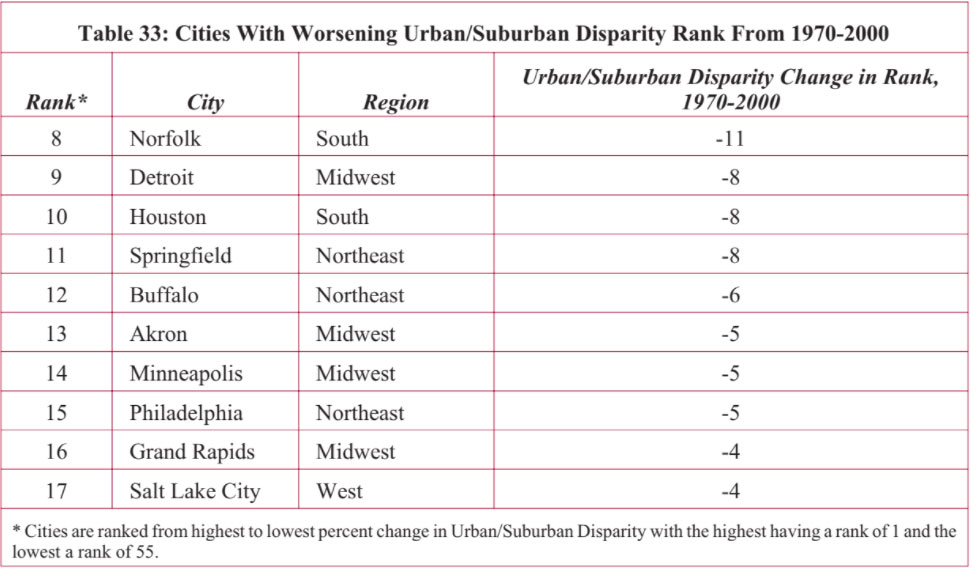
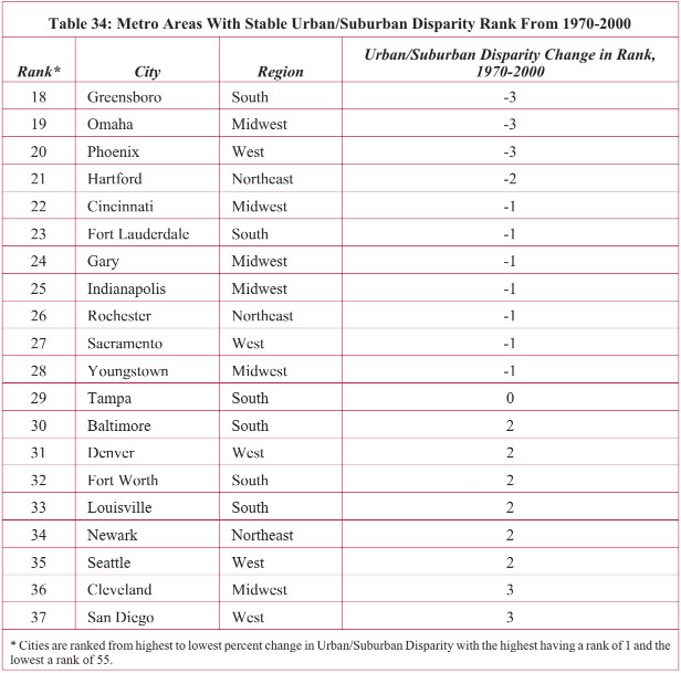
Table 34 presents the metro areas that had stable ranks on Urban/Suburban Disparity from 1970 to 2000. Greensboro, Fort Lauderdale, Seattle, and San Diego retained comparatively low levels of Urban/Suburban Disparity; Indianapolis and Tampa remained among those ranked with high levels; and Baltimore, Cleveland, Gary, Hartford, Newark, and Rochester retained rankings of very high levels of urban-to-suburban disparity.
Half of the metro areas in the West remained stable in rank on disparity. Forty percent of those in the South, 29 percent in the Midwest, and 23 percent in the Northeast also remained stable.
Only one metro area, Columbus, strongly improved its rank on the Urban/Suburban Disparity Index from 1970 to 2000. Although it improved relative to other metro areas on disparity, Columbus nonetheless continued to be categorized with high levels of disparity over the thirty year period. In fact, each of the metro areas listed in Table 35 with improved ranking on disparity had increases in their Disparity Index scores from 1970 to 2000; their increases were not as large as those in other metro areas, and therefore their rank improved.
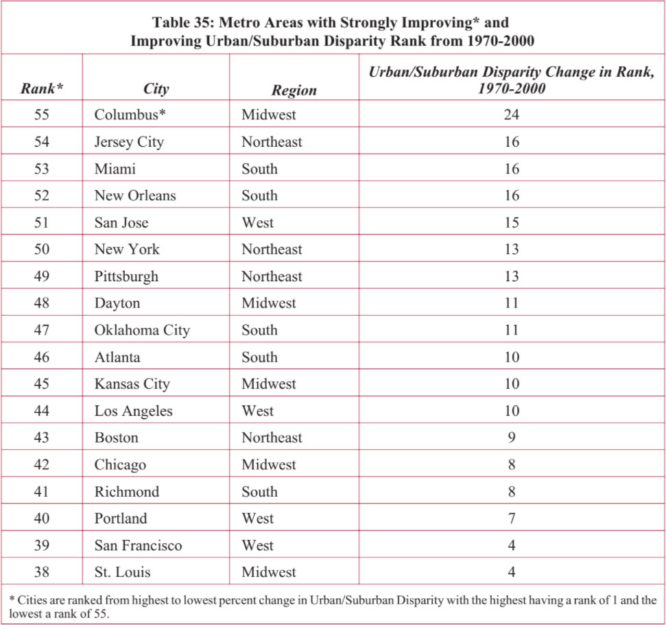
All regions had metro areas with improving Urban/Suburban Disparity ranks. Metro areas in the West led, with 40 percent improving on disparity, followed by 33 percent of those in the South, 31 percent in the Northeast, and 24 percent in the Midwest.
Nathan and Adams’ original report provides evidence that central cities had less improvement in their intercity hardship scores from 1970 to 1980 when their “metropolitan hardship” was high. We tested to see if this finding remained true with thirty years of data.
Close to three-quarters of the central cities in our study saw reductions in their Intercity Hardship Index scores between 1970 and 2000, indicating improving socioeconomic conditions.12 When we analyzed the degree of the central cities’ improvements in relation to urban-suburban disparity, we find — as Nathan and Adams found — that there is less improvement in Intercity Hardship in metro areas with higher urban-suburban disparity.
Figure 21 below illustrates the relationship between Intercity Hardship and Urban/Suburban Disparity, reflected in a comparison of the percent decrease in Intercity Hardship between 1970 and 2000 among different metro areas according to their levels of Intercity Hardship and urban- to-suburban disparity in 1970. In short, we found less improvement in Intercity Hardship where the degree of socioeconomic disparity between city and suburb is highest.
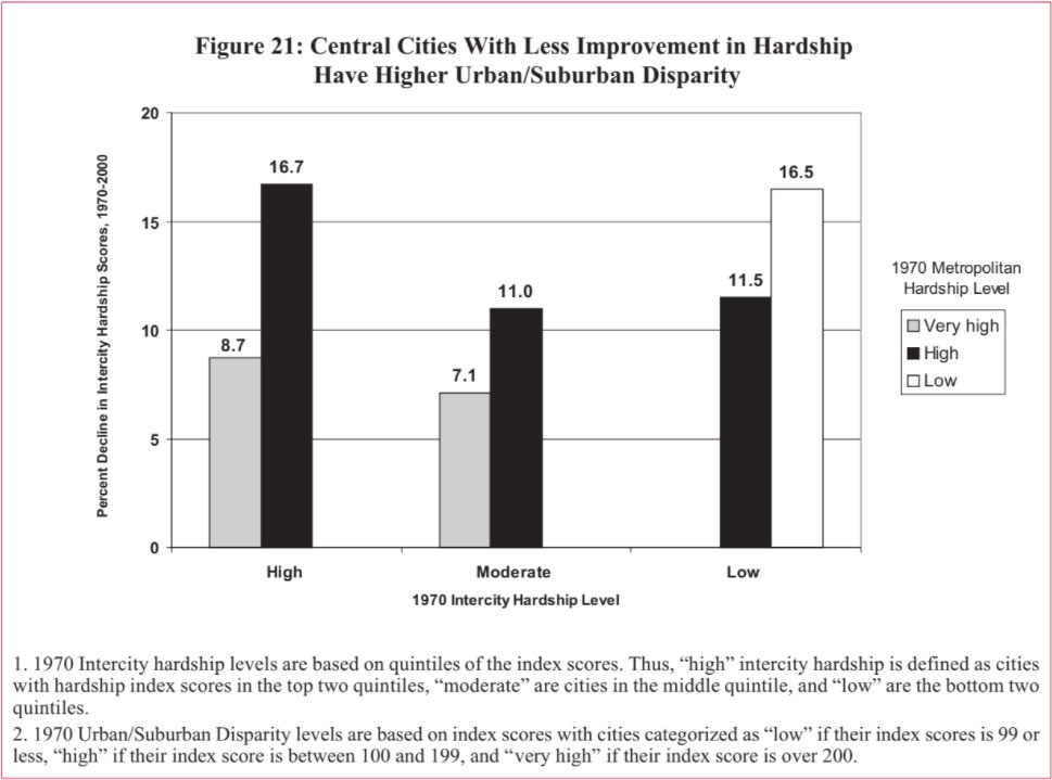
Among metro areas with high urban hardship in 1970, those categorized with very high Urban/Suburban Disparity had a decline in Intercity Hardship scores of 8.7 percent from 1970 to 2000, while those with only high levels of Urban/Suburban Disparity had more improvement with a 16.7 percent decline in Intercity hardship from 1970 to 2000. The same pattern is seen across the range of Hardship Index categories. Among metro areas with moderate Intercity Hardship levels in 1970, those with high levels of Urban/Suburban Disparity had an 11 percent improvement in their intercity socioeconomic conditions from 1970 to 2000, while those with very high Urban/Suburban Disparity only had a 7.1 percent improvement in Intercity Hardship from 1970 to 2000. Among the cities with low urban hardship in 1970, there is less improvement over thirty years in their urban socioeconomic conditions if the city had high levels of suburban-urban disparity as opposed to low levels.
The finding that central cities have less improvement when there is a higher level of socioeconomic disparity with their suburban areas has important policy implications. To the degree that socioeconomic conditions become less polarized between the suburbs and the central cities of major metropolitan areas, the more likely it is for urban revitalization efforts to succeed.
We explored the relationships between degree of poverty concentration, disparity in urban-to-suburban socioeconomic conditions, corresponding Hardship Index levels, and several factors associated with urban hardship. These include: elasticity of city boundaries over time, concentration of the metropolitan area population within the central city boundaries in 2000, proportion of new versus old housing stock being used in 2000, residential segregation, and violent crime reports in 2000.
In our previous report in this series, we found an association between city land area and Intercity Hardship Index scores. Central cities with higher levels of socioeconomic hardship conditions tend to have static, inflexible boundaries while cities with lower levels of hardship tend to have expansive boundaries. We tested this factor of a city’s ability to capture growth on its periphery with our measure of poverty impaction. We used percentage change in the land area of cities from 1970 to 2000 as a measure of their boundary elasticity. A change in land area of less than 10 percent is considered static, between 10.0 and 49.9 percent change in land area is categorized as low flexibility in city boundaries, 50.0 to 99.9 percent change is moderate flexibility, and over 100 percent change in land area is high flexibility.
The results illustrated in Figure 22, on the next page, indicate similar findings as we reported for the Intercity Hardship measure.
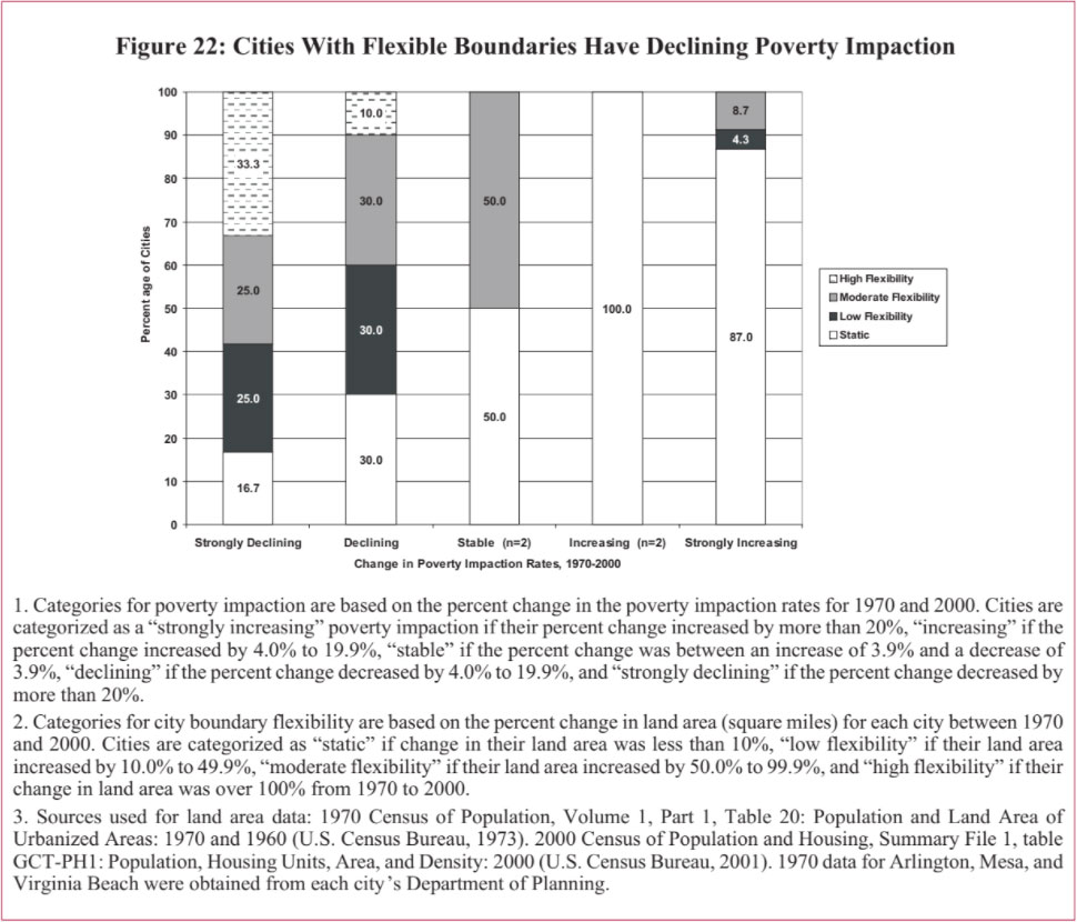
We had much the same results with respect to the relationship between static city boundaries and higher degree of disparity in socioeconomic conditions between central cities and surrounding suburban areas. As illustrated in Figure 23:
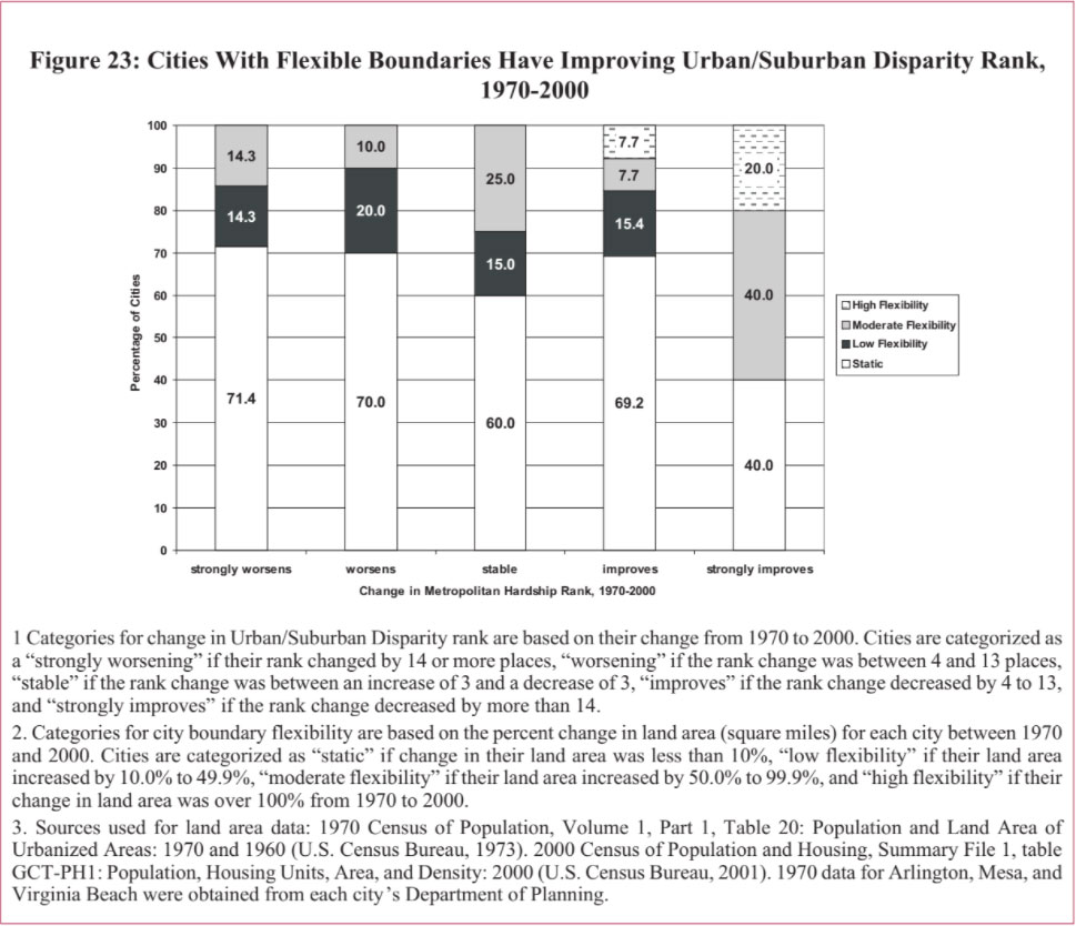
When we look at the results by region, we see some interesting patterns between flexible city boundaries, poverty impaction and Urban/Suburban Disparity. In Section III, above, we noted that the majority of cities in the Northeast and Midwest experienced strongly increasing rates of poverty impaction from 1970 to 2000. In Section VI, we saw the same trend with the Northeast and Midwest having the greatest increases in Urban/Suburban Disparity for the same thirty year period. The most improvement in poverty impaction rates occurred in the South, while the most improvement in Urban/Suburban Disparity occurred in the West and, to a lesser degree, in the South.
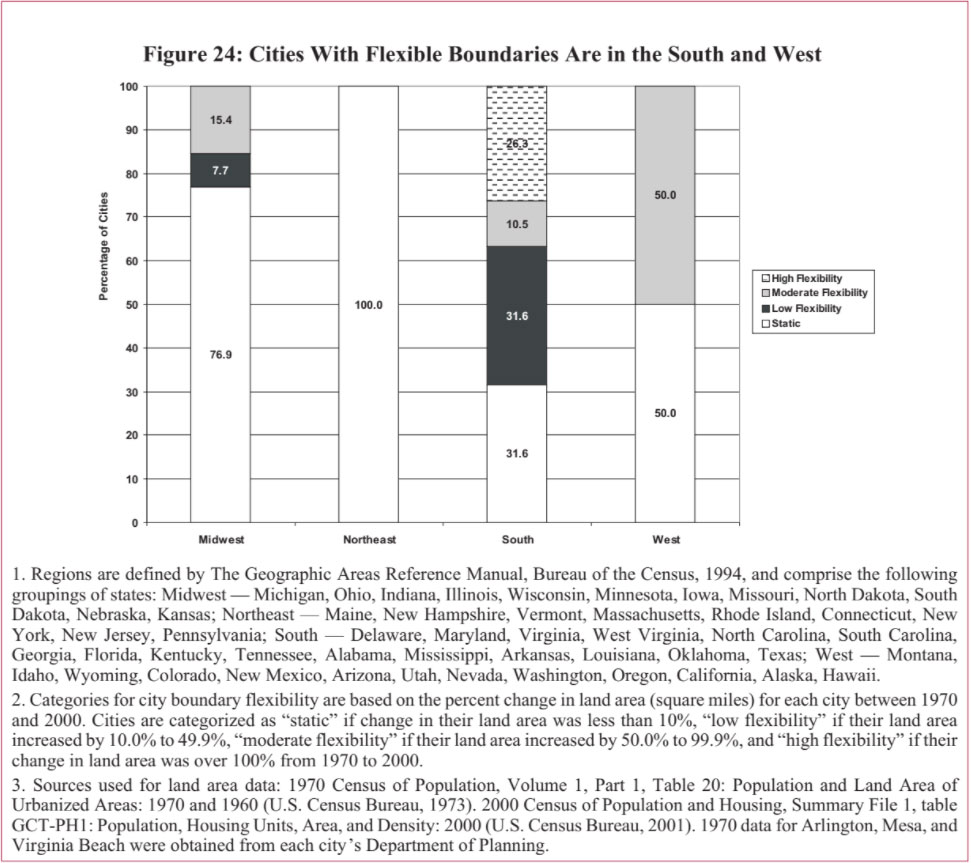
Figure 24 illustrates the percentage of cities in each region by the degree of boundary flexibility from 1970-2000. The two regions — Northeast and Midwest — that had the largest increases in poverty impaction and suburban-urban disparity had the highest proportion of cities with static city boundaries. The regions with improving poverty impaction and suburban-urban disparity — the South and West — had the highest proportion of cities with flexible boundaries.
We also tested for relationships between population dispersion — measured by the share of population within a metropolitan region that resides within the boundaries of the central city — and poverty impaction. We previously reported that as the percentage of metro population living within the central city boundaries increases, the Intercity Hardship score decreases, indicating that residents living in cities with a greater ability to incorporate higher shares of the total metro area population fare better in socioeconomic terms than residents in cities without this ability. Figure 25 illustrates the relationship between the concentration of metro area populations within central cities and the degree of poverty impaction in 2000.
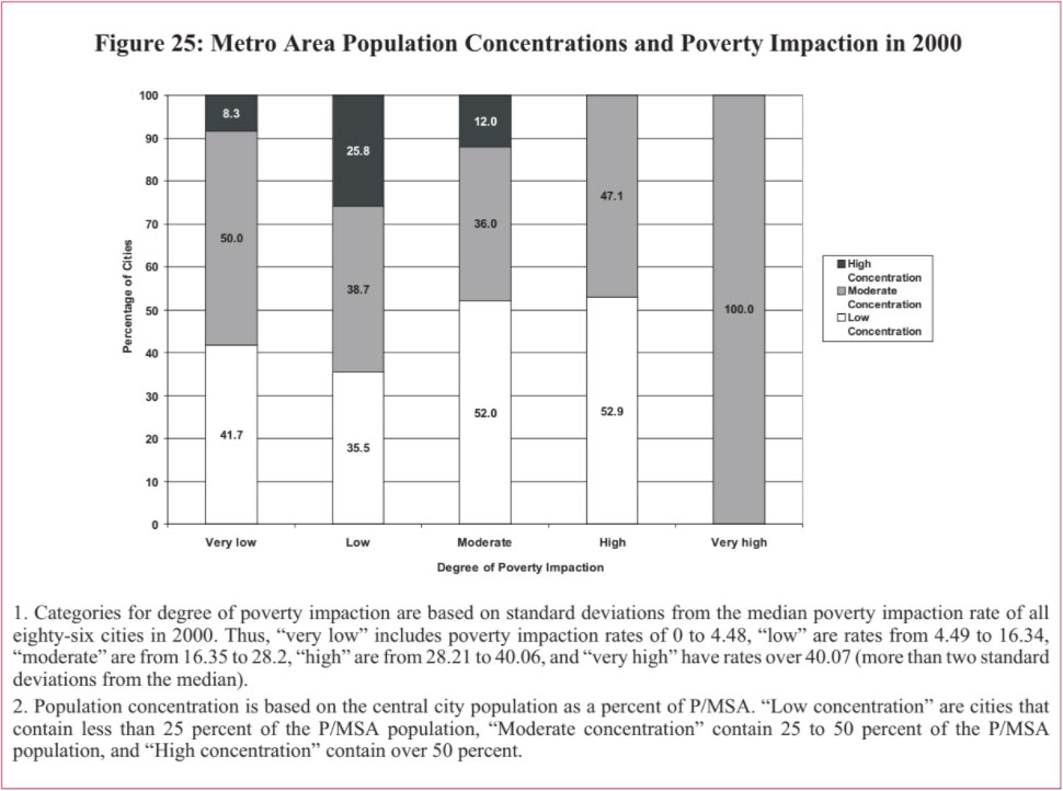
We see a similar association between metro population concentration and degree of disparity in socioeconomic conditions between central cities and surrounding suburban areas.
Figure 26 reports that in 2000 16.7 percent of the metro areas with low levels of Urban/Suburban Disparity had high shares of the population living within the central city, compared to only 4 percent of the metro areas with very high levels of Urban/Suburban Disparity. Conversely, 64 percent of the metro areas with very high Urban/Suburban Disparity had low shares of their population living within the central city versus less than 45 percent of the areas with low Urban/Suburban Disparity.
This corroborates findings concerning relationships between Intercity Hardship and metro population dispersion; that is, those metro areas that have central cities incorporating higher shares of the total metro-area populations have less disparity between central city socioeconomic conditions and those in the rest of the metro area, than do those places where higher shares of the people in the metro area live outside of the central city boundaries.
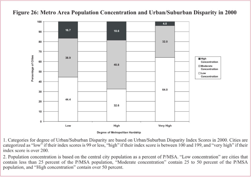
Our previous report in this series found a statistically significant relationship between higher levels of residential segregation by race and higher levels of Intercity Hardship. Conversely, we also found cities with lower levels of racial segregation to have lower levels of urban hardship, and found that cities showing improvement in their hardship scores from 1990 to 2000 tended to have considerably larger reduction in their levels of racial segregation than cities with worsening hardship levels over the 1990s.
We again used as a measure of residential segregation an Index of Dissimilarity. This statistic measures the evenness with which African Americans and Whites are spread across each of our study cities. Figure 27 illustrates the association between a higher level of residential segregation and a higher level of poverty impaction.
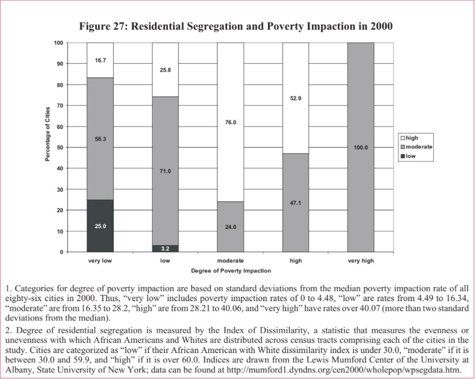
We also looked at the change from 1990 to 2000 in residential segregation and poverty impaction. As can be seen in Figure 28, while all cities experienced a decline in residential segregation, the degree of the decline varies by level of poverty impaction.
We also analyzed the relationship between residential segregation by race and Urban/Suburban Disparity Index scores in 2000. We expected a relationship between residential segregation and Urban/Suburban Disparity since other scholars have well-documented the negative economic and educational affects that residential segregation has on city residents. We also expected these findings to track our experience on Intercity Hardship: cities with higher levels of urban hardship tend to have higher levels of residential segregation.
Figure 29 illustrates that, indeed, metro areas with higher Urban/Suburban Disparity tend to have higher levels of residential segregation.
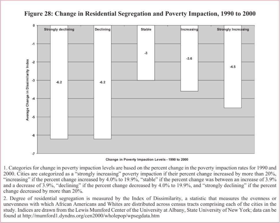
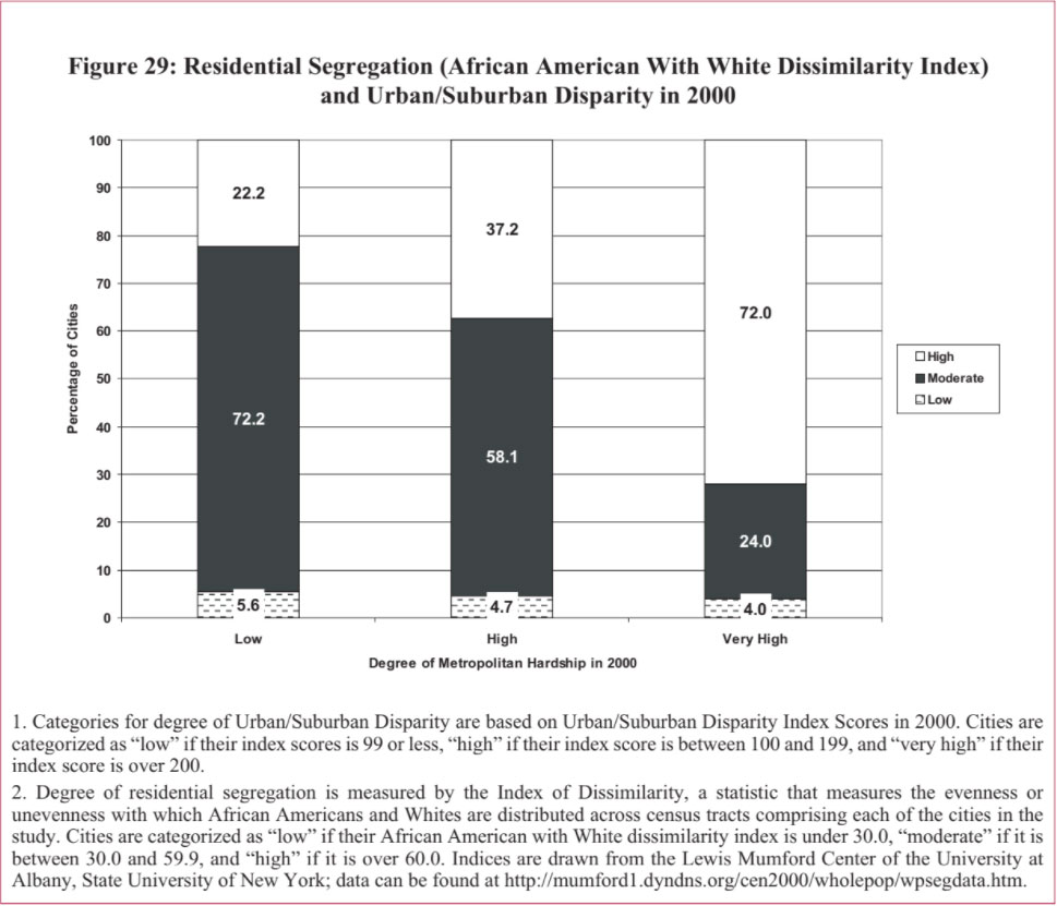
Our previous report in this series found a statistically significant relationship between higher levels of older housing stock and higher levels of Intercity Hardship. We also expect that higher levels of older housing would be related to higher levels of poverty impaction — that is, areas with older housing stock would be in areas with a concentration of people living in poverty.
Figure 30 illustrates the relationship in the 86 cities between the percentage of cities’ housing stock built before 1940 (our definition of “older housing”) and the degree of poverty impaction for the year 2000.
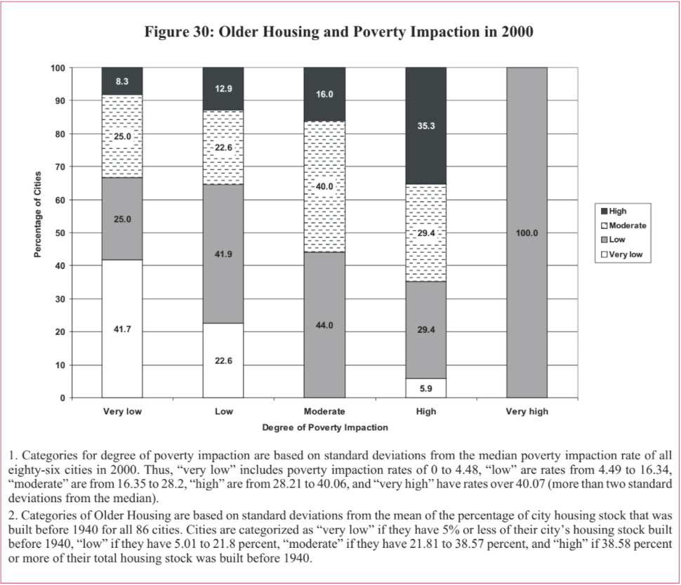
To see if this finding holds for Urban/Suburban Disparity, we analyzed the relationship between the percentage of older housing and the degree of Urban/Suburban disparity in 2000 (see Figure 31).
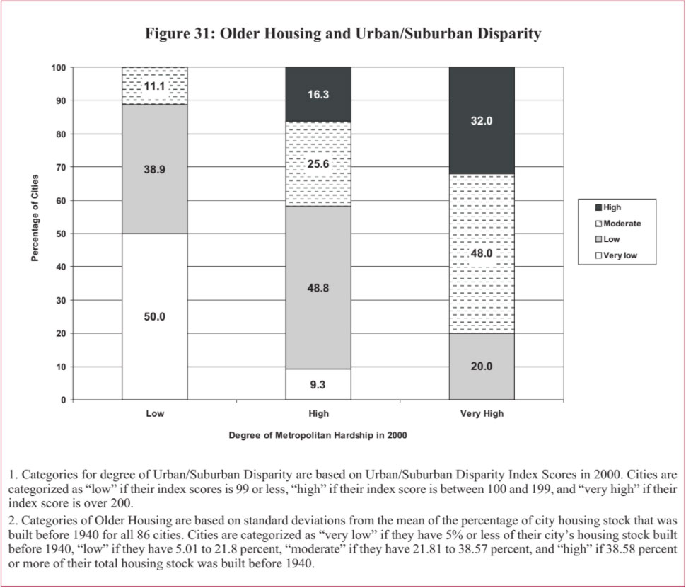
Overall, major metropolitan areas in the United States had declining rates of violent crime over the time span of our report. From 1990 to 2000, over 90 percent of the cities in our study had declines in the violent crime rate. Figure 32 shows that cities across all categories of Urban/Suburban Disparity had reductions in their levels of violent crime from 1990 to 2000.
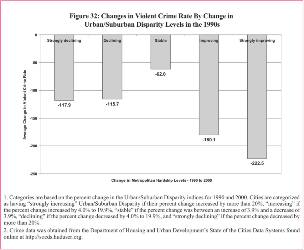
In our study on Intercity Hardship, we found that central cities that had improving urban hardship levels from 1990 to 2000 also had a greater degree of decline in reported violent crime (most cities in our study had declines in reported violent crime). One might expect to see a similar strong decline in cities with a strongly declining poverty impaction. However, as Figure 33 demonstrates, we found quite the opposite. The largest declines in reported violent crime from 1990 to 2000 tended to occur in cities with increasing levels of poverty impaction.
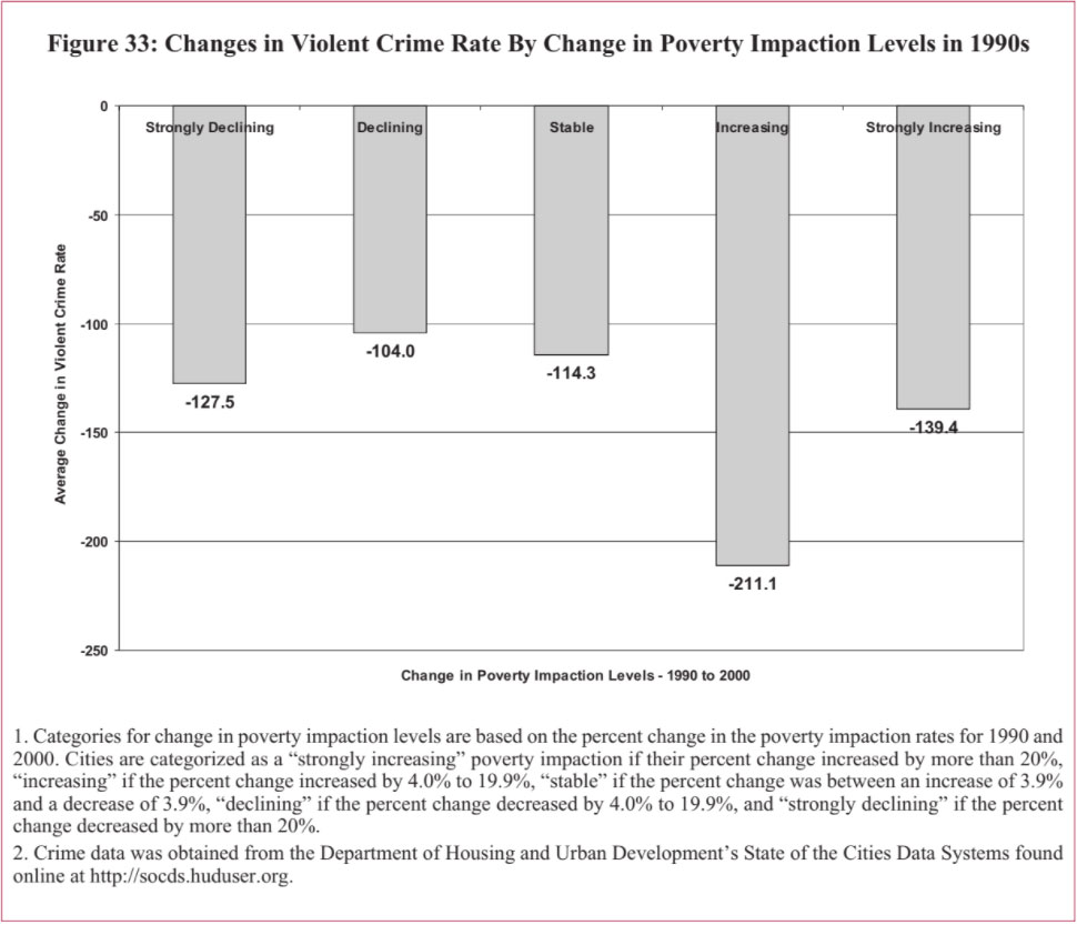
This report brings together several perspectives on urban hardship. We draw on an index measuring trends in social and economic conditions among the largest central cities in the most-populated metropolitan areas in the United States. We focus on concentrated poverty — what we term poverty impaction — defined by the percentage of poor people who live within extreme poverty areas where 40 percent or more of the population have household incomes below the poverty level. We widen the view, measuring change in metropolitan hardship through an index of social and economic indicators for the most-populated metropolitan areas in the U.S. And we assess the degree of disparity in social and economic conditions between central cities and their surrounding metropolitan areas. The discussion extends from our report on urban socioeconomic conditions between 1970 through 2000, which built upon the foundation for this research Nathan and Adams constructed more than three decades ago.
A summary view — looking across the several perspectives on hardship, time periods, and trends — provides two distinct groups of places. One set emerges of cities and metropolitan areas that are the most challenged — those most frequently listed at the most negative end of the spectrum, be it on Intercity Hardship, Metropolitan Hardship, Poverty Impaction, or Urban/Suburban Disparity. And, a second group emerges of those places most frequently listed at the most positive end of the spectrum on these measures.
Cleveland and Milwaukee tie for the position of “most challenged” in terms of the frequency at which they are listed at the most-negative end of the spectrum on our measures of hardship back to 1970. Five others tie for second: Birmingham, Buffalo, Detroit, Philadelphia, and Rochester. Tying for third-most challenged from 1970 to 2000 are Baltimore, Miami, Newark, and Norfolk.
Looking at the larger number of cities and metropolitan areas included in the analysis from 1990 to 2000, this group expands. Seen over the decade of 1990s, Bakersfield, California, emerges as most-challenged, in terms of the frequency of its appearance among the most-negative measures of hardship. Six places tie for second: Detroit, Fresno, Hartford, Los Angeles, New Orleans, and Santa Ana. The position of third-most challenged place over the 1990s goes to a five-way tie: Baton Rouge, Cleveland, Gary, Miami, and Newark. Milwaukee and Rochester complete this list. Six of these cities and metro areas appear in both groups, those most-challenged from 1970 to 2000, and from 1990 to 2000. This subgroup, to be regarded as those places with deepest hardship on our measures, comprises:
With the notable exception of Miami, this group of most-challenged cities and metro areas shares common geographic location and economic history, as declining former centers of commerce within the rust-belt. Milwaukee lost nearly 17 percent of its central city population from 1970 to 2000, compared to declines of more than one-quarter in Rochester, nearly three-in-ten in Newark, and over 36 percent in Cleveland and 37 percent in Detroit. Metropolitan Detroit’s social and economic conditions are close to — even in some cases better than — the average. Unemployment is high and dramatically so in 1990, but Detroit’s index scores on poverty, per capita income, education, and especially on crowded housing actually outperform the average of places in our study, at the metropolitan level.
Quite the opposite is true for Detroit’s central city relative to social and economic conditions elsewhere, however. Apart from crowded housing, which is not a comparative problem, Detroit’s central city has vastly higher measures of relative hardship on such components as unemployment — worst among the study cities in 1990, poverty, education, and nonworking-age residents. With this contrast, not surprisingly, Detroit’s position on measures of disparity between its urban core and suburban areas is even more negative — ranked among the five worst in the study both for 1990 and 2000.
A similar pattern can be seen for Milwaukee, Newark, and Rochester. For each of the three, index scores for hardship at the metropolitan level are actually better in 2000 than the average among all metro areas in the study. But for Milwaukee, Newark, and Rochester, central cities perform considerably worse on measures of social and economic hardship than do other cities. And in each place, the disparity between the relative condition of the central city and that of the rest of the metropolitan area is even more pronounced and more profoundly negative when compared to other cities and metro areas.
Miami particularly stands out in having high relative hardship compared to other areas both at the central city level, and for the metropolitan region. Miami’s index score for Metropolitan Hardship placed it fifth-worst in 1990 and fourth-worst in 2000, while its central city ranked with higher hardship than all the others analyzed in 1990, and all but one in 2000.
Four of the cities and metropolitan areas for which we have data back to 1970 tie for the position of overall “best.” They are Omaha, Portland, San Francisco, and Seattle. Three others tie for second: Columbus, Indianapolis, and Oklahoma City. And five more tie for third: Denver, Houston, San Diego, San Jose, and Tampa.
Among the larger pool of cities and metropolitan areas analyzed from 1990 to 2000, three tie as most frequently listed among the places with lowest hardship measures. They are Raleigh, San Francisco, and Seattle. Next are Arlington and Virginia Beach, tied for second, followed by Austin, Charlotte, and San Jose, crossing the line together in third. Then come Mesa, Salt Lake City, and San Antonio, as a group, with four more places close behind: Albuquerque, Anaheim, Columbus, Denver, and Little Rock.
Five of these places are among those with most consistently low measures of hardship viewed from 1970 to 2000 and over the 1990s. This group, with the overall best performance on conditions of hardship, includes:
Like Miami’s position among the most-challenged group, Columbus, Ohio, stands apart in terms of its geography and history from other cities and metro areas that fare best most consistently on our measures of social and economic trends. Areas on the sunny side of the hardship spectrum concentrate in so-called “Sunbelt” areas of the West, South, and Pacific Northwest, as in the cases of Denver, San Francisco, San Jose, and Seattle. These areas tend to have economies centering on newer age technologies and related services, rather than traditional manufacturing and distribution.
In 1990, the central city areas of San Francisco and San Jose were slightly better than average — at 33.4 and 36.8, respectively, compared to an average of 37.7 among all central cities studied. By 2000, this comparative favorability widened — index scores of 20.2 for San Francisco and 31.0 for San Jose, compared to 35 among all cities. Seattle, in particular, as well as Denver, and Columbus, compared even more favorably to the average in 1990, and they widened this advantage by 2000.
These lowest-hardship central cities look strong compared to average scores on virtually all of the variables that comprise our hardship index. Relative scores on poverty in these fortunate cities, for example, range from about one-third to one-tenth the average among all central cities in the study. Their levels of educational attainment — particularly for Seattle — compare especially favorably.
One exception in the parade of good news comes from the high cost and limited availability of housing in San Francisco and San Jose, however. The average index score on crowded housing among the 86 central cities was 13.9 in 1990 and 13.1 in 2000. But San Francisco was far higher, at 24.9 in 1990 and 21.7 in 2000, and San Jose was well more than twice the average score, at 35.7 in 1990 and 33.9 in 2000.
The trends and policies that separate cities and metropolitan areas faring well from those faring comparatively poorly on measures of hardship are illustrated in the contrast between two places within the state of Ohio: Cleveland and Columbus.
Cleveland, historically the largest urban center in Ohio, is in many ways typical of older citiesthroughout the rust belt. The city and regional economy are now more diverse than they were through the 1970s, and the city has embarked on a significant redevelopment effort to bring commercial, entertainment, and other retail activities back to downtown. But overall employment in the city and region remain heavily reliant on the manufacture of durable goods, especially those linked to the manufacture of American-made cars, which are much affected by fluctuations in the economy and the market for cars.
Known as a city of ethnically diverse immigrant groups, Cleveland shows the accumulated effects of high political fragmentation and racial segregation. There are some 89 municipalities in the Cleveland metro area and 60 local governments in Cuyahoga County alone, each with their own zoning and planning powers. Likewise, the area is divided into 56 separate school districts, 32 just within Cuyahoga County. Cleveland has one of the highest levels of racial segregation among cities in the US — with a Dissimilarity Index score in 1990 of nearly 90 percent. The combination of economic change, racial segregation, and political fragmentation has led to rapid population loss in the central city, sprawl and population gain among other political jurisdictions in the metro region outside the City of Cleveland, and school desegregation orders with limited effect, since such orders are not able to stretch across school systems.
From 1970 to 2000, the City of Cleveland’s land area grew by 2.2 percent, compared to an average of 49.9 percent among the 86 cities in the study. The population of the central city, meanwhile, declined by more than 36 percent over this same period. Cleveland has the worst problems of sprawl among Ohio’s cities, according to researchers at The Ohio State University, with its suburbs growing almost four times faster than the region as a whole.23 As of 2000, only a little more than 21percent of the population in its metro area lived within the boundaries of the City of Cleveland.
Cleveland’s relative standing on social and economic conditions at the metropolitan level are close to the average among all the metro areas studied in 1990 and 2000. But Cleveland’s central city has social and economic conditions that are considerably worse than the average among other cities in the study; index scores on poverty, low educational attainment, and unemployment in Cleveland are roughly twice these averages. And the comparative disadvantage of Cleveland is even more pronounced on measures of disparity between its central city and the rest of the metropolitan area. The exception is the measure of crowded housing, on which Cleveland compares quite favorably at the central city and metropolitan level.
Columbus is, by contrast, a highly elastic city and it had the least evidence of sprawl among metro areas in Ohio.24 Because of an aggressive annexation policy that city administrations have used since the 1950s, outlying areas that in most metropolitan areas would be suburbs have instead been incorporated within the City of Columbus. Between 1970 and 2000, reflecting this policy, the land area of Columbus grew from 134 to 210 square miles — an increase of more than 56 percent, which is above the average of the cities in the study.
In addition to annexation, Columbus has entered into agreements with several suburban school districts that permit children living in the outlying areas of the city to attend nearby suburban schools. The result has been that many families seeking to send their children to suburban schools have been able to do so while still living within the city.
Though somewhat higher than the average among all cities studied, segregation in Columbus is considerably less than in Cleveland. All-told, while Cleveland lost more than a third (36.3 percent) of its central city population from 1970 to 2000, the central city population of Columbus grew by nearly the same proportion (31.9 percent).
The manufacture of durable goods — so central to Cleveland’s regional economy, but susceptible to continued decline — plays a far smaller part for Columbus. The economy of Columbus is keyed to the city’s role as a center for government, being the state capitol, education, and financial services. Large employers include state government, The Ohio State University, and a number of the largest insurance companies in the country.
Social and economic conditions for the central city of Columbus are considerably better than the average among the study cities, across the board. Educational attainment and housing appear to be especially favorable in Columbus relative to other areas. In terms of the aggregate index, Columbus was among the handful of central cities in the best shape in 1990, and it improved its already very strong relative position somewhat over the 1990s.
Measures of relative hardship at the metropolitan level are similarly favorable for Columbus; already strong in comparison to other metropolitan areas in 1990, social and economic indicators for Columbus in 2000 are even stronger, well illustrated by an improvement in rank on Metropolitan Hardship of 13 places during the 1990s.
But herein lays a worrisome challenge for Columbus. Although the central city is strong and improving relative to other central cities, the pace of improvement for the surrounding metropolitan area is much greater. Indeed, this difference is large enough for Columbus’ relative rank on the Index of Urban/Suburban Disparity to worsen by 9 positions from 1990 to 2000. This combination of good news and underlying challenge is also what we found for urban and metro areas overall.
The summative view and the contrasts between Cleveland and Columbus point to areas of progress and continuing challenges for America’s metropolitan regions.
In relative terms, socioeconomic hardship conditions improved from 1970 to 2000 among nearly three-quarters of the largest central cities in the most-populated metropolitan areas in the country. In contrast with conventional images of widespread urban decay, we found that some 15 percent of these cities had high or very high levels of relative hardship in 2000, while only about one in five had worsening conditions of socioeconomic hardship from 1970 to 2000.
A similar pattern of improvement emerges from a comparison of poverty concentration in these same places over the 1990s. Poverty impaction declined in more than three-quarters of these cities, and declined significantly in over two-thirds of them between 1990 and 2000.
We found that high levels of Metropolitan Hardship were not common. About half the metropolitan areas had low or very low levels of hardship in 2000. Slightly more than ten percent of the metropolitan areas have high or very high levels of hardship, compared to over 15 percent of the central cities.
In most — 53.5 percent — of the metropolitan areas, hardship conditions improved or improved strongly over the 1990s. More than seven in ten of these places have stable or improving Metropolitan Hardship from 1990 to 2000.
Almost nine in ten study areas in the Midwest and six in ten in the South had improving or
strongly improving Metropolitan Hardship over the 1990s.
Places with most notable improvement in Urban/Suburban Disparity levels over the 1990s tended to be from the West, with improvement fed by changes in dependency, educational attainment, and employment.
Aprimary challenge to cities is their ability to keep up with their suburbs. Although central cities show improvement compared to one another and to themselves over time, there is even more marked improvement in social and economic conditions outside of central cities in metropolitan areas. The trend in disparity between cities and suburbs during the 1990s is split roughly in half between areas showing growing or shrinking differences in hardship levels. Limited educational attainment, poverty, and crowded housing drove increasing disparities between central cities and their surrounding metropolitan areas.
The longer-term trend in disparity in socioeconomic conditions between cities and their surrounding metropolitan areas is more profoundly negative. The Urban/Suburban Disparity scores for more than eight in ten metro areas worsened significantly from 1970 to 2000. More than a quarter declined in rank on this disparity score, illustrating their decline relative to one another in terms of their central cities falling further behind their own suburbs.
More than six in ten areas in the Northeast and half of those in the West had increasing or strongly increasing levels of Metropolitan Hardship. None of the study areas in the Northeast have strongly improving Metropolitan Hardship, but over 60 percent have declining or strongly declining metropolitan conditions. This is a much more negative trend than we reported with respect to Intercity Hardship for the Northeast, with 28.6 percent of the cities having increasing or strongly increasing Intercity Hardship over the 1990s.
The pattern of regional variation in levels of hardship among the metropolitan areas is quite different from what we reported among the central cities. The South had the largest share of cities with low hardship and smallest share of places with high hardship. By contrast, the South has comparatively high levels of Metropolitan Hardship relative to other regions. The opposite is true in the Northeast, where cities are most likely to have high or very high levels of Intercity Hardship compared with those in other regions, but where metropolitan areas are less likely than those in other regions to have very high levels of Metropolitan Hardship.
Levels of concentrated poverty increased strongly for nearly half of the cities studied from 1970 to 2000, about twice the share of cities where poverty concentration decreased significantly over that same timeframe. Regional variation was substantial: increasing concentration of poverty being typical among cities in the Northeast and Midwest, decreases being the rule in the South, and an almost even split being evident among cities in the West.
The ability of cities to capture growth on their periphery has a clear and direct relationship to hardship conditions over time. We found significant, negative and population concentration with Intercity Hardship, Poverty Impaction, and with Urban/
Suburban Disparity. In short, cities able to capture — rather than be cut off from — growth on their
suburban perimeter have less concentrated poverty and less disparity in social and economic
conditions between their central cities and surrounding suburbs than places with larger shares of
metro-area population living outside the city’s boundaries.
Oklahoma City and San Antonio, for example, each had a more than 100 percent increase in land area, and strongly declining poverty impaction rates from 1970 to 2000. Denver, Phoenix, Portland, San Diego, and San Jose all had moderate growth with between 50 and 99 percent increase in land area. By contrast, Allentown and Providence had the largest rank change in worsening urban/suburban disparity, losing over 20 places in rank, and had no land growth in the thirty year time frame from 1970 to 2000. Milwaukee, Toledo, and Syracuse also had strongly worsening disparity and static growth in land area.
The beneficial impacts of population concentration are similarly in evidence. San Jose, for example, had no poverty impaction and a high population concentration with over 53 percent of the metro population living within the central city. Albuquerque, Jacksonville, San Antonio, and Wichita all had low levels of poverty impaction in 2000 and high levels of population concentration — over 60 percent. By contrast, high-hardship cities like Newark, Norfolk, and Providence all had less than 15 percent of their areas’ populations living within their central cities. Fresno had the highest poverty impaction rate in 2000 at 47.7 and only had moderate population concentration at less than 50 percent.
As a second key factor, we saw that racial segregation was also related strongly with Intercity Hardship, Poverty Impaction, and Urban/Suburban Disparity: higher levels of residential segregation by race was related strongly with higher levels of central city hardship, concentrated poverty, and with larger levels of disparity in socioeconomic conditions between central cities and their surrounding metropolitan areas.
Areas with comparatively high levels of racial segregation tended to have high levels of poverty impaction and hardship. Cleveland, Miami, Newark, and Philadelphia had high poverty impaction rates between 29.2 and 38.8 and high dissimilarity index scores over 75. Conversely, low residential segregation is only found in cities with low or very low levels of poverty impaction. Anaheim, Mesa and Santa Ana had no poverty impaction in 2000 and low African American with White dissimilarity indices at less than 30.
Areas with improvement on residential segregation tend to have larger reductions in poverty impaction levels from 1990 to 2000. For example, Las Vegas, Portland, and San Antonio all had strongly declining poverty impaction and decreases in their dissimilarity indices of over 9.2. Cities whose residential segregation did not improve as much or at all also tended to have little or no improvement in poverty impaction levels. Allentown had the largest increase in poverty impaction of over 11,000 percent, and a dissimilarity index change of only -2.1.
Residential segregation was also related to hardship at the metropolitan level. Mesa had a low Metropolitan Hardship score of 87 in 2000, and a low African American with White dissimilarity index score of 28.2. At the other extreme, are cities like Cleveland, Detroit, Hartford, Milwaukee, and Newark with Metropolitan Hardship scores over 280 and dissimilarity scores over 60.
Along with the positive force of integration, the central summative point from the analysis turns on the importance of interconnections between urban and suburban areas within metropolitan regions. We established a close, statistically significant, positive relationship between change in Metropolitan Hardship and Intercity Hardship levels. Areas with strongly improving levels of Metropolitan Hardship during the 1990s were comprised entirely of places with central cities experiencing improving or strongly improving levels of Intercity Hardship. Put simply: metropolitan regions do better as their central cities do better.
We also established an important relationship between change in hardship conditions and degree of Urban/Suburban Disparity. Places that have greater differences in social and economic conditions between their central cities and surrounding metropolitan areas saw less improvement in Intercity Hardship.
These findings signal several important directions for public policy. The combination of sprawl and government fragmentation have contributed to the spiraling decline in the tax base of inner-cities and inner-ring suburbs, the inefficiency of layered general purpose governments, and environmental degradation from longer and longer commute times. Challenges confronting cities and suburbs have been far easier to raise than to resolve. But a number of well-intended and well-designed initiatives have been advocated, and some successfully pursued.
Efforts to revitalize central cities and connect them as destinations for visitors and residents have had some purchase. In Charlotte, city development has centered on downtown amenities to attract corporate-sector employees, and transforming blighted neighborhoods into solid, mixed-income communities. Revitalization of Seattle’s downtown, similarly, was premised on making the area more attractive for residents, by concentrating on retail and residential development, and by forming a public/private partnership through the Downtown SeattleAssociation which was able to make additional investments in public-purpose infrastructure. Although city-specific development efforts can be positive, regional and metropolitan-level approaches are essential. Stronger connections between cities and their surrounding suburban areas, as has been shown in this study, are clearly linked to better social and economic conditions at city and metropolitan levels over time.
The performance of several cities and metropolitan areas provide powerful illustrations of the benefit of regional approaches. San Francisco has a unified city-county government and Indianapolis-Marion County consolidated their governments in 1969 — both number among the best-performing areas in the study.
Albuquerque’s aggressive annexation policy permitted the city to expand its boundaries dramatically and capture nearly all the development and growth that has happened in the region. There has been a relative absence of other municipalities in the metropolitan area, avoiding fragmentation. The city and the county have a common comprehensive land use plan.
Schools in New Mexico are funded by the state through an equalization formula, with local property taxes used only for capital projects, and the Albuquerque region has a single, unified school system. Similarly in North Carolina, the Charlotte-Mecklenburg county school district is county-wide, which greatly reduces movement from city to suburban areas in search of better schools, and facilitates racial integration across a wider school system.
With the possible exception of Indianapolis, perhaps no example of regionalism is better-known than Portland, Oregon. Portland’s renowned “urban growth area” planning has led to environmental protection, particularly of waterfront areas. Housing investments, transportation, land acquisition, and city/state cooperation on growth management have been especially successful in preserving farmland and open space, while focusing growth within the urban core of the region.
The state of Oregon’s Statewide Land-Use Planning act was adopted in 1973, and it requires local governments there to encourage urban development within urban growth boundaries; discourage urban sprawl; identify and preserve historic or architecturally significant properties; set aside and protect open space, water, and air quality; and preserve farmland. Local development plans must provide for affordable housing, energy conservation, and promote citizen participation. Metro, a state-chartered regional government, covers three counties, the city of Portland, and 23 other municipalities in the only directly elected regional government in the US. Its primary function is regional planning and growth management (though it also has operational responsibility for the Washington Park Zoo and the Oregon Convention Center), and it has the power to require local compliance with the regional plan.
Yet, despite the examples of regionalism’s successes, the powerful force of localism persists. Proposals to consolidate city and county governments have been rejected far more often than accepted by voters. Land-locked older cities with established, separately incorporated areas as their immediate neighbors are hard-pressed to do much about making their borders more flexible. If annexation and consolidation are beyond the reach of some, however, other opportunities for regionalism are to be had. Cross-governmental agreements for shared services and tax-pooling are among the most promising.
Dayton, Ohio, is in many respects a typical city of the rust belt, with an industrial history and economy built on manufacturing cars, related parts, and supplies, having experienced a fall-off in the industrial sector leading to pronounced job losses in the downtown and widening disparity with growth areas elsewhere in the metropolitan region. It was also typical of its region and state in political fragmentation — the city of Dayton’s immediate surroundings included some nineteen municipalities, a number of which had formed to thwart annexation by the city, and some seventeen public school districts. But forward-thinking leadership forged a cooperative agreement among the city of Dayton and surrounding municipalities by linking access to a county-funded pot of joint economic development project funds to a sharing of a portion of governmental revenues.
Begun in 1992, the ED/GE [standing for Economic Development/Government Equity] program provides an annual pool of $5 million in economic development grants (generated from a portion of a countywide sales tax) awarded by the County Commission to area governments participating in the revenue sharing pool. The revenue sharing pool is regarded as having produced a limited amount of redistributed aid, due to provisions included in negotiations on the compact that protect any jurisdiction from consistent “losses.” However, it has generated spinoff benefits: from the ED/GE example of regional cooperation among otherwise competing political jurisdictions, have since come similar agreements on regional approaches to affordable housing, to public funding for the arts, and regional support for professional minor league sports teams in the area. In the mid-1990s, when Dayton and a suburb were competing fiercely for a back-office operation threatening to move out of the city, the result was an economic development incentive funded from the regional pool, and an agreement from the suburb that ended up winning out to share a portion of the increased payroll tax collections it was to receive with the city of Dayton as compensation for the jobs that had moved from the city.
Cities and suburbs are hard-pressed to put together regionalism initiatives on their own. While the interest may begin at the local level, municipalities and counties are themselves the offspring of state governments. A host of policies at the state level wield influence, directly and indirectly, on the need for regional efforts and the likelihood of their success.
A number of states have recent or established practices that are sensitive to cities and their metropolitan context. North Carolina, for example, permits cities to annex unincorporated areas without a vote of approval from people living in such areas, based on annexation criteria that focus on contiguity, density, and ability to extend services. That state also makes it difficult for unincorporated areas to incorporate as a municipality. In order to do so, they must offer four or more basic services (from among: police, fire, solid waste, water, street construction, street maintenance, lighting, and zoning). They must levy a property tax of at least a given threshold level within five years of incorporation. And they must be more than five miles from a city of 50,000 or more people, unless such city grants permission.
Oregon requires all cities and counties to develop comprehensive plans for complying with the state’s land use act, with respect to Urban Growth Boundaries and related zoning requirements. Washington State has a similar but less stringent Growth Management Act. Oregon also requires localities to have plans for reducing vehicle miles traveled by specified levels, supported by transportation investments in mass transit, bicycle and pedestrian travel.
California’s state constitution requires the state to reimburse local governments when the state mandates a new local program of higher levels of service. The California Commission on State Mandates was created in 2005 to resolve disputes over claims by local governments that a state entity has imposed a reimbursable mandate.
Michigan has a state land bank authority that can acquire title to vacant or abandoned property through tax reversion, helping to assemble property and to convey it to nonprofit or other groups for redevelopment. Ohio’s “joint economic development districts” permit localities to trade infrastructure extensions for tax revenues from development, and Michigan’s “cooperative conditional land transfers” permit two jurisdictions to share property tax revenues from development on conditionally transferred property. Michigan also funds local school systems primarily through a state sales tax, distributed on an equalized basis, and prohibits local districts from enhancing school funding from their property tax base.
The state role in urban and particularly metropolitan policy is emerging, considerable, and not yet well understood. Plainly more research is needed on the character and comparative merit of state policies toward urban and metro areas. Researchers at the Rockefeller Institute have initiated a study gauging state policies with bearing on cities, metropolitan areas, and regionalism initiatives encompassing such matters as governmental foundation; sources of revenue, financial management and oversight; regionalism incentives on shared services support for pooling of revenues; land use planning; transportation and environmental regulation; and direct expenditures for programs of particular interest to metro areas. It is true that the fifty-five cities tracked over the longest period of this study lost some of their standing to their suburbs: they comprised 19 percent of the total population of the US in 1970, and about 14 percent of the US in 2000. But this puts the emphasis on the wrong place, on fragmentation within metro areas. In fact, the metropolitan areas themselves have largely held: the fifty-five metropolitan areas comprised 45.2 percent of the total US population in 1970 and 43.4 percent of the US population in 2000. And the larger group of eighty-six areas tracked over the 1990s grew as a share of the country. In 1990, 51.5 percent of all Americans resided within the eighty-six metropolitan areas included in this study. By 2000, these same areas were home to 54.5 percent of the US population.
Encouraging and understanding the metro level view is pivotal. History shows that appeals for regionalism on the grounds of “equity” have been largely unsuccessful, as have recent efforts to create centralized regional governments. Perhaps, as has been suggested, appeals made on the grounds of governmental efficiency and regional competitiveness will prove more effective.25 Plainly the data show that growing disparity between inner and outer communities in metropolitan regions is to the long-term benefit of neither metropolitan areas or to the central cities at their core.