New York State residents, workers, and businesses send more than $80 billion to the state government each year. These dollars come from taxes such as those on personal income, sales, and corporate profits; charges such as university tuition and hospital payments; and fees for driver’s licenses, air emission permits, and other purposes. Along with tens of billions of dollars in federal revenues, these resources are distributed around the state to pay for education, health care, transportation, public safety, and other programs.
For decades, citizens in every region of New York have raised questions about the geographic distribution of revenues and expenditures in the state budget. Upstate residents often believe they subsidize generous social welfare programs that disproportionately benefit Downstate; New York City and suburban interests frequently quarrel over funding for education and other programs; the Capital Region generally benefits whe state government expands but may suffer disproportionately during periods of budget difficulties. These disputes over resources are closely linked to political competition in which Upstate and Downstate may both have reason for concern. The majority of the state’s residents live in the metropolitan region centered in New York City, so that the Legislature inevitably has a Downstate majority; on the other hand, Upstate voters are more likely to turn out on Election Day, and thus candidates for statewide office make sure to pay tribute to the region’s concerns.
A clearer understanding of New York State’s actual fiscal policies may help reduce such longstanding tensions and lay the groundwork for more useful discussions over potential changes — an especially important undertaking when budgetary choices are increasingly difficult. As one essential starting point, this report analyzes and assesses the regional distribution of revenues and expenditures in the state’s fiscal 2009-10 budget. It estimates budgetary impacts in four regions:
The study uses the “state-funds” basis of revenues and expenditures. Thus it includes, for example, payments that are funded from the state’s own taxes, fees, public university tuition, hospital and other charges, but not those supported by federal aid. We exclude proceeds from state bond issuances, given the difficulty of allocating such revenues by region. To offset that exclusion (conceptually if not dollar-for-dollar), we also omit disbursements for debt service. Capital expenditures funded through tax and other state-funds revenues are included. The basic data for analysis are from the Comptroller’s Annual Report to the Legislature on State Funds Cash Basis of Accounting, for the fiscal year ended March 31 2010.1 Revenue and expenditure categories in this report follow those in the cash report. Additional data sources include the state Department of Taxation and Finance, the Division of the Budget, and other agencies.
At first glance, undertaking such a regional analysis may appear straightforward and uncomplicated. The state disbursed $26.1 billion of its own-source revenues to school districts, community colleges, and other recipients for education purposes in fiscal year 2010. Each district and each college is in a particular region. The state Transportation Department builds and paves bridges and highways, all in identifiable locations. A resident of Buffalo or Brookhaven typically collects a paycheck, purchases taxable goods, and pays the fee for a driver’s license all within one region. State agencies track the home county of each individual who pays income taxes, the county in which every taxable sale is reported, and the home or mailing address of anyone who pays a fee for a driver’s license.
Yet there are complications. That resident of Brookhaven might commute to work in Brooklyn. If she works for a state agency, should the state’s expenditure for her pay and benefits be attributed to her home location (which is in our Downstate Suburbs region), or her place of work (in our New York City region)?
What if 100 residents of Brookhaven work on Wall Street and each collects the average $311,000 salary that securities-sector employees earned in the city during 2009? Should their state income tax payments be allocated to Long Island, where they live — or to the city, where they work?
This report provides alternative scenarios for selected parts of the budget on both the revenue and expenditure sides. We provide two views of the regional distribution of the state’s largest nonfederal revenue source, the personal income tax — one analysis assuming that revenues are sourced to the taxpayer’s residence, and one ascribing revenues to the individual’s place of work. These alternative scenarios have particularly significant implications for New York City and the Downstate Suburbs. On the expenditure side of the budget, the analysis largely allocates state spending to where it “lands” — where the dollars are initially spent. Recognizing that the impact of such expenditures may be more widespread, we also present alternative distributions for payroll and other disbursements at selected state institutions — the State University of New York campuses, and the facilities operated by the Department of Correctional Services. These methodological choices also affect the resulting picture of the geographic distribution of payments.
Once we have the data on the regional distribution of the state’s revenue collections and its expenditures, how are we to assess them? Should a region’s share of state expenditures most closely reflect its share of the population, or of individuals living in poverty, or some other metric? What about revenues — should the tax burden be distributed on a per-capita basis, according to incomes, or by a formula that reflects these and other characteristics? We do not attempt to determine whether regions pay or receive their “fair share.” We do, however, present relevant demographic data for each region so that our factual findings on the geographic distribution of payments may be considered in a useful context.
The analysis covers all tax revenues that flow through the state budget. These include taxes imposed only in parts of the state, such as the taxes on commuters’ wages and on corporate income that are imposed within the counties served by the Metropolitan Transportation Authority (MTA). We also include all miscellaneous receipts, other than those deposited to federal special revenue funds and bond proceeds from public authorities. On the expenditure side, the analysis includes all disbursements from the General Fund and from state special revenue funds, including those for capital projects.
Finally, it is useful to keep in mind that the numbers in this study relate to a single fiscal year. It is very likely that the broad conclusions would be the same in other years. Still, readers should not assume that specific figures are transferable to other periods. Additional discussion of methodological issues can be found in certain sections on individual revenues and expenditures, and in Appendix I.
New York City and the Downstate Suburbs “give” far more to Albany in taxes and other revenues than they “get” in state-funded expenditures. The Capital Region and the Rest of State, by contrast, get significantly more than they give. These conclusions hold under any of several alternative methodologies this study employs for regional allocation of the personal income tax and selected expenditures.
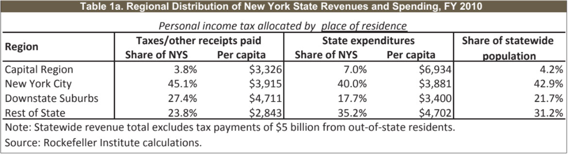
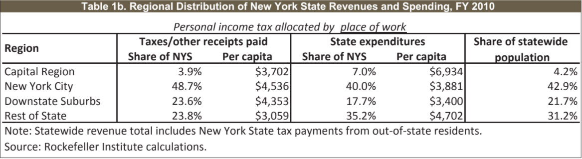
Tables 1a and 1b on the following page summarize the overall distribution of revenues and expenditures under two alternative assumptions. These should be viewed together, providing equally useful methods of examining the regional distribution of resources within the state budget. They differ in only one factor: regional allocation of personal-income tax revenue.
Table 1a allocates New Yorkers’ income-tax payments to the region in which they reside. Particularly relevant for our purposes, this means the measure of total revenue excludes $5 billion paid by residents of New Jersey, Connecticut, and other states. It also means that state income tax payments by people who live on Long Island or the northern metropolitan suburbs — but who work in New York City — are credited to the suburban counties rather than the city.
By this analysis, New York City’s share of state revenue payments is around 45 percent, and it receives 40 percent of expenditures. The Downstate Suburbs provide roughly 27 percent of taxes and other revenues, nearly 10 percentage points more than they receive in aid for education, health care, state payroll, and other expenditures. By contrast, the Rest of State region provides 24 percent of the revenues and receives 35 percent of expenditures. Not surprisingly, the Capital Region also shows a net gain, with a gap of 3 percentage points between its share of revenues and of expenditures. Under this method, the $5 billion in tax revenues that New York State receives from residents of other states amounts to “free” resources. Those dollars appear on the expenditure side of the ledger, but not on the revenue side. We do not adjust figures to eliminate that accounting imbalance.
Table 1b presents a second method of allocating the state’s revenues among the regions. Under this approach, personal income tax revenues are distributed based on the taxpayer’s place of work. The total amount of tax payments rises by more than $5 billion — from $29.4 billion to $34.8 billion — reflecting the addition of New York income taxes paid by out-of-state residents. Most of the additional payments are from individuals who live in nearby states and work in New York City. Compared to the previous distribution, the Downstate Suburbs’ share of the statewide total drops by almost 4 percentage points, and New York City’s share increases by almost as much.
(We will explore this further in the “Revenues” section of this re- port, below.) As a result, New York City replaces the suburbs as the region with the largest gap between giving and getting. The overall picture remains — both Downstate regions pay far more to support the state’s expenditures than they receive in return. The relative positions of the Capital Region and the Rest of State are little changed; both receive substantially more in state funding than they pay.
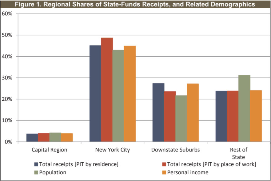
Figures 1 and 2 present another illustration of our summary findings, adding contextual measures of population and personal income. As shown in Figure 1, New York City’s share of the state’s revenue burden is very close to its share of statewide personal income when we allocate personal income tax receipts on the basis of the taxpayer’s residence. The same is true of the Downstate Suburbs. When allocating the income tax by taxpayers’ work locations, New York City’s share of overall revenue payments rises to a level nearly 6 percentage points above its share of personal income — and the suburban contribution to revenues declines, but not quite as much as the city share increases. In either case, both the city and the suburbs contribute a larger proportion of revenues than their shares of statewide population. The Rest of State region represents about 24 percent of the state’s personal income and of its revenues under either sourcing methodology — a proportion that is noticeably (around 7 percentage points) lower than the region’s share of the population. Upstate does not generate economic activity and income at the pace of Downstate; its relatively smaller contribution to state revenues reflects this reality. The Capital Region’s shares of revenues, population, and personal income are all closely matched.
On the expenditure side, the flow of funds also varies substantially from region to region. Overall disbursements are distributed in proportions that are roughly equivalent but not identical — to population. Spending on particular programs may differ sharply from regional population shares, partly because of other demographic differences including numbers of poorer residents.
New York City received 40.0 percent of total state-funded expenditures in fiscal year 2010, nearly 3 percentage points below its share of the state’s residents. The city received a significantly higher share of total spending in the category of local assistance, but a relatively low proportion of expenditures on state operations. Local assistance expenditures on Medicaid, education, and other programs are driven in part by the relative concentration of individuals living in poverty, and Figure 2 includes a regional breakout of such populations to provide context for expenditures. As explained further in discussion of local assistance payments, below, our measure of the city’s share of state spending is significantly influenced by the exclusion of federal funds (including Medicaid) from our analysis; if federal aid were included, New York City’s share of expenditures would rise significantly.
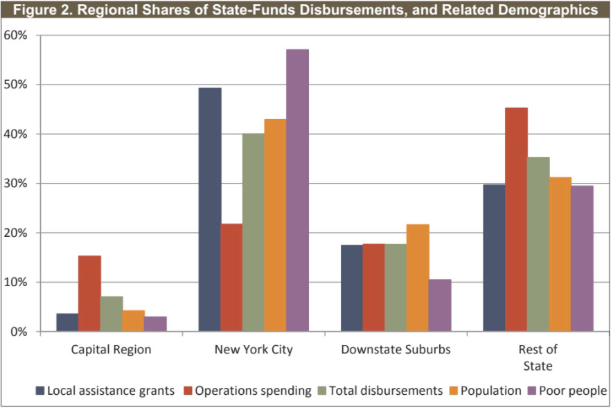
The Rest of State and Capital Region received a larger share of total disbursements, relative to population, while the opposite was true for the Downstate Suburbs. While regional shares of statewide expenditures generally varied sharply among major spending categories, this was not true in the suburbs. Their shares of overall state spending, local assistance, and state operations were all around 17 to 19 percent.
New York State collects substantial revenue from two major taxes — those on personal income and on retail sales — as well as a number of other taxes such as the corporate income tax; utility, bank, and insurance taxes; the petroleum business tax; and a “mobility” or payroll tax in the area served by the Metropolitan Transportation Authority. More than one-quarter of the state’s own-source receipts come from nontax sources including healthcare payments, gambling revenue, and public university tuition and fees.
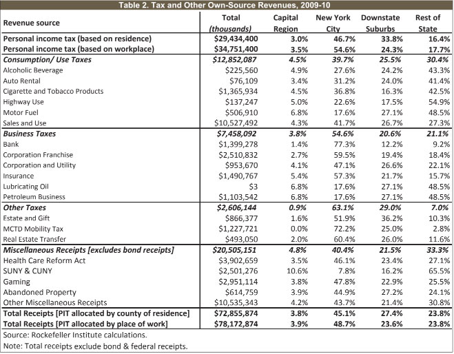
Table 2 shows total collections from each major category, and the regional sourcing of each, in fiscal year 2010. The personal income tax is by far the most important element of the state’s own-source revenue base, representing nearly half of nonfederal receipts. The bulk of the state’s high-value economic activity and wealth are located downstate, as reflected in the regional distribution of the personal income tax, most business taxes, the estate tax, and the real estate transfer tax.
As mentioned above, we analyze the regional sources of personal-income tax revenues in two ways. New York City pays the largest share of individual income taxes under either methodology. Allocating these revenues by the taxpayer’s residence produces a city share of just below 47 percent, modestly above the city’s representation in the statewide population. When we allocate the income tax according to where taxpayers are employed, the city’s contribution rises to more than 54 percent — significantly higher than its share of population.
The Downstate Suburbs also pay a disproportionately high proportion of the personal income tax under either methodology. While slightly more than one in five state residents live in these counties, they pay one in three income-tax dollars. Compared to their populations, the Capital Region and Rest of State provide relatively smaller shares of statewide income-tax revenues. That New York City and its suburbs pay disproportionately large shares of the state income tax, relative to their populations, is not surprising given the concentration of income in the Downstate Region. However, as Table 3 shows, the metropolitan region’s income-tax payments are disproportionate even when compared to personal income. New York City and its suburbs generated 72.1 percent of personal income in 2008, but 79 to 80 percent of the personal income tax. The picture is the opposite for the Rest of State and Capital Region, whose shares of overall income taxes were lower than their shares of statewide personal income. This disparity reflects the progressive nature of New York State’s personal income tax, in which effective tax rates on upper-income earners are significantly higher than those on middle and lower-income earners. For example, $1 million of taxable income in Erie or Albany counties would likely be spread among a dozen or more taxpayers whose effective tax rate might be in the range of 4 to 5 percent. In Manhattan or Westchester County, many more taxpayers have higher incomes and average effective tax rates in 2010 were one to two percentage points higher. In allocating PIT revenues by county of residence, we exclude the 14 percent of such revenue that is paid by non-New York State residents, leaving a total of just under $29.4 billion to be distributed regionally.
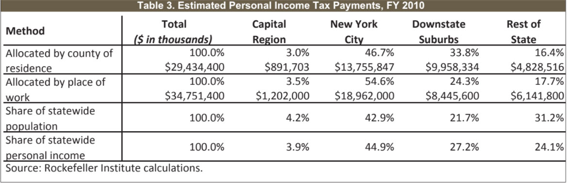
Table 2 also shows the regional distribution of taxes other than those on personal income, and of miscellaneous receipts. The largest category, consumption and use taxes, includes the state’s 4 percent general sales tax and taxes on cigarettes, alcohol, and motor vehicle-related purchases. Compared to population, the
Downstate Suburbs generate a relatively high proportion, and the Rest of State a comparatively low share, of sales-tax revenues, likely reflecting differences in disposable incomes. The motor fuel tax and others related to motor vehicles fall disproportionately outside New York City, whose residents are less likely than those elsewhere to own automobiles. The Rest of State generates a high proportion of the alcoholic beverage and cigarette taxes, compared to its population. Collectively, the state’s consumption taxes are generated roughly in proportion to each region’s share of the state’s population. Relatively high shares of the state’s business and other taxes fall on the downstate metropolitan area, which generates the lion’s share of New York’s economic activity and wealth. Business taxes include those on corporate income, petroleum products, banks, insurance companies, and utilities. In the category of “other” taxes, the largest single element is the Metropolitan Transportation Commuter District “mobility” or wage tax. The incidence of the estate tax also falls heavily on the downstate metropolitan region.
The third major element of the state’s locally generated resources is miscellaneous receipts, which represented 28 percent of nonfederal revenues in fiscal 2010. Table 2 includes the largest elements within this category.
Payments related to Health Care Reform Act programs include surcharges and assessments on hospitals, nursing homes, and other providers; and a “covered lives” assessment paid by health insurance carriers and policyholders. These resources help finance the state’s Medicaid and other health-care programs, the Elderly Pharmaceutical Insurance Coverage Program, graduate medical education, and other initiatives. New York City’s share of these revenues is larger than its share of the state population. SUNY and CUNY revenues depicted in Table 2 are predominantly State University tuition dollars. The geographic distribution of these revenues reflects SUNY’s stronger presence outside New York City.
The Office of the State Comptroller assumes control of inactive and unclaimed accounts held by banks, investment and insurance companies, utilities, and certain other firms. As of 2011, the comptroller held $11 billion in such abandoned-property assets. Each year, state law requires the comptroller to release a portion of such holdings for use within the state budget. Data on the geographic location of the owners of such funds are not readily available; we allocate these revenues based on each region’s share of statewide personal income.
New York State’s expenditures fall into three major categories: local assistance, including education, Medicaid, and a variety of other programs; agency operations and related costs including state employee compensation; and capital expenditures. Table 4 shows total disbursements, and those in each major category (with certain adjustments from totals reported by the Office of the State Comptroller, as described in the Appendix), as well as regional shares of each.
New York State classifies well over half of its total annual expenditures as “local assistance.”2 After excluding federal funds, such disbursements represent 65 percent of the total included in our analysis. Table 5 shows major categories of expenditures in this area, and our estimates of their regional distribution. When federal funds are omitted, education is by far the state’s largest expenditure category. (If federal aid is included, Medicaid is larger.) At $26.1 billion in state funds, education represented almost half of all local-assistance disbursements, and nearly a third of total spending, in fiscal 2010. In addition to general state aid for school districts, disbursements in this category include payments to districts through the School Tax Relief (STAR) program, community-college aid, and certain other programs.
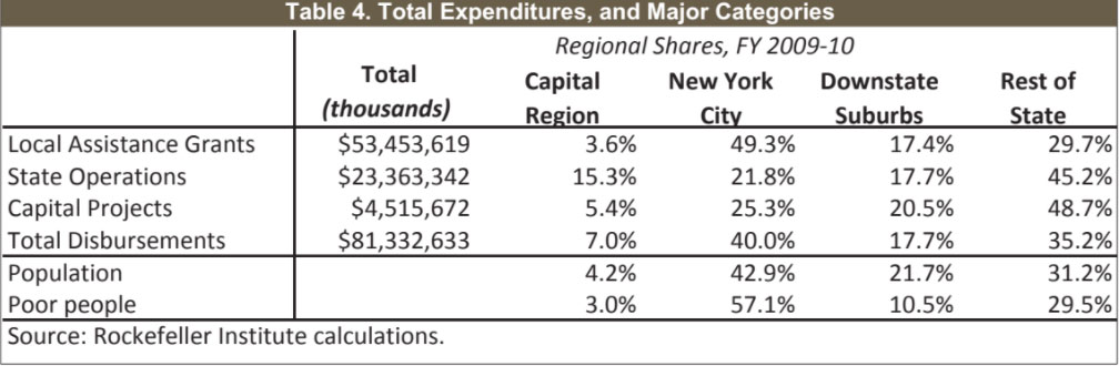
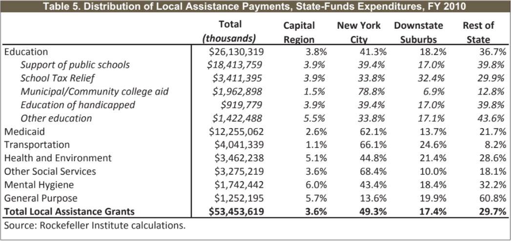
Table 5 summarizes the regional distribution of fiscal year 2010 disbursements for the largest local-assistance education programs. These elements differ significantly in their regional distribution. For example, New York City received 34 percent of STAR funding, just over 39 percent of public-school aid, and 79 percent of municipal and community-college aid in fiscal 2010. (Community college funding for the City University of New York is included in local assistance expenditures, while state expenditures on SUNY community colleges are made through the state operations appropriations discussed in the next section of this report.)
The largest and most politically charged element of the state budget is aid to public schools. Table 5 includes our calculation of the regional distribution of state-funds assistance for school districts — both general support of public schools and STAR payments to districts. The percentages used in both of these calculations reflect two-year averages of school-district expenditures (for school years 2007-08 and 2008-09) as districts report them to the state Education Department.
If federal funds were included, Medicaid would be the largest single element of state expenditures — $38.4 billion in fiscal year 2010.3 Federal resources provided $26.2 billion of that total, however, and are excluded from our analysis. Even after that adjustment, Medicaid represents the second-largest element of state-funded local assistance payments. About 62 percent of such expenditures went to New York City in fiscal year 2010, as shown in Table 2. That is far higher than the city’s proportion of the state’s population and higher than the city’s share of state residents living in poverty. The Rest of State region and the Downstate Suburbs receive a significantly smaller share of state-funded Medicaid dollars than their share of statewide population. Appendix 2 provides county-by-county figures for state-funded Medicaid disbursements in fiscal year 2010.
To understand the complicated picture of the regional distribution of state expenditures, it is important to consider the impact of New York City’s extraordinary share of Medicaid. As mentioned above, this study focuses on state-funded spending and excludes federal funds. If we were to include all federal funds in the analysis, New York City would “gain” more than $10 billion in Medicaid expenditures. While spending figures for the other regions would also rise, those additions would be much smaller than New York City’s, not only in absolute dollars but in proportion to overall state expenditures. The overall effect would be to move the city from a net “loss” in the intrastate mix of giving and getting to a position of significant gain. On the other hand, federal aid to the state is funded by federal income taxes and other revenues that fall much more heavily on New York City taxpayers than those elsewhere in the state.
As shown in Table 5, New York City also receives a disproportionately large share of state-funded local assistance payments for transportation, which totaled just over $4 billion in fiscal year 2010. Some 90 percent of this category is the state’s Mass Transportation Operating Assistance program. While transit systems in major Upstate cities receive some of that funding, the overwhelming majority of mass transit usage is in New York City and the other 11 counties that make up the Metropolitan Transportation Commuter District. Among our four regions of interest, three are served by the Metropolitan Transportation Authority. We allocate funding to the MTA among those regions based on MTA ridership. The state also spends billions of dollars each year on highways and other transportation programs through the Transportation Department. Some of those disbursements, which predominantly go outside New York City, are discussed later in this report’s section on capital expenditures.
Programs funded by the $3.4 billion of local assistance payments in the categories of health and environment include the state’s share of costs for the Child Health Insurance Program (CHIP), prescription-drug assistance for senior citizens, aid for county and New York City health departments, and food and nutrition programs. Most of the programs in this category are distributed roughly in proportion to each region’s population. Exceptions include CHIP funds, where New York City receives a relatively larger share; and early intervention programs for infants and toddlers under the age of three, which disproportionately benefit the Downstate Suburbs.
The state spent $7.6 billion in local-assistance funds during fiscal 2010 on programs classified as “other social services” — other than Medicaid, that is. Well over half this total comes from federal funds, however, bringing the state’s share to just under $3.3 billion. Excluding federal aid removes programs such as Temporary Assistance for Needy Families and the Home Energy Assistance Program from our analysis. Programs that rely heavily on state funds and thus are represented here include child welfare, foster care, and adoption; the state’s Safety Net program for certain needy families and individuals; and the state’s share of the Supplemental Security Income program for the aged, blind, and disabled. Again, Table 5 shows New York City receives a disproportionate share of assistance in this category.
More than $9 billion in total funding goes each year to programs for individuals who are developmentally disabled, mentally ill, or in need of addiction treatment. These payments are classified as “mental hygiene,” with $1.7 billion in such state funds paid in local assistance in fiscal year 2010. (The remainder includes federal funds, which are excluded from this study, and state-funds expenditures for state agency operations, which are addressed later in this report.) These local assistance payments go to nonprofit and for-profit service providers, local governments, school districts, and other recipients. Their distribution generally tracks each region’s share of total state population. The slightly disproportionate share for the Capital Region may reflect certain payments to statewide organizations that are based in or near Albany but provide services elsewhere as well.
The state spent more than $1.2 billion, all from its own-source funds, on general-purpose local assistance in fiscal year 2010. Just over $1 billion was for the Aid and Incentives for Municipalities (AIM) program, unrestricted aid that is distributed to most cities, villages, and towns through a population-based formula. New York City historically has received a comparatively low share of this assistance, and the state eliminated the city’s share of AIM funding after fiscal year 2010. Other Local Assistance payments, not shown separately in Table 5, support programs in areas such as criminal justice, local economic development, housing, court administration, and services for the aging.
As the term suggests, New York’s State Operations expenditures fund the operating costs of state agencies. These disbursements fall into three major categories: salaries and wages for state employees; general state charges, which are mostly payments for state-employee pension and health benefits; and other operating costs, a wide range of expenditures including contractual services, equipment, and supplies.
Table 6 shows two alternative measures of the regional distribution of state-funded expenditures on state operations for fiscal year 2010. Using either measure, spending on employee compensation — both direct payroll costs and benefits — tends to show a disproportionate concentration in the Capital Region, where central offices of most state agencies are located. Large institutional centers for the State University, the prison system, and mental hygiene facilities are disproportionately located in the Rest of State region. More than 60 percent of payroll and benefit costs go to Upstate (Rest of State and the Capital Region in our regional distribution), while its share of statewide population is around 35 percent.
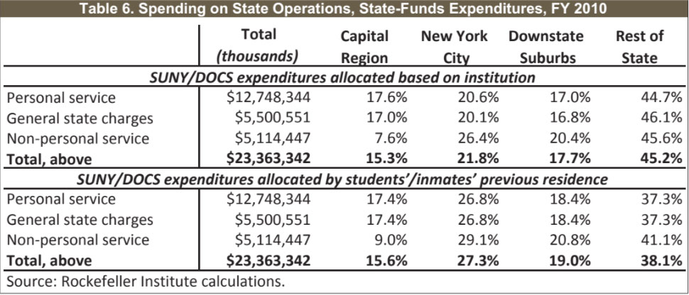
Table 6 first presents regional allocation of dollars as they were directly spent. The state’s $12.7 billion in payroll is distributed based on the Office of the State Comptroller’s database on payroll expenditures. Such dollars go to corrections officers at each of the state prisons, and to faculty at State University campuses, among others. More than 90 percent of general state charges reflect expenditures for employees’ pension, health, and other benefits and can reasonably be allocated to each region in the same proportion as the state payroll. Using this direct spending approach, New York City receives about 22 percent of state operations expenses, the Downstate Suburbs 18 percent, and the two upstate regions a total of over 60 percent. The disproportionate benefit to the upstate regions largely reflects the concentration of prisons, universities, and mental hygiene facilities there. But state spending through the Department of Correctional Services (DOCS) does more than provide jobs and paychecks in areas where prisons are located. Such expenditures are intended to improve public safety in communities where inmates lived and committed crimes. While most state correctional facilities are in Upstate regions, inmates’ home addresses are distributed more in line with the state’s overall population. The proportion of inmates who come from New York City (48.5 percent) is slightly higher than the city’s share of state population (just under 43 percent). By contrast, only 11.5 percent of inmates are from the Downstate Suburbs — far less than those counties’ share of the general population.
Similarly, dollars spent at the State University can be considered aid not only to towns and cities where campuses are located, but to the communities that SUNY students call home. Allocating SUNY expenditures based on students’ home addresses produces a slightly different picture than distributing those dollars according to campus location. Among the four regions, the largest changes that emerge from this alternative analysis affect New York City and the Capital Region. The city was home to only 3.1 percent of SUNY students based on campus location, but 8.1 percent of all students resided there before leaving for college. Under this approach, the Capital Region goes from 6.8 percent of SUNY students’ homes to 11 percent of enrollment based on institutional location. The bottom section of Table 6 shows the distribution of state-operations expenditures allocating SUNY and DOCS disbursements based on students’ and inmates’ home locations. For this purpose, we adjust expenditures on personal services (pay-roll) and general state charges, but leave nonpersonal service payments the same as above. The result is to reallocate some expenditures from the Rest of State region to New York City and, to a lesser extent, the Downstate Suburbs.
The state spent just over $4.5 billion of its own funds on capital projects during fiscal year 2010. The largest source of such expenditures is the Department of Transportation (DOT). Other agencies with significant capital disbursements included the State University; Correctional Services; Metropolitan Transportation Authority; Parks, Recreation and Historic Preservation; and the mental hygiene agencies.
As show in Table 7, the Rest of State region received more than 60 percent of capital funding from both DOT and SUNY. Most state highways and bridges are in the Rest of State, as are most SUNY facilities. Good data on the regional distribution of the state’s capital expenditures are not readily available for most programs. The figures in Table 7 include actual expenditures reported by the Department of Transportation, and estimates for SUNY, Correctional Services, and the MTA that are based on enrollment, institutional location, and ridership, respectively. We allocate the remaining $855 million in capital spending based on regional population, which is also shown in Table 7 for comparative purposes.
As a result of its large shares of DOT and SUNY capital spending, the Rest of State region received a much higher proportion of total capital expenditures than its share of the state’s population. New York City, on the other hand, received relatively little from the two largest sources of agency capital spending. It is the primary location of MTA capital expenditures, but that category is a small part of the overall total. Thus, the city’s overall share is far below its representation in statewide population.
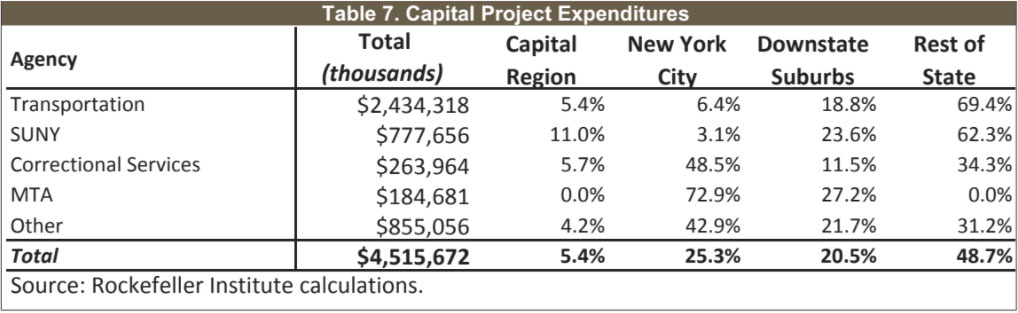
Table 8 shows the regional distribution of all the major sources of state-funds expenditures and revenues in fiscal year 2010, along with selected demographic measures for comparison.
If New York City’s share of state-funds expenditures had been the same as its share of state-funds revenues, the city would have received $4.1 billion to $6.1 billion more than it did receive. The lower figure is based on our distribution of personal-income tax revenues according to taxpayers’ residence; the higher on our allocation of such revenues by place of work.
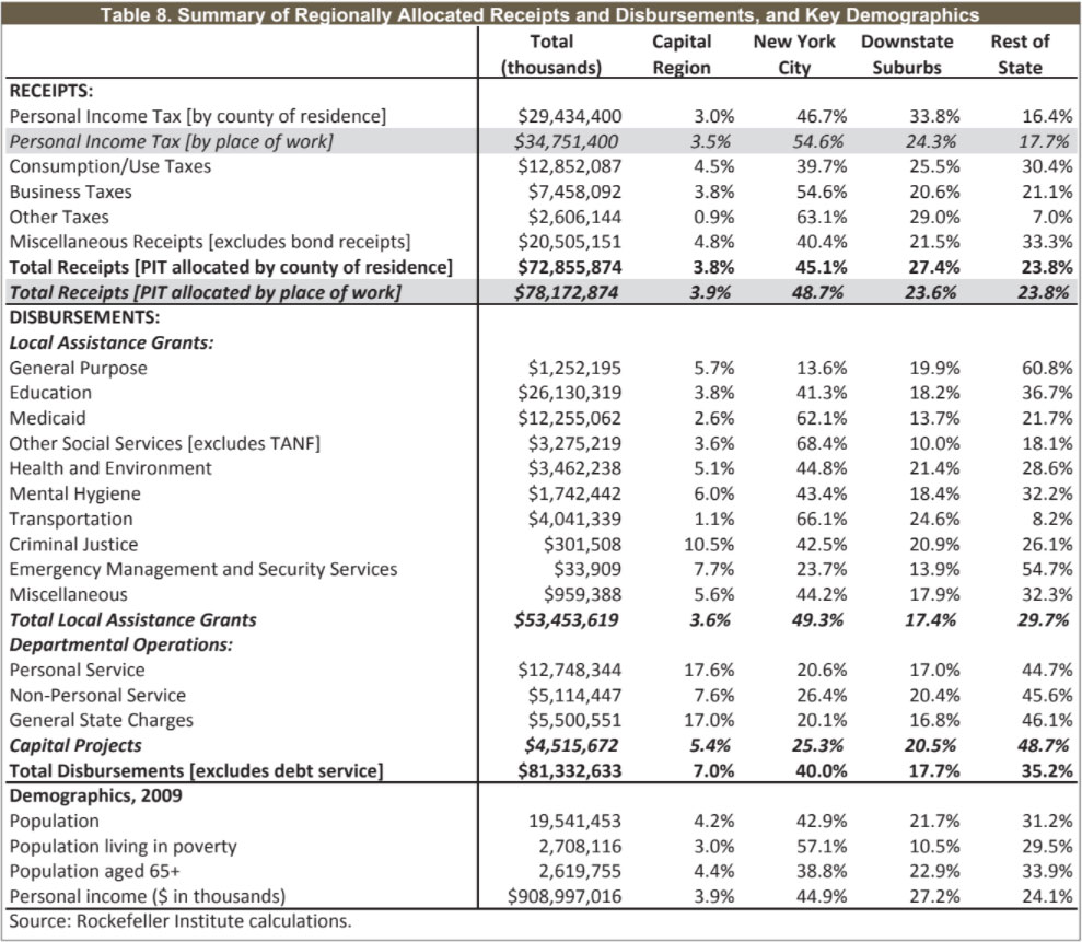
The Downstate Suburbs region would have gained even more — $4.6 billion to $7.9 billion — if its share of state-funds expenditures had matched its share of revenues. The Rest of State would have lost an estimated $8.1 billion to $9.3 billion, and the Capital Region an estimated $2.7 billion, if similar equivalence were applied to those regions.
The estimates in this report compare shares of revenues and expenditures to analyze the regional distribution of New York State’s budgetary revenues and expenditures. Such an approach is valuable as a starting point for discussion but is not intended to resolve questions of fairness and appropriateness. Of course, there is no broadly accepted definition of “fair share.” Would a fair distribution assure that taxes and expenditures are balanced perfectly, so that wealthier communities paying relatively large shares of state taxes also receive equivalent proportions of state aid for education and other purposes? Or might a fair share be based entirely on need, so that every dollar is distributed based on factors such as a locality’s proportion of all state residents who live in poverty? If so, what would go into that formula — for example, how would we account for a high proportion of older residents compared to an abundance of school-age children, given that both groups generate higher-than-average demand for public expenditures? And then there are varying community preferences. If legislators from one area care deeply about Medicaid funding, and those from another area are especially interested in providing state-funded institutional jobs, how might we balance their concerns? Such value judgments are important. They are, however, beyond the scope of this study. The state’s revenue system is structured to rely heavily on individuals’ and communities’ ability to pay, as evidenced by the importance and graduated structure of the personal income tax.
At the same time, New York’s overall tax structure reflects a conscious choice to draw revenue from a broad cross-section of the economic spectrum, given that individuals of all income levels share the cost of the sales tax, petroleum business tax, lottery and certain other categories of receipts. Overall, the geographic distribution of revenues reflects a policy balance: While every region contributes significantly to the state budget, those regions that enjoy larger shares of New York State’s income and economic activity also pay more to Albany.
Analyzing equity on the expenditure side of the budget is more complex. We would expect to see some difference in the distribution of local assistance payments, which reflect particular purposes and needs, compared to state operations and capital expenditures. For example, state aid for public schools is delivered based on formulas that are inversely related to communities’ ability to pay. Yet the final calculation of aid for each district also is influenced by current and historic levels of local school expenditures. These naturally are higher in districts with greater wealth, thus partially offsetting formulas that are intended to deliver more dollars to lower-income communities. Medicaid expenditures also should be expected to vary regionally, depending on measures such as the number of residents who are elderly or live in poverty. Yet, while New York City has proportionately more poor residents than other regions, it has a comparatively low share of the state’s population aged 65 and over — a group that drives especially high Medicaid costs. In other words, the city’s extraordinarily high share of statewide Medicaid dollars is not entirely explained — and may not be primarily explained — by demographic differences.
Finally, some concentration of state-operations expenditures in the Capital Region is inevitable, given that state government has a large administrative core. Similarly, areas with the lowest population density might be expected to receive somewhat larger proportions of institutional and capital expenditures than sheer numbers of residents would indicate. The state may save money by locating institutions in lower-cost areas, and some investment in highway infrastructure is required even where homes and businesses are few and far between. There is no obviously ideal regional distribution of such functions and expenditures. However, state policymakers increasingly recognize that some of the Upstate concentration of prisons and other institutions developed as a political response to economic needs in host communities rather than to the service needs of the state as a whole.
Over decades, regional tensions have often exacerbated New York’s longstanding failure to deal adequately with its fiscal challenges. In 2011, strong executive leadership and the Legislature’s shared willingness to tackle a deep budget gap produced an on-time budget that combined current-year balance, a minimum of one-time solutions, and significant improvement in the state’s long-term fiscal stability. Further action will be required to deal with major, lingering budget challenges, both short- and long-term. A clear understanding of the state’s existing distribution of costs and benefits may usefully inform the policy debate over such actions.
By one standard, a regional imbalance of payments is necessarily unfair. On the other hand, longstanding state policy provides — and most voters likely agree — that ability to pay should influence the amount that each individual pays in taxes and that each community receives in state funding. Among the four regions analyzed in this report, average incomes are highest in the Downstate Suburbs and lowest in the Rest of State. If the highest-income region pays more than it receives from Albany, and the lowest-income areas receive more than they pay, such variations may broadly reflect voter preferences as expressed by elected policymakers.