NOVEMBER 2, 2009
Intercity Hardship
From Maine to California, America’s cities and suburban areas are now mired in the deepest, most extensive recession in more than a generation. The present challenge has been widely reported, and recognized as profound enough to move the national government toward historic actions to boost the economy. But less well understood is the fact that the nation’s metropolitan areas already were in decline, even before the recession took hold. And unlike previous trends, this slide was steepest in portions of the country associated previously with economic growth rather than deterioration.
Intercity Hardship Since 2000
Social and economic conditions grew increasingly negative since 2000 for most central cities in America’s populous metro areas, in a dramatic departure from trends over the 1990s. Measures of Intercity Hardship — a composite index comparing unemploy- ment rates, the proportion of nonworking-age residents, educa- tional attainment, income per person, poverty levels, and the extent of crowded housing — worsened in nearly two-thirds (64 percent) of the cities from 2000 to 2007.1 That was a significant change from the trend over the previous decade, when worsening hardship conditions were recorded in only about one- fifth (22 per- cent) of the cities.
Improvement and strong improvement in conditions of social and economic hardship were roughly four times as common among cities during the 1990s than from 2000 to 2007. Differences in the shares of cities experiencing the most negative change were even more striking: more than four in ten cities had strongly increasing hardship from 2000 to 2007, nearly six times the proportion of cities that had strongly increasing hardship over the 1990s. The proportion of central cities with strongly worsening In Table 1 lists the ten central cities with the highest proportionate increase in Intercity Hardship scores from 2000 to 2007. Seven of these cities are in the South. Raleigh, Greensboro, and Arlington were also among the cities with the largest increases in Intercity Hardship over the 1990s.
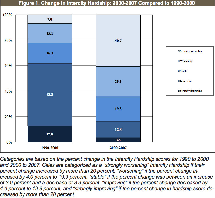
The average hardship score among central cities in the study grew from 35.0 in 2000 to 39.7 in 2007, for an increase of about 13 percent. Each of the cities listed in Table 1 had increases of more than five times that average.
Omaha, for example, began the decade with a hardship score down around half the average among the group of central cities. By 2007, however, Omaha’s Intercity Hardship Index score had risen by 78.7 percent, approximating the central-city average. The Charlotte, North Carolina, and Mesa, Arizona, have been rap-
idly growing cities in very different regions of the country, each enjoying a host of favorable features and advantages. But relative to other central cities, each experienced significant deterioration in index scores for unemployment and household income levels from 2000 to 2007.
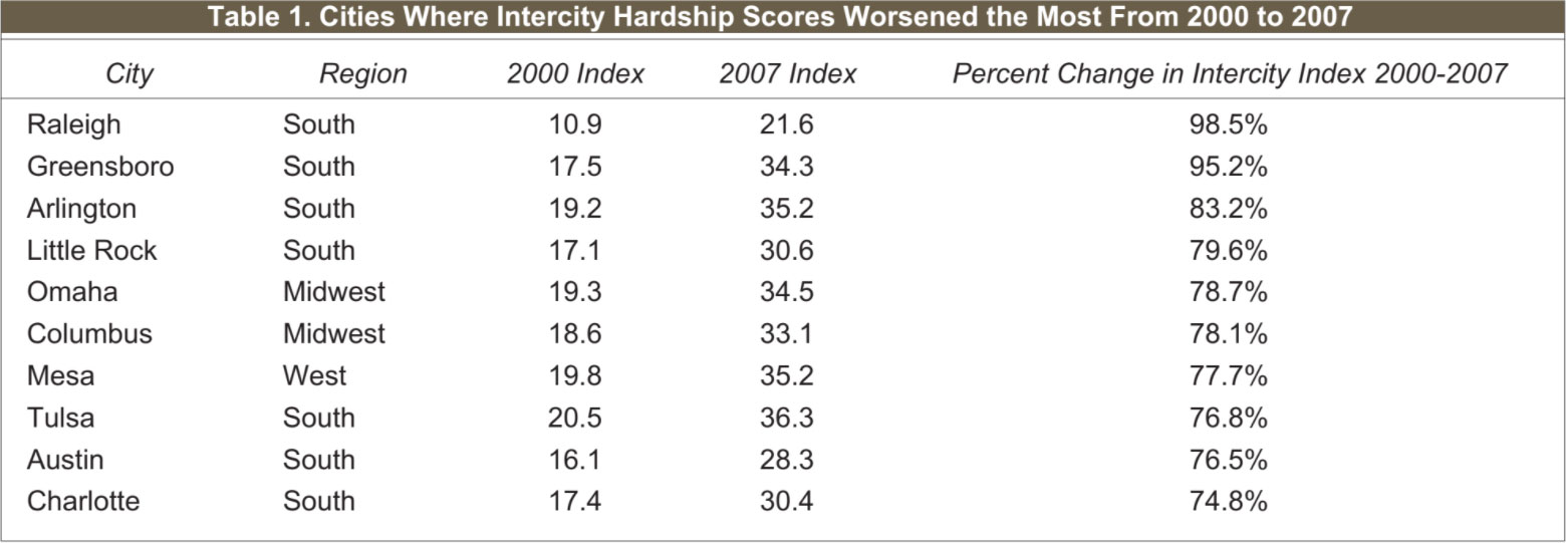
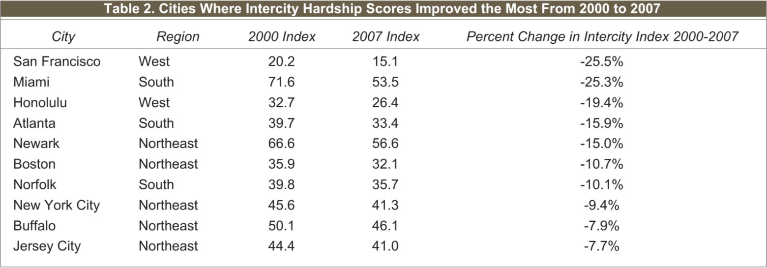
Table 2 lists those ten cities with the largest proportionate improvement in hardship scores from 2000 to 2007. The result underscores sharp differences between newer and older patterns of regional variation in hardship conditions.
Not a single city in the Northeast made the list of places where hardship conditions improved the most over the 1990s. But from 2000 to 2007, fully half of the top-ten cities are in the Northeast. And along with bastions of big business and high finance, like Boston and New York, the list of most-improved central cities from 2000 to 2007 includes such surprises as Newark, New Jersey and Buffalo, New York — places long-associated with urban economic decline.
Buffalo fared worse than the average among central cities on every element of the Intercity Hardship Index in 2000 and in 2007, save for crowded housing. But relative to other cities, Buffalo’s index scores for unemployment and poverty were much improved over this period. Newark presented a similar story: comparatively high on scores of hardship virtually across the board, but relatively improved as measured by index scores for crowded housing, household income levels, and particularly for unemployment between 2000 and 2007.
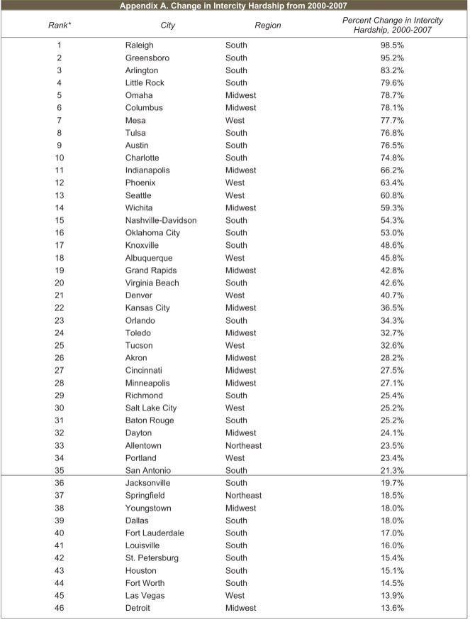
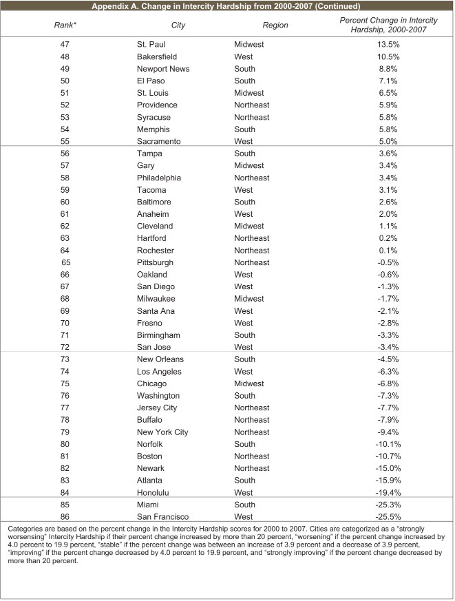
Appendix A lists each of the central cities according to level of change in Intercity Hardship conditions from 2000 to 2007. As shown, thirty-five cities had strongly worsening Intercity Hard- ship from 2000-2007. Eight are from the West, eleven are from the Midwest and fifteen are from the South. Allentown is the only central city in the Northeast with strongly worsening hardship — the region that had the most cities with strongly worsening Intercity Hardship over the 1990s. Twenty central cities had worsening Intercity Hardship from 2000 to 2007. Half of them are from the South, four are from the Midwest, and three each are from the West and Northeast. Seventeen central cities had stable Intercity Hardship from 2000-2007. The list includes seven cities from the West, four from the Northeast, and three each from the Midwest and the South.
Also shown in Appendix A, twelve central cities had improving Intercity Hardship from 2000-2007 (indicated by declining hardship scores). Five are from the Northeast and four are from the South. Half of the cities with improving Intercity Hardship had high to very high levels of Intercity Hardship in 2000 and the other half had moderate levels. Only two cities had strongly improving Intercity Hardship from 2000-2007. The most improvement was seen in San Francisco where Intercity Hardship was already low in 2000. Miami, however, had very high levels of Intercity Hardship in 2000.
Changes in Intercity Hardship, 1970-2007
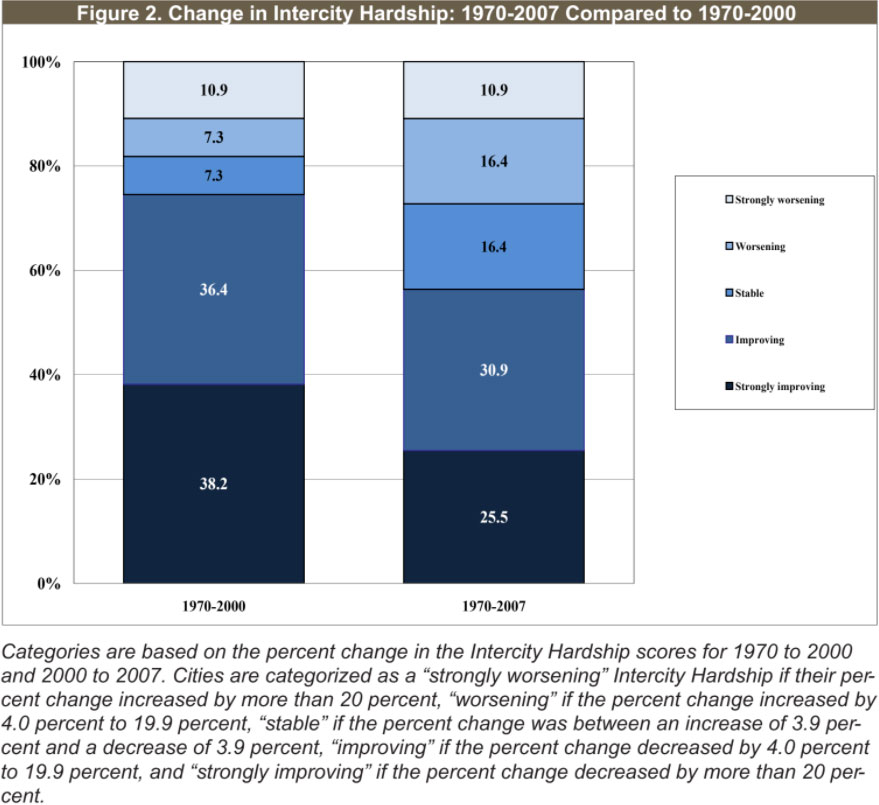
Compared to more recent years, the long-term trends in Intercity Hardship look somewhat brighter for a wider swath of the largest cities in the most populous metropolitan areas of the nation. More than half — over 56 percent — of the central cities for which we have data going back to 1970 have improving Intercity Hardship conditions. But here too, the downturn since 2000 is apparent. In our previous study, we reported that three-quarters of the central cities had improving Intercity Hardship from 1970-2000, yet now the share showing improvement is at the lower level of fifty-six percent.
As shown in Figure 2:
• About one-quarter (more than 25 percent) of cities hadstrongly improving Intercity Hardship from 1970-2007. This is less than the 38 percent share of cities from 1970-2000 with strongly improving hardship.
• Another 30 percent of the cities had improving Intercity Hardship from 1970-2007. This represents a decline from the over 36 percent proportion of cities with improving hardship for the 1970 to 2000 time frame.
• Over 16 percent of the cities from 1970-2007 had stable levels of Intercity Hardship. This is a higher share of cities than during the 1970-2000 time period when there was only 7.3 percent with stable hardship.
• Over 16 percent of cities from 1970-2007 experienced worsening Intercity Hardship conditions and another 11 percent had strongly worsening hardship. This is a worse picture than what we saw for the 1970-2000 time frame, when only 7.3 of cities experienced worsening hardship and 10.9 percent of cities had strongly worsening Intercity Hardship. Figure 2 shows that about one quarter (25.5 percent) of central cities had strongly improving Intercity Hardship from 1970-2007, compared to the larger share of nearly four in ten central cities (38 percent) from 1970-2000. The proportion of central cities with improving Intercity Hardship from 1970-2007 was similarly smaller than the group for 1970-2000, 30.9 percent compared to over 36 percent, respectively. Toward the other end of the spectrum, the share of central cities with strongly worsening hardship remained the same between the two periods. But the share of central cities with worsening Intercity Hardship conditions was more than twice as large from 1970-2007, at 16.4 percent, than for 1970-2000, at 7.3 percent.
A higher share of central cities in the West and Midwest had improving Intercity Hardship conditions during this period than in the Northeast and South. However, one in five Southern cities had strongly increasing hardship — the highest proportion of any region. Twenty-three percent of cities in the Northeast had strongly improving Intercity Hardship from 1970-2007, but more than 15 percent of the region’s central cities saw strongly increasing scores for Intercity Hardship, with only cities in the South faring worse. Thirty percent of the cities in the West had strongly improved Intercity Hardship conditions from 1970 to 2007, but 30 percent had increasing to strongly increasing Intercity Hardship. Only the Midwest region had no cities with strongly increasing Intercity Hardship; more than half the cities in that region had improving Intercity Hardship, plus another 12 percent with strongly improving hardship levels.
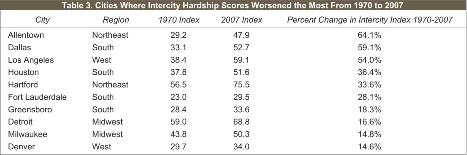
Table 3 lists the ten central cities with the highest percent in-
creases in Intercity Hardship scores from 1970 to 2007. Seven of
them — Allentown, Dallas, Los Angeles, Houston, Hartford, Fort Lauderdale, and Milwaukee — were also among the cities with the greatest proportional increases in Intercity Hardship from 1970-2000. Cities such as Denver and Greensboro do not conform to stereotypical, northern Snowbelt settings of urban decline.
Allentown’s 2007 index score, at 47.9, is not nearly so far above the central city average (43.2) as scores for places like Los Angeles (59.1), Detroit (68.8), or particularly Hartford (75.5). Allentown, in fact, has better-than-average index scores for crowded housing, unemployment, and poverty. But levels of educational attainment, nonworking-age population, and household income in Allentown are worse than average and the city’s proportional change in overall score on the composite Intercity Hardship Index was worst among the cities studied.
Cities on this list like Denver and Fort Lauderdale present a different picture. Scores for every element of the Intercity Hardship Index are better in Denver and in Fort Lauderdale than average among central cities for 2007, as are their aggregate index scores. However, trends in hardship conditions for Denver and Fort Lauderdale relative to other cities are among the most negative.
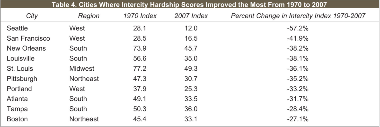
By contrast, Table 4 lists the central cities with the most significant improvement — largest percent declines — in their Intercity Hardship scores from 1970-2007. Four of the ten cities are in the South, three are in the West (including the two cities with the one is in the Midwest. Four of the cities with the greatest improve- ments — St. Louis, New Orleans, Louisville, and Seattle — were also among the most improved from 1970-2000. The cities of San Francisco, Pittsburgh, Portland, Atlanta, Tampa, and Boston are all newcomers to this group.
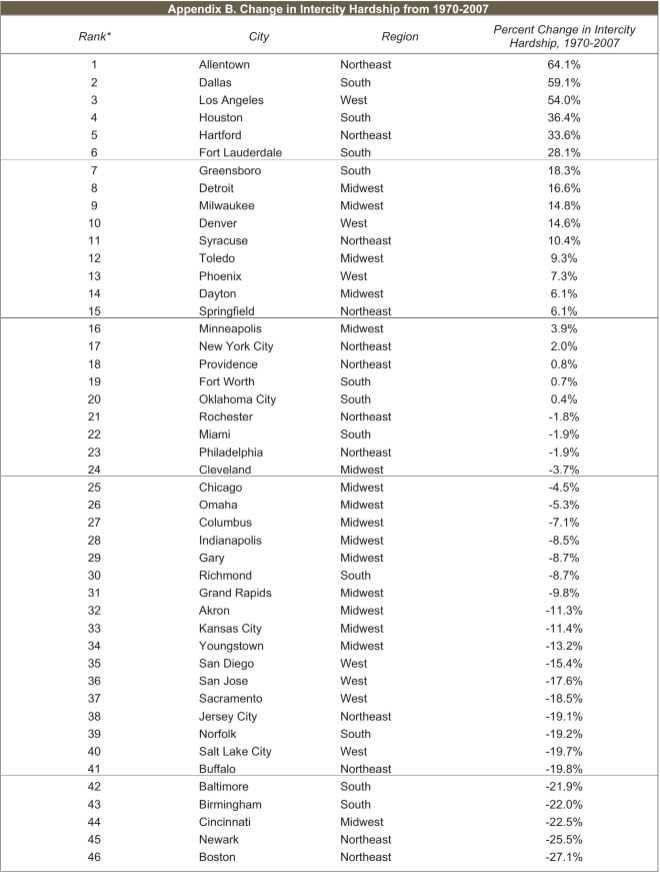
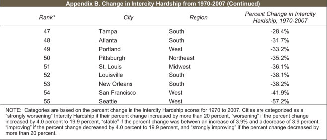
Appendix B lists each of the central cities according to level of change in Intercity Hardship conditions from 1970 to 2007. As shown, six cities had strongly worsening Intercity Hardship from 1970-2007: three from the South, two from the Northeast, and one from the West. Nine cities had worsening Intercity Hardship from 1970 to 2007: four (Detroit, Milwaukee, Toledo, and Dayton) from the Midwest, two (Syracuse and Springfield) from the Northeast, two from the West (Denver and Phoenix), and one from the South (Greensboro). Nine cities had stable Intercity Hardship levels from 1970 to 2007, four from the Northeast (New York City, Providence, Rochester, and Philadelphia), three from the South (Fort Worth, Oklahoma City, and Miami) and two from the Midwest (Minneapolis and Cleveland).
Appendix B also lists the seventeen cities with improving Intercity Hardship from 1970 to 2007. Nine of these are from the Midwest, four from the West, and two each from the South and the Northeast. Fourteen cities from across the nation had significant improvements in their Intercity Hardship scores from 1970 to 2007. Six cities are from the South, three are from the West, three are from the Northeast, and two are from the Midwest.
Metropolitan Hardship Since 2000
Social and economic conditions improved in most places over the 1990s at the metropolitan level — for central cities and their corresponding suburban areas combined. But this trend turned negative in more recent years. Measures of Metropolitan Hardship — a composite index comparing metro statistical areas on levels and trends in unemployment rates, the proportion of non-working-age residents, educational attainment, income per person, poverty levels, and the extent of crowded housing — worsened from 2000 to 2007 for nearly half of study areas, including 24.4 percent with strongly increasing hardship. Only about one in five had improving levels of Metropolitan Hardship in this period. This is a dramatic change from the trend in the 1990s where over 53 percent of all places had improving Metropolitan Hardship.
Evidence of this decline is found mainly in the Midwest and the South. Contrary to the Midwest’s positive trend over the 1990s, almost 90 percent of metro areas in the Midwest had increasing Metropolitan Hardship from 2000 to 2007, and no Midwestern metro area was recorded to have improving Metropolitan Hardship since 2000. Fifteen percent of Southern metro areas had increases in Metropolitan Hardship during the 1990s but since 2000 that figure rose to over 48 percent.
Metropolitan Hardship trends this decade looked much better in the West and Northeast. The share of places with rising levels of Metropolitan Hardship in the West actually shrank, from 52.4 percent over the 1990s to 38.1 percent from 2000-2007. The Northeast fared even better. Index scores for social and economic conditions worsened in only 7.7 percent and were stable or improved in 92.3 percent of metro areas in the Northeast — a stark improvement of the 1990-2000 trend when we saw over 60 percent with increasing Metropolitan Hardship.
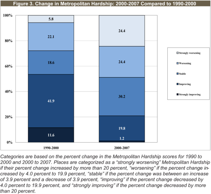
Table 5 lists the ten places with the largest increases in Metropolitan Hardship from 2000-2007. They are located across the nation with three places each in the Midwest, South, and West and one in the Northeast. All of these areas had very low to low levels of Metropolitan Hardship in 2000 and, while worsening, still remain toward the better end of the index in 2007.
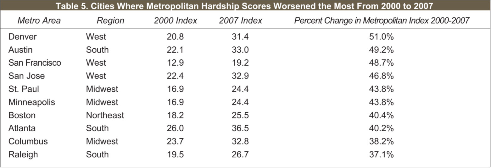
Austin, Texas, for example, had a proportional increase in its Metropolitan Hardship Index score from 2000 to 2007 that was more than four times larger than the average increase among areas in the study. The most significant changes appear to be in relative levels of unemployment, a change of nearly 480 percent, and in household income, more than 44 percent.
For Minneapolis, Minnesota, the driving factors in the negative trend since 2000 were also in its index scores for unemployment and in household income. Those same two elements of the index were also the primary areas of relative decline for Raleigh, North Carolina. For both Minneapolis and Raleigh, the proportional increase in Metropolitan Hardship was about four times the average increase among the group of metro areas in the study.
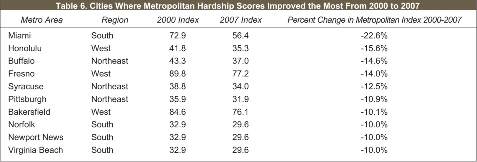
Table 6 lists the ten places with the greatest improvement in social and economic conditions, measured as declines in Metropolitan Hardship, from 2000 to 2007. Four are from the South, and three each are from the Northeast and West. Miami, Fresno, and Bakersfield all experienced relative improvement but still had comparatively high levels of Metropolitan Hardship in 2007. Honolulu, Buffalo, Syracuse, and Pittsburgh all moved from moderate levels of Metropolitan Hardship in 2000 to low levels in 2007.
Syracuse, New York, moved from a slightly higher than average score on Metropolitan Hardship in 2000 to a somewhat lower than average score in 2007. Index score components for levels of poverty, educational attainment, and nonworking population were all areas of relative improvement for Syracuse over the period.
The improvement in metro index score in Fresno, California, was more than twice as large than the relative worsening in average index score among the group of areas studied. Relative levels of unemployment and poverty were the most pronounced areas of improvement for Fresno.
On a proportional basis, no metropolitan did better than Miami, Florida, in relative improvement on conditions of hardship from 2000 to 2007. The components driving Miami’s comparative improvement were unemployment, educational attainment, and especially crowded housing.
Appendix C lists each metro area according to level of change in Metropolitan Hardship conditions from 2000 to 2007. As shown, twenty-one places had strongly worsening Metropolitan Hardship during this period, typically located in the Midwest and the South. Most of these metro areas contained central cities with worsening conditions, marked by increasing or strongly increasing Intercity Hardship scores. But interesting exceptions include San Francisco, where central city hardship improved strongly; Boston and Atlanta, where central city hardship improved; and San Jose, where Intercity Hardship scores were stable.
Another twenty-one metro areas had worsening Metropolitan Hardship from 2000-2007. Eight of them are in the South, eight are in the Midwest, and the remaining five are in the West. For Seattle and Oakland this relative decline was a continuation, but for many others in this category, this trend marked a reversal from stability or improvement in hardship conditions shown over the 1990s.
Almost every metro area with worsening Metropolitan Hardship from 2000-2007 contain central cities that had strongly worsening (13 of the 21) or worsening (another 4 of the 21) Intercity Hardship from 2000-2007. Notable exceptions are Chicago and Washington, DC, whose central cities had improving Intercity Hardship from 2000-2007.
Nearly three in ten of the metro areas had stable levels of Metropolitan Hardship from 2000 to 2007. They include a nearly equal number of places for which “stability” this decade is an improvement over worsening hardship during the 1990s (11 metro areas), and places for which stability from 2000 to 2007 in Metropolitan Hardship is a decline from reductions in hardship levels shown over the 1990s (12 metro areas). More than half had central cities with increasing Intercity Hardship (St. Louis, Youngstown, Springfield, Jacksonville, Las Vegas, St. Petersburg, and Sacramento) or strongly increasing Intercity Hardship (San Antonio, Oklahoma City, Tucson, Knoxville, Little Rock, and Albuquerque).
Only Miami, whose central city also experienced strong improvement in Intercity Hardship during this period, had strongly improving Metropolitan Hardship from 2000-2007. For a number of metro areas, improving social and economic conditions this decade continued the same trend during the 1990s: Pittsburgh, Norfolk, Newport News, Virginia Beach, El Paso, New Orleans, and Salt Lake City among them. For places like Honolulu, Fresno, Syracuse, Bakersfield, Providence, Allentown, San Diego, Fort Lauderdale, and Rochester, more recent improvement in Metropolitan Hardship came after a decade of relative decline during the 1990s.
Improving social and economic conditions were found this decade at both the central city and metro area for Honolulu, Buffalo, Norfolk, and New Orleans. We found, in fact, that there was a statistically significant, positive association between worsening metropolitan conditions and worsening central city conditions.2 More surprisingly, Metropolitan Hardship improved from 2000-2007 in a number of locations where core central cities had worsening Intercity Hardship during this same period. These include Syracuse, Bakersfield, Newport News, Providence, El Paso, and Fort Lauderdale, as well as Allentown, Virginia Beach, and Salt Lake City, where Intercity Hardship increased even more strongly from 2000-2007.
Urban/Suburban Disparity Since 2000
A third perspective on hardship focuses more particularly on the contrast in social and economic conditions between the central city and metropolitan levels within a region. This part of the analysis rests on an Urban/Suburban Disparity Index Score, which compares relative values on measures of hardship — as before, combining unemployment rates, the proportion of nonworking-age residents, educational attainment, income per person, poverty levels, and the extent of crowded housing — for the most-populated central city in each area, defined as urban, and the balance of the metro area, defined as suburban. The higher the index score, the greater the difference in the degree to which the central city’s social/economic hardship conditions are worse than those for the rest of its metro area.
Contrary to trends in Intercity and in Metropolitan Hardship, Urban/Suburban Disparity shows a trend of improvement when comparing the 2000 to 2007 period to the prior decade, reflected in Figure 4. From 2000 to 2007, levels of Urban/Suburban Disparity increased — which is to say, grew worse — in about 37 percent of the study areas. In almost 63 percent of the study areas, the change in the degree of socioeconomic disparity between central cities and their surrounding metropolitan areas was either equal or positive. Over the 1990s, however, almost half of the study areas had Urban/Suburban Disparity levels that increased to some degree.
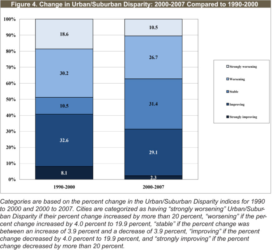
Trends in Urban/Suburban Disparity this decade appear more favorable in the South and West than in the Midwest and Northeast. The South is the only region to have strongly improving Urban/ Suburban Disparity levels and, in total, 42.5 percent of areas in the South improved. An equal proportion of Western areas had improving Urban/Suburban Disparity. Only 10 percent of Midwestern metro areas had improving Urban/Suburban Disparity, compared to about 45 percent that worsened from 2000 to 2007. The Northeast did slightly better; Urban/Suburban Disparity grew better in 23 percent of the study areas in that region, but grew worse in 46.2 percent.
The regions with the most improvement since 2000 in Urban/Suburban Disparity (South and West) are the regions with the lowest levels of disparity in 2007, and the regions with the most increases in disparity (Midwest and Northeast) are those with the highest levels of Urban/Suburban Disparity in 2007. This is a reversal of trends observed over the 1990s, where regions with highest levels of Urban/Suburban Disparity scores in 2000 (Midwest and Northeast) had the most improvement in their average Urban/ Suburban Disparity scores from 1990-2000, and the regions with the lowest levels of disparity (South and West) had the largest relative increases in urban/suburban socioeconomic disparity.
Table 7 lists the ten cities that had the greatest percent increases in their Urban/Suburban Disparity index scores from 2000 to 2007, and which are spread nearly evenly among regions. Of them, only Arlington remains from the ten cities that had the greatest increases from 1990-2000. Arlington and Mesa moved from low to high levels of Urban/Suburban Disparity while Syracuse moved from high to very high levels during this period.
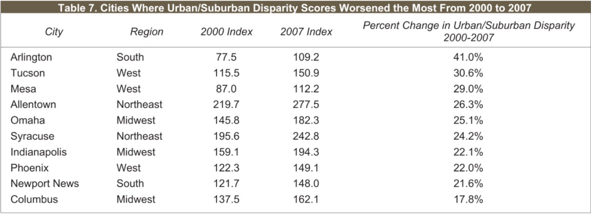
For Tucson, Arizona, relative scores worsened from 2000 to 2007 in virtually every element of the hardship disparity index, save for the share of nonworking age population. The Tucson metro area’s comparative decline in household income levels was especially pronounced; the index score for disparity in income between city and suburb in Tucson grew by more than 148 percent during this period.
For Newport News, Virginia, negative changes from 2000 to 2007 in the components of the hardship disparity index were generally slight. Levels of crowded housing, poverty, and nonworking age population were up somewhat. But the driving force in the worsening comparative score for Newport News appeared to be in levels of unemployment; the disparity index score for unemployment in the Newport News metro area more than doubled from 2000 to 2007.
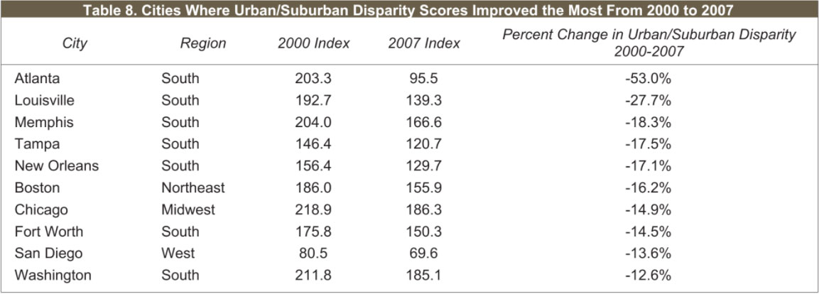
Table 8 lists the ten cities with the greatest declines in Urban/Suburban Disparity from 2000 to 2007. Seven of the ten cities are in the South. Atlanta’s disparity improved from a very high level in 2000 to a low level in 2007. Memphis, Chicago, and Washington moved from very high levels to high levels of disparity. Chicago is the only city that also made this top ten from 1990-2000.
Memphis, Tennessee, had strong improvement in each element of the disparity index score, save for education. Relative levels of unemployment appeared to be a particular area of improvement in Memphis during the period. Chicago, Illinois, displayed strong improvement in relative conditions of metro hardship disparity across the board.
Change in metro disparity for Washington, DC, between 2000 and 2007 presented a more complicated picture. Differences in levels of crowded housing and poverty between urban and suburban Washington, DC, grew somewhat worse relative to other metro areas during this period. However, improved scores on disparity in household income, educational attainment, nonworking age population, and especially in levels of unemployment more than compensated, and led to a generally improved comparative score.
Appendix D lists each of the study areas according to level of change in Urban/Suburban Disparity Index scores from 2000 to 2007. As shown, nine cities had significant increases in disparity compared to their metro regions since 2000, notably Arlington, Texas, and Mesa, Arizona, both of which moved from low to high levels of Urban/Suburban Disparity between 2000 and 2007. Thirty-two metro areas had increasing Urban/Suburban Disparity from 2000-2007, including nine from the Midwest, nine from the South, eight in the West, and six in the Northeast. Syracuse and Toledo moved between 2000 and 2007 from high to very high levels of disparity, while Austin and Orlando moved from low to high levels. Most of those growing worse were already at high or very high levels of Urban/Suburban Disparity.
Appendix D also notes the twenty-seven areas that did not exhibit significant change in their Urban/Suburban Disparity from 2000-2007. Though stable, most remained at high or very high levels of Urban/Suburban Disparity during this period.
Almost thirty percent of the places in Appendix D had declining disparity relative to their suburban areas from 2000-2007. Of the twenty-seven cities listed in this category, nine are in the South and thirteen are in the West. Notable movers are Chicago and Washington, where disparity declined from very high levels to high levels between 2000 and 2007, and San Francisco, where disparity declined from high to low levels.
Only two places had significant improvements in their Urban/Suburban Disparity Index scores from 2000 to 2007. Both are cities are in the South. Atlanta moved from very high levels of Urban/Suburban Disparity in 2000 to low levels in 2007. Louisville had a significant change in Urban/Suburban Disparity index scores, but remained within the same category of disparity from 2000 to 2007.
Changes in Urban/Suburban Disparity, 1970-2007
From 1970-2007, 83.6 percent of the areas studied had worsening disparity between their central cities and suburbs. But this is actually an improvement from the 90.9 percent that had worsening disparity for the 1970-2000 time period.
Another positive signal can be seen in the proportion of areas that had improving Urban/Suburban Disparity. The share of the total remains small, but the 9.1 percent with improving Urban/ Suburban Disparity from 1970-2007 reflects a sizable increase in share compared with only 1.8 percent from 1970-2000.
Viewing this trend decade by decade, we can see a turn that occurs between 2000 and 2007. The proportion of metro areas with very high levels of social and economic disparity between central city and suburban areas increased from 16.4 percent of the metro areas in 1970, to 43.6 percent in 1980, then to 61.8 percent in 1990 and in 2000 as well. In 2007, however, that proportion of high disparity among all metro areas fell to 54.5 percent. On the other end of the spectrum, the trend was for a shrinking share of metro areas with low levels of social and economic disparity between central city and suburban areas: from 23.6 percent in 1970, to 10.9 percent in 1980, the same in 1990, down to a low of 9.1 in 2000, but then improving back to 10.9 percent in 2007.
Metro areas with stable to improving Urban/Suburban Disparity from 1970-2007 were most common in the West, at 30 percent. Over 13 percent of the Southern metro areas had strongly improving disparity from 1970 to 2007. The Northeast and the Midwest fared worse. In the Northeast, all had worsening disparity from 1970-2007, with almost 62 percent of those having strongly worsening disparity. All of the cities in the Midwest had worsening disparity, including 88 percent of the cities that had strongly worsening disparity.
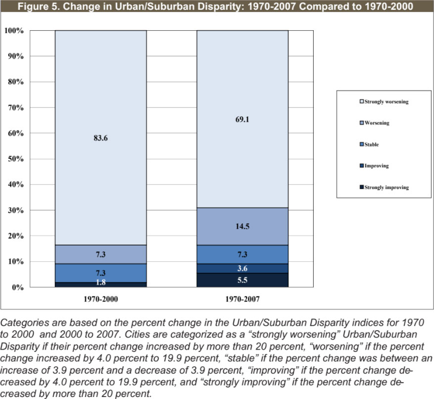
Table 9 lists the ten metro areas with the greatest percent increase in Urban/Suburban Disparity scores from 1970 to 2007. Four are in the Northeast, and three each are in the Midwest and South. Allentown, Syracuse, Norfolk, Milwaukee, Toledo, Dallas, Providence, and Birmingham were all among the ten with the greatest increases in Urban/Suburban disparity rank change from 1970-2000.
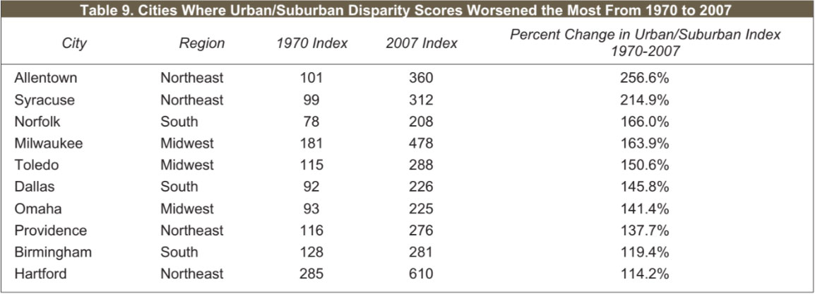
In Toledo, Ohio, index scores for disparity between urban and suburban levels of unemployment and nonworking age population are decidedly above the average. Levels of crowded housing are lower as a contributing factor, relative to other metro areas.
Providence, Rhode Island, offers a very different story. There, poverty and, in particular, levels of crowded housing are driving factors in the metro area’s high and worsening levels of Urban/Suburban Hardship disparity, compared to other places.
Appendix E lists each of the study areas according to level of change in Urban/Suburban Disparity Index scores from 1970 to 2007. A total of 38 metro areas had strongly worsening Urban/Suburban Disparity from 1970 to 2007. Many (24) began with high levels in 1970 and moved into very high levels of disparity in 2007. Five metro areas — Hartford, Gary, Baltimore, Rochester, and St. Louis — had very high levels in 1970 and continued to have worsening socioeconomic conditions in their central cities compared to their suburban areas, hence remaining with very high levels of disparity in 2007. Seven metro areas had low levels of disparity in 1970 and moved into high or very high categories of Urban/Suburban Disparity by 2007.
Eight metro areas had worsening Urban/Suburban Disparity from 1970-2007. Five of the metro areas are in the Northeast, and one each are in the Midwest, South, and the West. Cleveland and Newark had very high Urban/Suburban Disparity in 1970 and remain with very high levels in 2007. The rest had high levels in 1970 and remained in high levels in 2007, except for New York City, which moved into very high disparity.
The opposite end of the spectrum is illustrated by Table 10, which lists the metro areas most improved in Urban/Suburban Disparity from 1970-2007. Half are in the West, three are in the South, and one each are in the Midwest and Northeast.
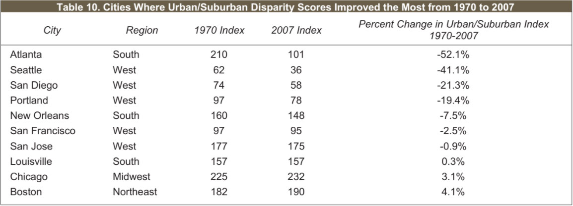
Only four of the fifty-five metro areas in our study had stable levels of Urban/Suburban Disparity from 1970-2007. Chicago had very high levels of disparity in 1970 and remained with very high levels in 2007. Louisville and San Jose had high levels of Urban/ Suburban Disparity in both 1970 and 2007. San Francisco had low levels of disparity in 1970 and remained with low levels of disparity in 2007.
Only five metro areas had improving socioeconomic conditions in their central cities compared to the surrounding suburban areas from 1970-2007. However, this is an improvement since there was only one metro area (Seattle) in this category from 1970-2000. Atlanta had very high Urban/Suburban Disparity in 1970, but had improved enough to be in the high category by 2007. Seattle, San Diego, and Portland all had low levels of Urban/Suburban Disparity in 1970 and remained with even lower levels in 2007. New Orleans had high Urban/Suburban Disparity in 1970, and even though their index score improved, remained in high levels in 2007.
We previously reported that as the percentage of metro population living within the central city boundaries increases, the Intercity Hardship and the Urban/Suburban Disparity scores decrease, indicating that residents living in cities with a greater ability to incorporate higher shares of the total metro area population fare better in socioeconomic terms than residents in cities without this ability.
We again found that cities with high and very high Intercity Hardship scores in 2007 have a low share of the metro population residing within the central city. Over 70 percent of cities with very low Intercity Hardship scores in 2007 have moderate concentrations of their metro population residing within the central city. The pattern we reported in 2000 with the increasing metro population living within the central city boundaries associated with decreases in Intercity Hardship is still evident in 2007, though not as strong since about 12 percent of both low and high categories of Intercity Hardship in 2007 have high shares of metro population living in the central cities.
Similar to the trend for 2000, there is an association between metro population concentration and degree of disparity in socio-economic conditions between central cities and surrounding sub- urban areas in 2007:
• There is a statistically significant, inverse relationship between central city population concentration and Urban/Suburban Disparity Index scores.
• Metro areas that have a higher proportion of populations residing within the central city are associated with a lower level of Urban/Suburban Disparity in 2007. Albuquerque and El Paso had low levels of disparity and high concentration of population with over 50 percent of their areas’ population living in these cities.
• Metro areas that have a lower proportion of populations residing within the central city are associated with a higher level of Urban/Suburban Disparity in 2007. Hartford, Santa Ana, Newark, Gary, and Allentown all had very high disparity in 2007 and less than 14 percent of the population living within the central cities.
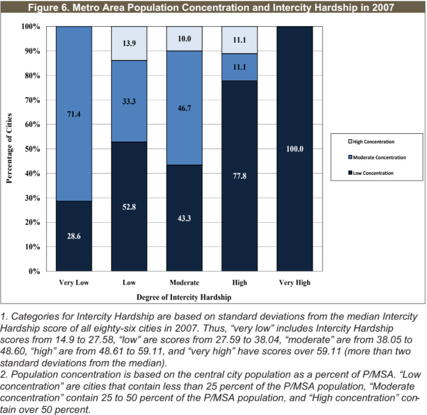
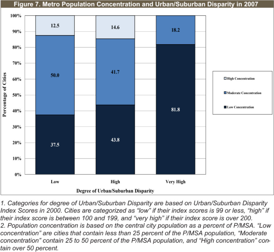
Figure 7 shows
that, in 2007, 12.5 percent of the metro areas with low levels of Urban/Suburban Disparity had high concentrations of the population living within the central city, compared to none of the metro areas with very high levels of Urban/Suburban Dis- parity. Conversely, almost 82 percent of the metro areas with very high Urban/Suburban Disparity had low concentrations of their populations living within the central city versus 37.5 percent of the areas with low Urban/Suburban Disparity.
Finally, these trends also demonstrate an association between hardship levels, urban/suburban disparity, and violent crime. The degree of average reduction in violent crime appeared to follow improvements in Intercity Hardship from 2000-2007.
Overall, about 56 percent of the cities in our study had declines in their rates of violent crime from 2000-2007 (a rather bare majority compared to the share of cities showing improvement in violent crime rate over the 1990s, which was almost 90 percent). Cities with improving (meaning lessening) levels of Intercity Hardship from 2000 to 2007 had an average reduction in violent crime of almost 65 percent over the same period. Conversely, cities with increasing (worsening) Intercity Hardship had an average decline in their crime rate of about 18 percent, less than one-third the reduction in crime rates felt among cities with improving Intercity Hardship. An even larger difference was seen in cities with strongly increasing levels of Intercity Hardship, where average rates of violent crime increased.
Higher reductions in violent crimes are also associated with improving Urban/Suburban Disparity. There is a statistically significant relationship between worsening Urban/Suburban Disparity Index scores and smaller reductions in violent crime rates.4 Metro areas with strongly increasing disparity between their central cities and surrounding suburbs have an average reduction in violent crime of 4.7 percent while metro areas with strongly improving disparity conditions have an average reduction of 70 percent.
Atlanta had the most improved change in Urban/Suburban Disparity scores from 2000-2007 of all 86 cities in our study and had the second largest decline in their violent crime rate of 227.5 percent. Arlington and Allentown both had large increases in their Urban/Suburban Disparity scores from 2000-2007 indicating worsening conditions, and also had increases in their violent crime rates of 17.6 and 57.5 percent, respectively.
America’s metropolitan areas have undergone enormous challenges since the onset of the Great Recession, as costs for rising social demands and revenues from shrinking economic activity have moved in opposite directions and at an alarming pace. But a longer view demonstrates that the recession’s pain hit when social and economic conditions in these metropolitan areas had already turned negative.
Social and economic conditions grew increasingly negative since 2000 for most central cities in America’s populous metro areas, in a dramatic departure from trends over the 1990s. More than four in ten cities had strongly increasing hardship from 2000 to 2007, nearly six times the proportion of cities that had strongly increasing hardship over the 1990s.
Large and surprising changes in relative conditions of social
and economic hardship also occurred at the regional level. The
slide from 2000 to 2007 was steepest in portions of the country associated previously with economic growth rather than deterioration. Over the 1990s, hardship conditions in the Northeast fared worst and were growing worse more rapidly than other regions of the country, and cities in the south and Midwest typically fared far better. But the proportion of central cities with strongly worsening Intercity Hardship from 2000-2007 was highest in the Midwest and the South, and lowest in the Northeast.
While levels of disparity between central cities and their sur-
rounding suburbs appear to have reduced over this more recent pe-
riod, the ostensible improvement is more the result of relative
decline in the suburbs than progress in the central cities. Importantly, we again find that as the percentage of metro population living within the central city boundaries increases, the Intercity Hardship and the Urban/Suburban Disparity scores decrease, indicating that residents living in cities with a greater ability to incorporate higher shares of the total metro area population fare better in socioeconomic terms than residents in cities without this ability.
These findings signal several important directions for public policy. There continues to be a need for federal — as well as state — responses to conditions of social and economic hardship. But it is vital to avoid the trap of conflating urban poverty and a metropolitan agenda. Stronger connections between cities and their surrounding suburban areas are clearly linked to better social and economic conditions at city and metropolitan levels over time. Advancing interconnections at the regional level is pivotal. As plans are made and implemented to reinvest and to restore the American economy from more recent malaise, US cities and suburbs plainly have a distance to travel. And it is a distance to travel together.
1 The Index is a composite of six factors: Unemployment (defined as the percent of the unemployed civilian popu-
lation over the age of 16); Dependency (the percentage of the population under the age of 18 or over the age of 64);
Education (the percentage of those over the age of 25 with less than a high school education); Income Level (per
capita); Crowded Housing (measured by the percent of occupied housing units with more than one person per
room); and Poverty (the percent of people living below the federal poverty level). Values from these six factors
were compared to a national standard, and then given equal weight when combined in a composite index. A
higher Intercity Hardship Index score signifies worse economic conditions.
The underlying methodology is outlined more fully in David J. Wright and Lisa M. Montiel. (2007) Divided
They Fall: Hardship in America’s Cities and Suburbs. Albany, NY: The Nelson A. Rockefeller Institute of Gov-
ernment. It is an update of a method originated by Richard P. Nathan and Charles F. Adams, Jr. (1989). “Four
Perspectives on Urban Hardship.” Political Science Quarterly 104 (3):483-508. The same formulation as the original study was used to calculate the Intercity Hardship Index:
X = ((Y-Ymin)/(Ymax – Ymin))*100 where: X = standardized value of component variable (for example, unemployment rate) for each city to be computed.
Y = unstandardized value of component variable for each city.
Ymin = the minimum value for Y across all cities.
Ymax = the maximum value for Y across all cities.
The (Ymax – Ymin ) part of the formula was reversed to (Ymin – Ymax ) for the calculation of Income Level so that the resulting ratio would be interpreted consistently with the other ratios — a higher value indicating higher hardship. The formula standardizes each of the component variables so that they are all given equal weight in the composite Intercity Hardship Index. The Index represents the average of the standardized ratios of all six component variables. The Intercity Hardship Index ranges from 0 to 100 with a higher number indicating greater hardship. Adjustments were made to reflect regional cost-of-living differences in order to compare economic conditions between cities in different parts of the country. Because the Bureau of Labor Statistics discontinued the Family Budget Index Nathan and Adams used for this purpose in their original analysis, adjustments were made using the Department of Housing and Urban Development’s Fair Market Rents (FMR), defined as the 40th percentile rent for a two bedroom home, and established for each of the cities in the study. The FMRs were in- dexed and the index was applied at 100 percent as an adjustment to the income variable (which Nathan and Ad- ams adjusted by the “intermediate level of living” of the BLS Family Budget Index), and at 67 percent as the poverty adjustment (which Nathan and Adams adjusted by the “lower level of living” of the BLS Family Budget Index). Data sources included the 1990 and 2000 Decennial Census of Population and Housing and the American Community Survey
2 Pearson r = 0.385 with the correlation significant at the 0.01 level.
3 Pearson r = -0.290 with the correlation significant at the 0.01 level.
4 Pearson r = 0.236 with the correlation significant at the 0.05 level.